BUG:This update totally removes the hook from ad_header
Code:
<xen:hook name="ad_header" />
From what I can tell, the style isnt making use of that hook at all which has broken my ads
The ad_header is still in logo_block. We did add a setting so it can float under the logo whenever you want. This allows for better responsive ad integration. Create a ticket and Ill see if there is a template outdated or something. Even though Im not sure we changed much in this area other than added some code.
This is why we can't have anything unique and constantly keep changing things

Hah, this is how I feel about a lot of things

@Audentio .... I have a member with android 4.2.2 who says the sticky header is following down the page but flashing and rendering it useless. Is this something you've come across before? I'm trying to get more details and hopefully a video.
Cheers
Ill definitely look into the flashing issue, I thought we fixed that many versions ago. Anyone else seeing this?
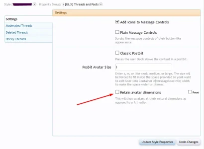
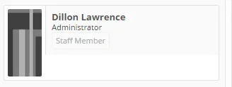
Updated UI.X to the latest and now the avatars are square, have the option checked for rounded avatars. Should note in that everywhere else they rounded but not in the message_user_info_ template
Yes, so we accidentally turned the retain avatar dimensions setting on when we exported. If that setting is on, we remove the rounded aspect on avatars otherwise you get weird oval shapes. Rounded avatars only looks good when they are perfect squares. This issue will be fixed in the next release.
Mike, I purchased this theme yesterday and was not able to download it. I left a ticket, and message on the board, and still no response. Please look into it, thanks.
As far as I can remember I responded to your ticket, but Im not sure if you used the same username there. PM me if it was not taken care of.
So this is what I was referring to
View attachment 82266
As can see the other items are rounded but not the actual avatar itself. There are no outdated templates and made sure to check that rounded avatars were selected.
Correct, this is by design. What is not by design are some width related issues with the avatars. So apologies for that.
@Mike Creuzer
A few of questions

When using the responsive design (mobile) fonts in Chrome (Android) appear larger, so the footer font size is almost as large as the category titles.
Upon initial page loads, the navigation bar and user bar appear to have rounded corners (all browsers).
The sticky user bar is not sticky (Chrome, Android 4.4).
As for the fonts, I have no idea. We don't change font size for the footer based on the viewport size. Feel free to create a ticket and Ill check and see if a plugin or script is causing the trouble.
Did anyone on 1.3.5 who upgraded to the newest version of the theme lose the ability to use the multi-quote system? I didn't even notice it but mine's completely borked. When I switch back to the default theme it works again.
This has been reported by one other, and it has to do with the sticky nav (darnit

). If you disable userbar as sticky just temporarily this should fix the issue. Its already been patched on our end.
Its our fault for keeping that setting on, apologies for the trouble, really.
@Mike Creuzer
Is there any solution to the avatar issues?
For now, disable the retain avatar dimensions and put the size back to 'm' as opposed to 'l'. It won't fix the horizontal postbit issue (which is primarily an issue in Chrome 37 as they changed A LOT in this version. So a lot of theme designers and web designers are scrambling on a few things.
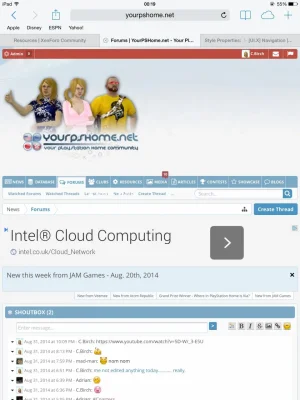
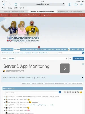
@Mike Creuzer I have just updated to latest version and my nav bar does not seem to wrap anymore on my ipad, it just moves the over flow to below over the sub menu.
View attachment 82452
You can see, it's covering the latest and new ports sub menu, it used to wrap and add a icon to view the rest of the menu like this.
View attachment 82454
That is likely a JS issue. Its hard to say why, but this also might be caused by the userBar. Feel free to create a ticket so I can confirm or tick off the sticky userBar and see if that helps.

