You are using an out of date browser. It may not display this or other websites correctly.
You should upgrade or use an alternative browser.
You should upgrade or use an alternative browser.
UI.X 1.5.22.0
No permission to download
- Thread starter Dad.
- Start date

Found this: http://stackoverflow.com/questions/...rigin-wildcard-subdomains-ports-and-protocolsI currently can't load the ad styler using a CDN
View attachment 58140
Might have something to with your CDN .htaccess settings.
Thanks. It's not really an issue, as ad_styler isn't enabled, I just wanted to have a play about with it.Found this: http://stackoverflow.com/questions/...rigin-wildcard-subdomains-ports-and-protocols
Might have something to with your CDN .htaccess settings.
Yeh the developer tells me its because he is using AJAX to access the server preset templates. Definitely worth playing with, can be a lot of fun!Thanks. It's not really an issue, as ad_styler isn't enabled, I just wanted to have a play about with it.


No sir. I will check on that, but shouldn't have touched that.have you made changes to lightbox styling?
View attachment 58143
The control icons are the same colour as the background, so they go invisible.
UI.X is using #ffffff for @secondaryLightest in formOverlayNo sir. I will check on that, but shouldn't have touched that.
The default style uses rgba(0,0,0, 0.75)
I see the CSS thats making that white in the HTML in the <head> tag. Check that area, we didn't put that there.have you made changes to lightbox styling?
View attachment 58143
The control icons are the same colour as the background, so they go invisible.
ETA: You might be right, looking into it now.
Can you add this to your extra.css:UI.X is using #ffffff for @secondaryLightest in formOverlay
The default style uses rgba(0,0,0, 0.75)
Code:
.xenOverlay.lightBox #LbUpper, .xenOverlay.lightBox #LbLower {
background-color: rgba(0,0,0,.75);
}
Or with an !important. Ill just manually do that since all form overlays have white backgrounds at the moment. If it causes some trouble, I'll just make them dark again. I just thought that was an inconsistent look with XenForo skins.
lol good thinking.Quick dirty fix (using my custom css file)
Code:.xenOverlay.lightBox #LbUpper, .xenOverlay.lightBox #LbLower { background-color: rgba(0,0,0, 0.75) !important; }
Thats the fix Im going to do, unless more issues come up which I doubt there will. Its just the fact that the lightbox has some extra code that it adds, plus the white icons.
ggace
Active member
What would it take for there to be an option to share or save the theme variations by authors? Basically I want to create a color scheme from the version of our site 2-3 years ago as a sort of "anniversary" gift to the users. Great update & the members LOVE messing with the theme.
I love this theme even more now, excellent job.
One request (maybe?") )
)
Can we get the color options panel in the AD styler, instead of floating out there on the forum? It just looks a bit tacky at the bottom, and not everyone's going to understand what that's all about. I love the idea, and love the changes you've made. Maybe some will share their custom styles with the rest of us, eventually
One request (maybe?
)Can we get the color options panel in the AD styler, instead of floating out there on the forum? It just looks a bit tacky at the bottom, and not everyone's going to understand what that's all about. I love the idea, and love the changes you've made. Maybe some will share their custom styles with the rest of us, eventually

Thanks guys! Reviews are welcome too if you guys can spare the moment!
Good suggestion. You can put them in the styler quite easily actually. I just wanted to show people that you can have them outside as well. I think what I'll do is have a little toggle icon or something, so that might make it not look so random. You're right.
Great to hear! Ill make a video on how to do it, it's unbelievably powerful.What would it take for there to be an option to share or save the theme variations by authors? Basically I want to create a color scheme from the version of our site 2-3 years ago as a sort of "anniversary" gift to the users. Great update & the members LOVE messing with the theme.
I love this theme even more now, excellent job.
One request (maybe?
Can we get the color options panel in the AD styler, instead of floating out there on the forum? It just looks a bit tacky at the bottom, and not everyone's going to understand what that's all about. I love the idea, and love the changes you've made. Maybe some will share their custom styles with the rest of us, eventually
Good suggestion. You can put them in the styler quite easily actually. I just wanted to show people that you can have them outside as well. I think what I'll do is have a little toggle icon or something, so that might make it not look so random. You're right.
Shouldn't be too hard to do that. I don't really cover specific support here, but if you create a ticket at my site I can help you with that.How can I make the search do this all the time, removing it from the right side of the header.
View attachment 58270

Made a few theme variants.
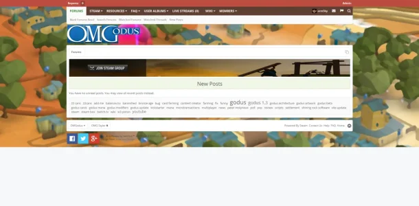
http://omgodus.com/
@Audentio
After using Artys Resonsive theme, there is one thing missing, or i don't quiet understand to make work.
When using going responsive view , it'd be nice to have option of another logo or have no logo at all. The activeHeaderSticky seems to be persistent.
Regarding the background images. The look is really weird in that it scales the image to the height of the page, but even as people are typing in threads it keeps scaling. And as you click through screens with different heights it jumps all over the place. Does not look good .
.
I've just used the mincraft files and renamed the links etc, so still your stock code.
Try it out on my site.
Its especially bad
http://omgodus.com/wiki/index/ then click on the cards as page is much longer.
Also evident on the "No New Posts" as you get loads of white space at bottom.
Can you show me how to fix the image. like fusion game on http://pixelexit.com/demo/xf/index.php
http://omgodus.com/
@Audentio
After using Artys Resonsive theme, there is one thing missing, or i don't quiet understand to make work.
When using going responsive view , it'd be nice to have option of another logo or have no logo at all. The activeHeaderSticky seems to be persistent.
Regarding the background images. The look is really weird in that it scales the image to the height of the page, but even as people are typing in threads it keeps scaling. And as you click through screens with different heights it jumps all over the place. Does not look good
.I've just used the mincraft files and renamed the links etc, so still your stock code.
Try it out on my site.
Its especially bad
http://omgodus.com/wiki/index/ then click on the cards as page is much longer.
Also evident on the "No New Posts" as you get loads of white space at bottom.
Can you show me how to fix the image. like fusion game on http://pixelexit.com/demo/xf/index.php
Attachments
Last edited:
Similar threads
- Replies
- 1
- Views
- 464