How do you add those presets into one style so the members can simply click and change the look of it? (Using AD Styler)By creating different styles or turn on the AD Styler.
You are using an out of date browser. It may not display this or other websites correctly.
You should upgrade or use an alternative browser.
You should upgrade or use an alternative browser.
UI.X 1.5.22.0
No permission to download
- Thread starter Dad.
- Start date
As far as I'm aware, I'm sure @Mike Creuzer will confirm, is to create your own SoftImage file (.si) and upload to js/audentio/ad_styler/2.1/styles/uixHow do you add those presets into one style so the members can simply click and change the look of it? (Using AD Styler)
Anyone using UI.X and Brogan's Featured Threads/Portal addon together? I'm curious to see what the themed homepage would look like and how they interact together. Feel free to PM me if you don't want to post your home page. TIA.
I'm using it but I haven't customized the FT part at all : www.travelstories.gr
Try this in EXTRA.cssIs there a way to disable all the footer stuff from loading in mobile view? Focussing on user experience and the footer doesnt need to be loaded for each and every page on mobile view esp since it takes up so much screen real estate.
Code:
<xen:if is="@enableResponsive">
@media (max-width:@maxResponsiveNarrowWidth)
{
    #uix_footer_columns
    {
        display: none;
    }
}
</xen:if>Where is this setting please?Whats great too is if you have centered logo on mobile turned on, it should also center these if you have centered advertisements on

Put this in your EXTRA.cssView attachment 85771
Where is the style property to be able to reduce the vertical height of the header to remove unnecessary space?
Code:
#header, #header>div { margin: 0 0 !important; }The space is using the Gutter Width setting in Style Properties > Global Settings which will be set as 16px in your settings, if you adjust this it will also alter a lot of other spacings throughout your board, so just use that code I've given you to resolve your spacing issue.
Last edited:
Little bit of an update here:
- xenPorta dropdown menu icon margin issue fixed
- post history link fixed
- toolbar can now be entirely fontAwesome
- online indicator as a default 'triangle' shape works better now
- alerts are more prominent (made them red when there is something to read as opposed to tertiary color, works across userbar/nav better)
- hide visitortab username setting added
- show avatar in the visitor tabs (I know this is default, we just made it a setting so you can show a glyph icon instead)
- you can now choose to close welcome block when it is in fixed position as opposed to it prepending back into the content pane
- private message controls are responsive as opposed to always on always off
- all files are pulled locally, not requiring you to use external CDNs for any files whatsoever anymore
- html5 shiv, css3, media queries for IE8 is now a setting for those that don't care about IE8

- admin menu is responsive as opposed to always on or off based on visitor tabs to user bar setting
- we designed a new login modal
- retain avatar dimensions simplified to use small/medium/large avatar sizes in postbit
- various postbit inprovements
- tons of CSS optimization
- you can now choose to allow jump to bottom as well as jump to top
Attachments
View attachment 85771
Where is the style property to be able to reduce the vertical height of the header to remove unnecessary space?
You can do what @thejackarmy suggested, or you can edit the header gutter width var Header White Space. It will be under UI.X Header style property group in the next release.
I can't display an ad *between* posts. The code I was using in my previous style no longer works for UI.X (breaks the layout), so I'm wondering what I need to change to make is work, can you help me out? I tried leaving the li tags out, but then the ad goes INTO the post, and still does not display properly (goes in the middle of the page and cuts in half)
Code:
<xen:if is="{$post.position} % {$xenOptions.messagesPerPage} == 2">

<li>
<div id="banner_below_messages_td">


<!-- begin travelstories  ROS 728x90_2 -->
        <div id="td_728x90_bot_ros">
            <script type="text/javascript">
***script code goes here***</script>
        </div>
<!-- end travelstories  ROS 728x90 -->

<br />

</div>
</li>
</xen:if>Put this in your EXTRA.css
Code:#header, #header>div { margin: 0 0 !important; }
The space is using the Gutter Width setting in Style Properties > Global Settings which will be set as 16px in your settings, if you adjust this it will also alter a lot of other spacings throughout your board, so just use that code I've given you to resolve your spacing issue.
Thanks!
I can't display an ad *between* posts. The code I was using in my previous style no longer works for UI.X (breaks the layout), so I'm wondering what I need to change to make is work, can you help me out? I tried leaving the li tags out, but then the ad goes INTO the post, and still does not display properly (goes in the middle of the page and cuts in half)
Code:<xen:if is="{$post.position} % {$xenOptions.messagesPerPage} == 2"> <li> <div id="banner_below_messages_td"> <!-- begin travelstories ROS 728x90_2 --> <div id="td_728x90_bot_ros"> <script type="text/javascript"> ***script code goes here***</script> </div> <!-- end travelstories ROS 728x90 --> <br /> </div> </li> </xen:if>
Did you try just doing the ad code? We've built the ad templates to really support whatever you throw at them so Im surprised you keep having issues
 . If after you try that its not working create a ticket and Ill go in and do it for you.
Style Properties: ├ [UI.X] Forum Nodes
New Indicator Label
.... shows for guests (non-logged in) too. Suggest that it should only show for logged-in members.
Hmm. We are using the same code that changes the node icon to show that label. Im not sure if that makes sense to do, any one else have input?
Why? CDN is a good thing. I certainly want to use CDN for all possible content.
- all files are pulled locally, not requiring you to use external CDNs for any files whatsoever anymore
CDN when it pertains to geolocation is a good thing, but most sites just serve a file from their regular web server.Why? CDN is a good thing. I certainly want to use CDN for all possible content.
You can use fontawesome CDN or local, there is a style property for that. Same with jQuery. Its just the extra IE8 stuff we are loading locally.
We are using the same code that changes the node icon to show that label. Im not sure if that makes sense to do

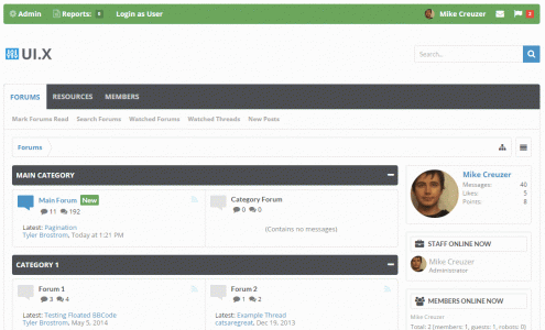
Here's an example. Whilst the node icon is OK and a lot more subtle, the New Indicator standards out a LOT more and looks, IMHO, quite sillly for guest users since of course all content will be new.
Little bit of an update here:
We are looking into a breadcrumb issue on windows phone, nothing major here, just wanted to check into it, but that is quite literally all we have left before a release so we are thinking tonight/early tomorrow.
- xenPorta dropdown menu icon margin issue fixed
- post history link fixed
- toolbar can now be entirely fontAwesome
- online indicator as a default 'triangle' shape works better now
- alerts are more prominent (made them red when there is something to read as opposed to tertiary color, works across userbar/nav better)
- hide visitortab username setting added
- show avatar in the visitor tabs (I know this is default, we just made it a setting so you can show a glyph icon instead)
- you can now choose to close welcome block when it is in fixed position as opposed to it prepending back into the content pane
- private message controls are responsive as opposed to always on always off
- all files are pulled locally, not requiring you to use external CDNs for any files whatsoever anymore
- html5 shiv, css3, media queries for IE8 is now a setting for those that don't care about IE8
- admin menu is responsive as opposed to always on or off based on visitor tabs to user bar setting
- we designed a new login modal
- retain avatar dimensions simplified to use small/medium/large avatar sizes in postbit
- various postbit inprovements
- tons of CSS optimization
- you can now choose to allow jump to bottom as well as jump to top
Cool! Any plans to include this suggestion in the near future?
Hi MikeLittle bit of an update here:
We are looking into a breadcrumb issue on windows phone, nothing major here, just wanted to check into it, but that is quite literally all we have left before a release so we are thinking tonight/early tomorrow.
- xenPorta dropdown menu icon margin issue fixed
- post history link fixed
- toolbar can now be entirely fontAwesome
- online indicator as a default 'triangle' shape works better now
- alerts are more prominent (made them red when there is something to read as opposed to tertiary color, works across userbar/nav better)
- hide visitortab username setting added
- show avatar in the visitor tabs (I know this is default, we just made it a setting so you can show a glyph icon instead)
- you can now choose to close welcome block when it is in fixed position as opposed to it prepending back into the content pane
- private message controls are responsive as opposed to always on always off
- all files are pulled locally, not requiring you to use external CDNs for any files whatsoever anymore
- html5 shiv, css3, media queries for IE8 is now a setting for those that don't care about IE8
- admin menu is responsive as opposed to always on or off based on visitor tabs to user bar setting
- we designed a new login modal
- retain avatar dimensions simplified to use small/medium/large avatar sizes in postbit
- various postbit inprovements
- tons of CSS optimization
- you can now choose to allow jump to bottom as well as jump to top
Very much look forward to this update. I assume the UIX. Flex will be getting this same update since it is based on UIX.
I'm moving from the original Flexile to this UIX. Flex and there are a few items that I'm trying to see if they exist as a property.
1) The option to hide the visistor panel. In Flexile, it's the Show User Card option
2) I have a leaderboard 728x90 banner on the ad_header template. When in mobile, I see the banner got squeezed/cut off to fit the width.
3) Rounded avatar option can use some improvement in CSS.

This is in UIX

4) Resource icons are not rounded and have some blue background
5) On RM index page, it will complain about a missing /styles/uiflex/uiflex-dark/navigation-tab.png
6) Sticky header does not work on mobile?
Similar threads
- Replies
- 1
- Views
- 464