You are using an out of date browser. It may not display this or other websites correctly.
You should upgrade or use an alternative browser.
You should upgrade or use an alternative browser.
UI.X 1.5.22.0
No permission to download
- Thread starter Dad.
- Start date
Had merged the templates after doing the upgrade and it was still coming up with those errors. I've set up the latest build as a new style and things are much smoother.
In 'Background' change the colour from White to Transparent by putting a check in 'Clear Value'
Dammit, that was it. I didn't see it because there was nothing showing in the box so I didn't click on it. Thanks.
Yeah, I got that one. What I was wondering was if there were some changes in there since the last version or two?@Rambro go into Style Properties: BB Code Elements and fiddle with the colour settings in BB Code Quote, Quote Attribution Block and BB Quote Message until you get what you want.
Any word on the signature spacing? With the dotted line breaks and the large gaps its looking pretty odd.
No idea mate, just helping fellow users out with some limited knowledge I have of UI.X that I learned last night after upgrading mine lolDammit, that was it. I didn't see it because there was nothing showing in the box so I didn't click on it. Thanks.
Yeah, I got that one. What I was wondering was if there were some changes in there since the last version or two?
Any word on the signature spacing? With the dotted line breaks and the large gaps its looking pretty odd.
Any word on the signature spacing? With the dotted line breaks and the large gaps its looking pretty odd.

I also want more options to be separated for desktop and mobiles.Any idea on how to not show the Welcome Block overlay on mobile and just have it be the Welcome Block banner, while keeping the overlay on the desktop?
For example an option to have sticky navigation on mobile always on.
Or User/Mod Bar above navigation on desktop AND below navigation on mobile.
Well, just some examples...
The registration page is broken.
JS-error:
Checked again.
It turns out that this error is not on the registration page.
Error for the entire board of a guest.
---
Accidentally published references.
Project is not yet ready. Closed asterisks.
JS-error:
Code:
uix.init()
UI.X IS IN BETA MODE
Uncaught TypeError: Cannot read property 'top' of undefined ***/js/audentio/uix/functions.min.js?_v=0cb401be:1
Uncaught TypeError: Cannot read property 'top' of undefined ***/js/audentio/uix/functions.min.js?_v=0cb401be:1
Uncaught TypeError: Cannot read property 'top' of undefined functions.min.js?_v=0cb401be:1
Checked again.
It turns out that this error is not on the registration page.
Error for the entire board of a guest.
---
Accidentally published references.
Project is not yet ready. Closed asterisks.
Last edited:
So I fixed up my quote button spacing, but now it's all fubared on mobile. Suggestions?
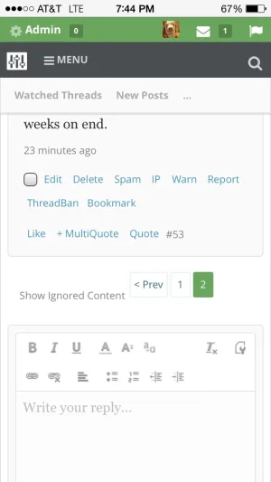
Here's how it looks on the desktop:

And this is how the text logo looks after increasing the size and width. I can't get it to really change. Also that's how the font awesome chat bubble looks now, for some weird reason:
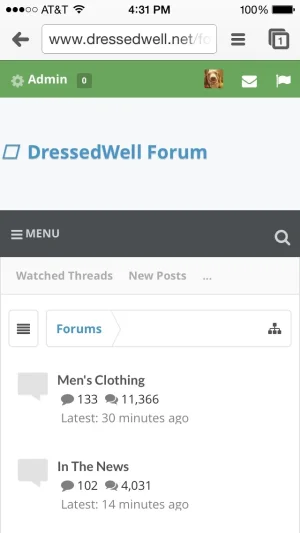

Here's how it looks on the desktop:

And this is how the text logo looks after increasing the size and width. I can't get it to really change. Also that's how the font awesome chat bubble looks now, for some weird reason:

It's on uix_quickScripts_head template.Welcome block is still appearing even after unchecking all options to make sure it does not appear. Along with that it is pushing the node background images slightly and causing them to not align properly as before.
Also wanting to add in receiving this error at the very top of the site on all pages "$(document).ready(function(){ //put jquery code here });"
I sum everything up below, but for your convenience/TLDR:
OK guys bear with me on this. Am doing my best to answer tickets and such. To recap quick, here are known issues:
Well, to each their own I guess. Add this to your EXTRA.css:
Right, I suppose I didn't see a point in having a width on text-based logos. Is that what you are talking about.
But people still need to use some basic sense. If the logo is too long things will break. Just because we are giving the tools doesn't mean we can account for every single user input.
Correct.
Correct again . I will say this, I have seen the XenForo upgrade theme script bug up before even though it works at least 9/10 times. Always make a backup.
I'm not seeing the spacing issue. If you are talking about the min-height (that default XenForo theme also uses), you can just remove the min-height on post message content.
This is a bug, thanks for reporting
Yes, Appearance > Style Properties > ├ [UI.X] Navigation > Uncheck Visitor Tabs to User Bar
You can either decrease font size or increase width on that block. We increased font-size all around in the last release. Just use Typography style properties to decrease small font size back to 11, thats one fix.
Yes, but not with sticky nav enabled. You can just simply use css to hide it.
There is likely a PAGE_CONTAINER outdated issue here as others have mentioned.
This is a bug, thanks for reporting
Still having the issue after merging templates? You likely have page_container outdated.
I'd agree, but what should I do? Force people to remove boxes on mobile? What about people who do want them. Its all a give and take relationship. The more features we give you the more I really hope you understand that there are varying levels of what people want by default.
Yes this is intentionally put there. I did, just now, add one margin below the copyright. I understand some might think this is too much space, so just simply remove the margin or padding for legal style/footer extended columns. If you need help in this let me know.
There is no simple way to have a sticky automatically sticky AND have the navigation below the logo and NOT sticky on desktop on load. You cannot have it both ways. I don't care what framework you use If you want it sticky so bad on mobile, put the navigation above the logo, there's a setting for that
Right, so you need to remove the margin top on userbar and the margin bottom of navigation. SOmething like this should work in your extra.css. A setting is very difficult to do for this because what about the people who want it like that? Or want a margin below user bar but not navigation? There are like 9 different settings x 2 for margin top and bottom. I don't want 18 settings for just margins
Remember this is a framework, it does the heavy lifting. THe little details like this is for you to decide. There are style properties to help too but every now and again some extra css is needed.
Seems like you have a javascript issue. If you are using a CDN/caching plugin make sure to recache. If that doesn't help create a ticket at audentio.com.
Yeh some times style properties that are out dated can get in the way. XenForo needs to make a way to upgrade style properties too instead of just templates
This can be done, yes. It requires a bit of javascript.
Some day, CSS will support this (there is no IE8 support, which puts me on the fence when it comes to using it). But as of right now, there is nothing I can do that would be worth the effort. We're talking super complicated code here. You cannot just move things, in Javascript, because all the dom elements will break. Your menus would stop working.
You can always do some absolute positioning. If this was a custom theme I could figure it out. But in a framework where there are 100,000 different permutations of all the settings? Not a chance sadly.
OK guys bear with me on this. Am doing my best to answer tickets and such. To recap quick, here are known issues:
- the show hidden content link on mobile
- sidebar width issues (Drift only)
- the close icons are not showing up
- beta mode in console, this does not affect anything FYI
But if I scroll down and stop, then read stuff, I then have to trigger it to appear by scrolling again? I don't see why this is sensible compared to how it worked when you first put it in having it on permanently. It was the most complained about thing when it broke on one of your previous updates.
Well, to each their own I guess. Add this to your EXTRA.css:
Code:
#uix_jumpToTopFixed {opacity: 1 !important; display: block !important;}For the logo, when using the text based logo, the width and height settings don't change anything. Only when using images.
Right, I suppose I didn't see a point in having a width on text-based logos. Is that what you are talking about.
But people still need to use some basic sense. If the logo is too long things will break. Just because we are giving the tools doesn't mean we can account for every single user input.
Just to clarify, there is no need for UI.X Dark to be a child of UI.X any longer?
Correct.
So if I give UI.X Dark the no parent option then import the new UI.X Dark xml and choose Overwrite Style: UI.X Dark things will be ok?
My current style setup is:
UI.X
------ Theme 1 (child of UI.X)
------ UI.X Dark (child of UI.X)
------------------ Theme 2 (child of UI.X Dark)
Will effectively change to:
UI.X
------Theme 1
UI.X Dark
------Theme 2
Thanks
Correct again
Anyone else having weird spacing issues within their posts? I've got large gaps between signature tops and bottoms, and in some posts, just large blocks of empty space below where the signature would be, even if it isn't present:
View attachment 78621
View attachment 78622
View attachment 78623
I'm not seeing the spacing issue. If you are talking about the min-height (that default XenForo theme also uses), you can just remove the min-height on post message content.
I don't know if this was on purpose or not, but I noticed that the closed icons are missing from the photo and video overlays in the top right hand corners.
View attachment 78624
This is a bug, thanks for reporting
Maybe I am blind but it there anyway to have the user items like in the old style?
View attachment 78627
Yes, Appearance > Style Properties > ├ [UI.X] Navigation > Uncheck Visitor Tabs to User Bar
You can either decrease font size or increase width on that block. We increased font-size all around in the last release. Just use Typography style properties to decrease small font size back to 11, thats one fix.
Possible to Remove Selected Tab Sub-Links on mobile only?
Yes, but not with sticky nav enabled. You can just simply use css to hide it.
Welcome block is still appearing even after unchecking all options to make sure it does not appear. Along with that it is pushing the node background images slightly and causing them to not align properly as before.
Also wanting to add in receiving this error at the very top of the site on all pages "$(document).ready(function(){ //put jquery code here });"
There is likely a PAGE_CONTAINER outdated issue here as others have mentioned.
Something weird shows on mobile size.
View attachment 78630
This is a bug, thanks for reporting
I too get this on a test install, no outdated templates. It is from one template (cannot remember which as not near my PC).
Flushed all caches, rebuilt master data, reverted any templates that were outdated.
Still having the issue after merging templates? You likely have page_container outdated.
Something else I noticed - The new blocks around the edit and quote and things in the post boxes really blow up the spacing on mobile.
I'd agree, but what should I do? Force people to remove boxes on mobile? What about people who do want them. Its all a give and take relationship. The more features we give you the more I really hope you understand that there are varying levels of what people want by default.
Another thing I've noticed is the space between footer and copyright:

IMO it is to much. Well, not a big deal, just noticed.
Yes this is intentionally put there. I did, just now, add one margin below the copyright. I understand some might think this is too much space, so just simply remove the margin or padding for legal style/footer extended columns. If you need help in this let me know.
I would like to have sticky navigation and user bar on mobile view always on. I got some code from @RoldanLT, but on UI.X it doesn't work very well, specially if you're using user bar above logo, like I am.
Nevermind, just removed all this and using default.
There is no simple way to have a sticky automatically sticky AND have the navigation below the logo and NOT sticky on desktop on load. You cannot have it both ways. I don't care what framework you use
Settings:
- User/Mod bar below navigation (not sticky)
How to remove that space here:

Don't like header to be separated.
EDIT: or if it's possible to have User/mod bar below navigation ONLY on mobile
Right, so you need to remove the margin top on userbar and the margin bottom of navigation. SOmething like this should work in your extra.css. A setting is very difficult to do for this because what about the people who want it like that? Or want a margin below user bar but not navigation? There are like 9 different settings x 2 for margin top and bottom. I don't want 18 settings for just margins
Remember this is a framework, it does the heavy lifting. THe little details like this is for you to decide. There are style properties to help too but every now and again some extra css is needed.
Code:
#userBar {margin-top: 0;} #navigation {margin-bottom: 0;}I just upgraded, and I have a few issues.
Toggle sidebar doesn't work for me, and I can't exit out of the welcome block.
They worked fine before the upgrade.
They both have the url of, myforum.com/# & it seems that everything with that url doesn't work.
Seems like you have a javascript issue. If you are using a CDN/caching plugin make sure to recache. If that doesn't help create a ticket at audentio.com.
Had merged the templates after doing the upgrade and it was still coming up with those errors. I've set up the latest build as a new style and things are much smoother.
Yeh some times style properties that are out dated can get in the way. XenForo needs to make a way to upgrade style properties too instead of just templates
Any idea on how to not show the Welcome Block overlay on mobile and just have it be the Welcome Block banner, while keeping the overlay on the desktop?
This can be done, yes. It requires a bit of javascript.
I also want more options to be separated for desktop and mobiles.
For example an option to have sticky navigation on mobile always on.
Or User/Mod Bar above navigation on desktop AND below navigation on mobile.
Well, just some examples...
Some day, CSS will support this (there is no IE8 support, which puts me on the fence when it comes to using it). But as of right now, there is nothing I can do that would be worth the effort. We're talking super complicated code here. You cannot just move things, in Javascript, because all the dom elements will break. Your menus would stop working.
You can always do some absolute positioning. If this was a custom theme I could figure it out. But in a framework where there are 100,000 different permutations of all the settings? Not a chance sadly.
Last edited:
The registration page is broken.
JS-error:
Code:uix.init() UI.X IS IN BETA MODE Uncaught TypeError: Cannot read property 'top' of undefined ***/js/audentio/uix/functions.min.js?_v=0cb401be:1 Uncaught TypeError: Cannot read property 'top' of undefined ***/js/audentio/uix/functions.min.js?_v=0cb401be:1 Uncaught TypeError: Cannot read property 'top' of undefined functions.min.js?_v=0cb401be:1
Checked again.
It turns out that this error is not on the registration page.
Error for the entire board of a guest.
---
Accidentally published references.
Project is not yet ready. Closed asterisks.
The beta mode bug has been fixed and we will release that soon. As for the other issues, not sure. Send me a ticket at audentio.com with your login admin creds.
So I fixed up my quote button spacing, but now it's all fubared on mobile. Suggestions?
View attachment 78751
Here's how it looks on the desktop:
View attachment 78754
And this is how the text logo looks after increasing the size and width. I can't get it to really change. Also that's how the font awesome chat bubble looks now, for some weird reason:
View attachment 78753
Not sure what is wrong with any of these views honestly. Cept for the font awesome icon, add "fa " with the space, no quotes, in front of your icon class in the style properties.
ex: fa fa-book
Thank you for all the explanations. Sorry, I know it's easier to suggest or to be realized. No problem, just thinking out loud.I sum everything up below, but for your convenience/TLDR:
OK guys bear with me on this. Am doing my best to answer tickets and such. To recap quick, here are known issues:
- the show hidden content link on mobile
- sidebar width issues (Drift only)
- the close icons are not showing up
- beta mode in console, this does not affect anything FYI
Well, to each their own I guess. Add this to your EXTRA.css:
Code:#uix_jumpToTopFixed {opacity: 1 !important; display: block !important;}
Right, I suppose I didn't see a point in having a width on text-based logos. But you still need to use some basic sense. If the logo is too long things will break. Just because we are giving you the tools doesn't mean we can account for every single user input.
Correct.
Correct again. I will say this, I have seen the XenForo upgrade theme script bug up before even though it works at least 9/10 times. Always make a backup.
I'm not seeing the spacing issue. If you are talking about the min-height (that default XenForo theme also uses), you can just remove the min-height on post message content.
This is a bug, thanks for reporting
Yes, Appearance > Style Properties > ├ [UI.X] Navigation > Uncheck Visitor Tabs to User Bar
You can either decrease font size or increase width on that block. We increased font-size all around in the last release. Just use Typography style properties to decrease small font size back to 11, thats one fix.
Yes, but not with sticky nav enabled. You can just simply use css to hide it.
There is likely a PAGE_CONTAINER outdated issue here as others have mentioned.
This is a bug, thanks for reporting
Still having the issue after merging templates? You likely have page_container outdated.
I'd agree, but what should I do? Force people to remove boxes on mobile? What about people who do want them. Its all a give and take relationship. The more features we give you the more I really hope you understand that there are varying levels of what people want by default.
Yes this is intentionally put there. I did, just now, add one margin below the copyright. I understand some might think this is too much space, so just simply remove the margin or padding for legal style/footer extended columns. If you need help in this let me know.
There is no simple way to have a sticky automatically sticky AND have the navigation below the logo and NOT sticky on desktop on load. You cannot have it both ways. I don't care what framework you useIf you want it sticky so bad on mobile, put the navigation above the logo, there's a setting for that
Right, so you need to remove the margin top on userbar and the margin bottom of navigation. SOmething like this should work in your extra.css. A setting is very difficult to do for this because what about the people who want it like that? Or want a margin below user bar but not navigation? There are like 9 different settings x 2 for margin top and bottom. I don't want 18 settings for just margins
Remember this is a framework, it does the heavy lifting. THe little details like this is for you to decide. There are style properties to help too but every now and again some extra css is needed.
Code:#userBar {margin-top: 0;} #navigation {margin-bottom: 0;}
Seems like you have a javascript issue. If you are using a CDN/caching plugin make sure to recache. If that doesn't help create a ticket at audentio.com.
Yeh some times style properties that are out dated can get in the way. XenForo needs to make a way to upgrade style properties too instead of just templates
This can be done, yes. It requires a bit of javascript.
Some day, CSS will support this (there is no IE8 support, which puts me on the fence when it comes to using it). But as of right now, there is nothing I can do that would be worth the effort. We're talking super complicated code here. You cannot just move things, in Javascript, because all the dom elements will break. Your menus would stop working.
You can always do some absolute positioning. If this was a custom theme I could figure it out. But in a framework where there are 100,000 different permutations of all the settings? Not a chance sadly.
@Audentio - thanks for the workaround (which works perfectly fine) and my apologies for my slightly abrupt tone.
Thank you for all the explanations. Sorry, I know it's easier to suggest or to be realized. No problem, just thinking out loud.
Don't get me wrong guys, I absolutely love and appreciate your suggestions and comments! Sometimes its hard for me to find the words to explain why things are difficult, but sometimes they just are. We do all the research we can to make sure we are delivering on the best features and the best organization of not only any framework for XenForo but the web as well. So again, thank you for your suggestions and comments
I'm scared of losing everything I currently have if I run an upgrade, what's the best way going about it?
Also thank you for the update Audentio, your designs are impeccable. Would expect something like this as a custom, not a $30 resource skin!
Also thank you for the update Audentio, your designs are impeccable. Would expect something like this as a custom, not a $30 resource skin!
I'm scared of losing everything I currently have if I run an upgrade, what's the best way going about it?
Just make sure you have a backup. Did you make all your changes to a sub-theme? If so, you have nothing at all to fear. If you made your changes directly to UI.X (which you should never do), you might be in a bit of trouble but that would be any theme not just UI.X.
Also thank you for the update Audentio, your designs are impeccable. Would expect something like this as a custom, not a $30 resource skin!
I appreciate your kind words very much!
Similar threads
- Replies
- 1
- Views
- 464
