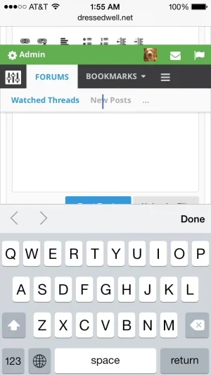
I've looked, but I can't seem to find where to do this... Unfamiliar with xF template editing after being away from it for so long.
Any help would be appreciated

Thanks!
Well, not something that has to do with UI.X but will help you anyways. Find (in the templates) node_forum_level_2 (and maybe other levels as well you might want this applied to).
Find:
Code:
<span class="nodeIcon" title="{xen:if $forum.hasNew, '{xen:phrase unread_messages}', ''}"></span>
Wrap that in an anchor:
Code:
<a href="{xen:link path/to/page}">span node icon code here</a>
Also, logo block height has increased massively in size. Too much padding above and below logo and above user bar. Waste of space, especially on mobile. How can I fix?
View attachment 74389
Right, so this was done to allow easily rearranging of userbar/navigation/logoblock/anything else you want to add. You will want to manually remove the margin for your custom style henceforth. I'd make a setting for it but I don't quite know what good it would do. We'll see.
For now, since you have the userbar (modbar) above the logoblock...
Code:
#userBar {margin-bottom: 0;}
#logoBlock {margin-top: 0; margin-bottom: 0;}
For me, I think the easiest solution would be to move the bookmarks link to the nav bar side. Now that I know its causing all the probems...
Gotta love Syndol baking all those options in.
Right, so its just a clash between plugin and theme. These happen, no ones fault really. You can either ask the plugin or theme designer for assistance. And like I said my suggestion was make the bookmarks link an icon OR as you say there is a setting in the plugin which works fine as well

Thanks!
Another couple of problems!
Search logo now overlaps text?
View attachment 74404
I was unable to reproduce this if you create a ticket at audentio.com with link to your site Ill see if its a bug.
Quick question. On mobile, the sticky navigation does not move until the brasiers scroll has stopped, as opposed to the 'live' scroll on PC. Can this be changed? Feels 'clunky' on mobile with sticky nav.
The code is the same desktop or mobile. The reason for the delay is because this way users cannot 'bug out' the navigation. I know what you mean about it being slower, but really it has to do with how fast your phone processes javascript I imagine, so you'll likely see mixed results. If the navigation instantly turned into the navbar, as it was BEFORE 2 updates ago, people complained about performance. So you can have perfectly smooth or performance

. The code is good, I rewrote it twice.
How do I make the green moderation toolbar and the black navigation bar stick to the top of the pane even when scrolled all the way up. I dont want that space around it and the rounded corners.
Have you tried page style 1? AKA covered style? This is a quick fix for what you want. but if you do not want covered style you just need to remove the margins on the userbar and logoblock as seen above (similar code, not the same, is needed). The rounding and such will be automatically done for you.
Just upgraded to 1.3.2.0 and the green back to top floating thing is really hit and miss. It seems to come and go as it pleases, and if you do manage to catch it and don't click quickly it disappears.
It's more reliable on Firefox but is a real pain on Chrome. I've only seen it a couple of times on my iPad so far, and it faded in then out after a few seconds....
Hmm, Im sorry. I definitely know it was buggy in the last version, but the most recent version I just release I thought it was perfect. Ill take a look.
How can I remove the space between the user bar and the nav bar?
I want to have visual synergy of having them stuck to the top even when at the top of the page.
What i mean by this is when you scroll down they are right on top of each other stuck to the top.
I want that all the time.
See the top of this post.
How do I change the node list background color?
Everything I have tried has resulted in nothing!
I tweaked every single little detail of the style but cannot for the life of me clear this white from the background of the node list.
It's supposed to be a transparent black but for some reason there is white behind it which ruins the look.
Right, so, to get the styler to work with the icons, we needed a mask (I could use something like fontAwesome, which I might do in the future). The simplest solution is to just change the image in Style Properties > Node Icons. So a bit of a pain, but it was the best way I knew of aside from using the arguably overused fontAwesome as the node icons. Too much FontAwesome gets annoying.
Anyways, if you get stuck changing the icons out let me know and Ill see if I can help some more.


