@Mike Creuzer: First, thank you (and the team) for the improvements. Some are pretty slick. At some places I had to revert my custom fixes, as they are implemented now.
Here are
two three bugs I found so far:
1) The Sidebar Toggle is still there if in responsive mode (sidebar under main container). Was this intentional? I found no option to adjust that. So I came up with:
@media (max-width:maxResponsiveWidth) {
.uix_breadCrumb_toggleList { display: none; }
}
The only intention I can imagine was to have the chance to get the sidebar back if you toggled it off on desktop and later return to the forum on a mobile device. But that produces an ugly kilometer long gap if you toggle the sidebar off in responsive mode. Furthermore, clicking it again to toggle the sidebar back, does not work too.... Suggestion: Reset the last toggle state every time the page is loaded in responsive mode. That will always show the sidebar underneath the main content no matter how the last state was and hide the switch in responsive.
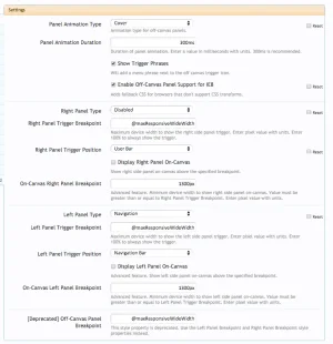
2) OffCanvasPanels: Visitor Navigation Alerts Tab: The links "Alerts", "Alert Preferences" and "Show all..." are not working (are dead although href links seem to be ok).
EDIT:
3) Visitor OffCanvas Panel z-index: If elements on the canvas near the page edge have a css box-shadow and you activate the off canvas menu on the right hand side, the shadow casts onto the off canvas menu. Changing the z-index of the OffCanvas menu breaks the functionality of the sliding effect. Is there a workaround?


