Here at XenForo, we like to take controls that are infrequently used and tuck them neatly away so they don't get in the way of everyday browsing.
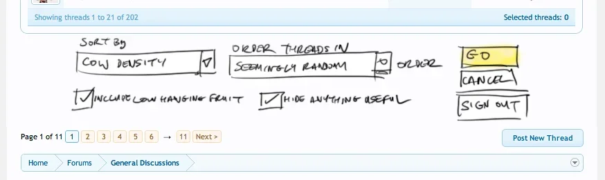
One example of this is the thread list display options, which could be presented as a big fat hairy form stuffed right under the thread list, or it could be gently placed inside a friendly little tab, ready to pop out whenever you need it.
We chose the latter.
One example of this is the thread list display options, which could be presented as a big fat hairy form stuffed right under the thread list, or it could be gently placed inside a friendly little tab, ready to pop out whenever you need it.
We chose the latter.


")
") , but it is horribly big and fat indeed and most of my users (including myself) will never ever look at that section! So then why o why present it in such an in-your-face way? I adore the simplicity and cleanliness of xenForo. Sorry to repeat myself and others, but this is litterally a breath of fresh air. Keep up this fantastic work on this refreshing user interface! vBulletin (and Invision) can take notice.
, but it is horribly big and fat indeed and most of my users (including myself) will never ever look at that section! So then why o why present it in such an in-your-face way? I adore the simplicity and cleanliness of xenForo. Sorry to repeat myself and others, but this is litterally a breath of fresh air. Keep up this fantastic work on this refreshing user interface! vBulletin (and Invision) can take notice.