XF 1.0 Thread List Display Options

Here at XenForo, we like to take controls that are infrequently used and tuck them neatly away so they don't get in the way of everyday browsing.

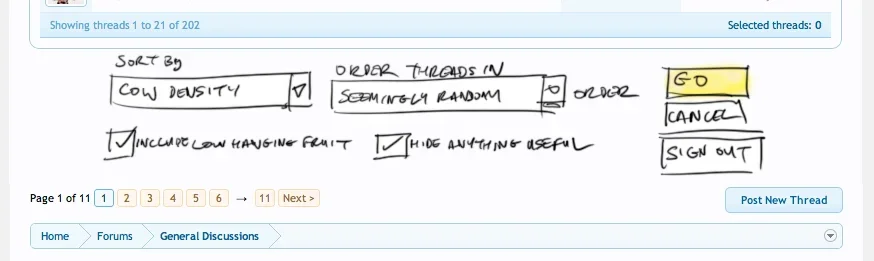
One example of this is the thread list display options, which could be presented as a big fat hairy form stuffed right under the thread list, or it could be gently placed inside a friendly little tab, ready to pop out whenever you need it.

We chose the latter.
 

Attachments

  • fat-hairy-form.webp
    fat-hairy-form.webp
    18.2 KB · Views: 1,639
  • tab-closed.webp
    tab-closed.webp
    5.8 KB · Views: 1,128
  • tab-open.webp
    tab-open.webp
    12.2 KB · Views: 686
Sorry, but I much rather prefer the "big fat hairy form" as it is more visible and therefore will be used more. If you hide everything away then most general users wont even know that it exists. This feature is most successful in vB.org where it is put in a highly visible position on top of the page. Hiding everything away neatly may make the page appear more minimalistic and artistic but does not add to the usefulness of the software.

It would probably be quite easy to change it so it is expanded/shown by default instead of hidden by default, if that's what you want. I like it the way it is.
 
I believe the reason it's hidden is because it wasn't really used much. Out of the people I know, only a small amount actually used those options including myself, and that was extremely rare.


^^ Even I did not use those options until I saw them placed prominently on the top in vB.org where I found it most useful for sorting out threads. Infact I made a much more uglier variation of that on one of my forums. you can see it here http://www.erodov.com/forums/bazaar/classifieds-sale/ basically what I did is to put up a huge and highly visible image map on the top which will sort out the threads by thread prefixes for you. It looks really ugly but it is a highly used feature there and it helped out a lot of people quickly find what they are looking for.
 
I see my username in one of the screenshots! ;)

Anyway, a very nice implementation indeed. I prefer the fact that things are hidden and they're only there if you need them. Having things there all the time may seem practical, but in the compormise of design. However, the way you've done this, both practicality and design are there; as we still know what it is and we know that if we want it, we simply click it.

Good job guys!
 
It is much better like this. Seeing how this site runs has made me rethink my site. My site is way to cluttered after visiting here. I have to rethink the way I display things now lol
 
This is beautiful! I also never quite liked the way vB implemented this feature, so this stroke of brilliance is a welcome sight.
 
An advantage about it, is that Admins should be able to easily place/move what-ever they want within the Thread-List Display area as the ground-work is already in place.
 
Why not just have the user click to sort on the top like on forumdisplay and then have a "Save this view (x) for all forums" link.
 
The thread display was the first thing I recognised and appreciated as being clean and clutter free. On other forum software (key legends, dropdown boxes, and mod options etc) this was my least favouraite area. Here it's up there with my top fav area that have been vastly improved. Obviously, newcomers to forum software won't fully appreciate how great the thread display layout is. Excellent stuff. :thumbsup:
 
Sorry, but I much rather prefer the "big fat hairy form" as it is more visible and therefore will be used more. If you hide everything away then most general users wont even know that it exists. This feature is most successful in vB.org where it is put in a highly visible position on top of the page. Hiding everything away neatly may make the page appear more minimalistic and artistic but does not add to the usefulness of the software.

I'm sure this can be changed with a quick template edit. :)
 
Sorry, but I much rather prefer the "big fat hairy form" as it is more visible and therefore will be used more. If you hide everything away then most general users wont even know that it exists. This feature is most successful in vB.org where it is put in a highly visible position on top of the page. Hiding everything away neatly may make the page appear more minimalistic and artistic but does not add to the usefulness of the software.

If someone really wants to order the posts in a forum they will find a way.
 
I like the sleekness and cleaner result. But, I can also see this becoming an overlooked feature if it's 'hidden' like it is.

I like having the option though :D
 
Top Bottom