You are using an out of date browser. It may not display this or other websites correctly.
You should upgrade or use an alternative browser.
You should upgrade or use an alternative browser.
UI.X 1.5.22.0
No permission to download
- Thread starter Dad.
- Start date
As I'm playing around with the style I become to like it more and more, really neat style. As for the XenPorta issues, it seems that the sidebar on the left is the problem. When you chance that, the block pushing problem disappears. It needs some css tweaks though. Can you help me with that @Audentio?
Thanks.
Thanks.
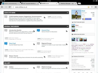
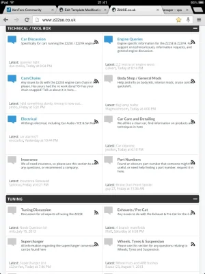
The RSS icon I can probably move next to the last post info so it doesn't go on-top of the node description. Or I can put a padding on the rght.
As for the height, there really isn't any good way to fix this. I recommend using tooltips when using side by side nodes, since the height of the node description is whats making some nodes taller than others. Its important to also note that this isn't a table (as in <table>), its emulating one only by appearance, not any other way. I researched thoroughly doing side by side nodes using display: table. The only way would be to convert it to a table and no one wants that
As for the height, there really isn't any good way to fix this. I recommend using tooltips when using side by side nodes, since the height of the node description is whats making some nodes taller than others. Its important to also note that this isn't a table (as in <table>), its emulating one only by appearance, not any other way. I researched thoroughly doing side by side nodes using display: table. The only way would be to convert it to a table and no one wants that
I have tool tips enabled, but isn't the default behaviour on touch devices to disable them, and add it into the node information area?The RSS icon I can probably move next to the last post info so it doesn't go on-top of the node description. Or I can put a padding on the rght.
As for the height, there really isn't any good way to fix this. I recommend using tooltips when using side by side nodes, since the height of the node description is whats making some nodes taller than others. Its important to also note that this isn't a table (as in <table>), its emulating one only by appearance, not any other way. I researched thoroughly doing side by side nodes using display: table. The only way would be to convert it to a table and no one wants that
It's hidden totally on the iPhone, but visible on the iPad
Just bought it as well. Great work! Love the additional style properties.I'm really enjoying it as well. Some really cleaver touches to make it easier to customise.
Good point. I could add a fixed height to the node and add a scroll bar if it overflows. Ill make it a pretty scroll bar. That sound good? There isn't any obvious solution to this issue, I had already given it some thought.I have tool tips enabled, but isn't the default behaviour on touch devices to disable them, and add it into the node information area?
It's hidden totally on the iPhone, but visible on the iPad
It's not really that much of an issue for me. It was only when I saw the RSS icon covering the description text that I paid a bit more attention and saw it.Good point. I could add a fixed height to the node and add a scroll bar if it overflows. Ill make it a pretty scroll bar. That sound good? There isn't any obvious solution to this issue, I had already given it some thought.
What are other peoples thoughts on the above solution?
It also does it when in desktop view when using tooltips, and it seems to affect ones with longer descriptions, such as this section on my site: http://www.z22se.co.uk/forums/engine-queries.3/


Actually, I can fit it by changing the CSS a bitIt also does it when in desktop view when using tooltips, and it seems to affect ones with longer descriptions, such as this section on my site: http://www.z22se.co.uk/forums/engine-queries.3/
View attachment 54649
From
Rich (BB code):
.node .nodeText {
margin: 10px 270px 10px 56px;
min-height: 40px;
}
To
Rich (BB code):
.node .nodeText {
margin: 10px 270px 10px 50px;
min-height: 40px;
}
EDIT: Scrap that, only works when tooltip is enabled.
All live for me on http://xenmediagallery.com 
All live for me on http://xenmediagallery.com
I prefer the traditional forum view too. Looks awesome on XMG by the way.
Matthew Hawley
Well-known member
I am soooo gonna buy this when I have access to paypal. 
Similar threads
- Replies
- 1
- Views
- 464


