You are using an out of date browser. It may not display this or other websites correctly.
You should upgrade or use an alternative browser.
You should upgrade or use an alternative browser.
Need Customization?
- Thread starter Sheldon
- Start date
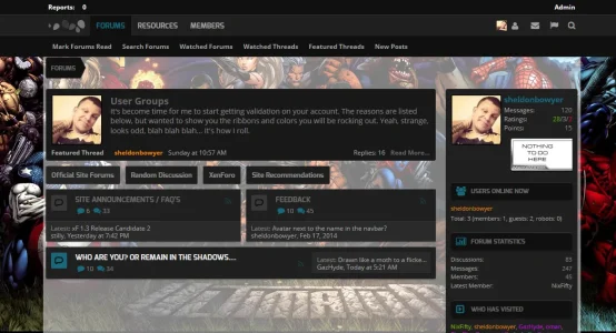
I think the breadcrumb either needs no margin on the left or equal margin on the top (and bottom). It just looks a little off because there's like 1px marign top, 3px margin left, and 10px margin bottom (maybe exaggerated). Other than that, I like it [a lot].
TBDragon
Active member
Debating on building something based off this, or in another direction with it.
Marvel'D
View attachment 68736
wow its really great *-* hope u can share the editing for the background as i want to do the same idea in my forum
I think the breadcrumb either needs no margin on the left or equal margin on the top (and bottom). It just looks a little off because there's like 1px marign top, 3px margin left, and 10px margin bottom (maybe exaggerated). Other than that, I like it [a lot].
That's just a pic where I scrolled up. It isn't like that. Just wanted to get the background/frost look up... and plus, wouldn't be doing this one with Tabs...
Oh alright, well looks good then.
Carlos
Well-known member
Now, that's a skin I'd buy. Looks like you're testing it.Debating on building something based off this, or in another direction with it.
Marvel'D
View attachment 68736
b...bu..buh...buh... bup.... niiiiiiiice.
TBDragon
Active member
wooooooooooooooow this something i like to do in my RM *-*
hope u can share the modification
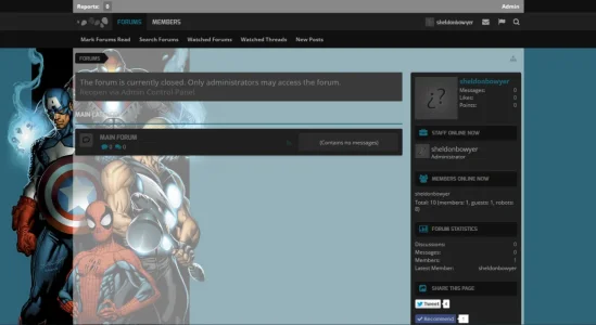
A different background...
View attachment 68744
Just not sure yet what to do with categories, nodes, etc... I'm liking the blue background though.. hah.
The opacity of the index may need to be bumped up a bit. The background is a bit distracting to the eye and draws it to the background and not the index.
The Sandman
Well-known member
It was only a couple of months ago that Admin Extra was "dreamsmashed" (AKA customized by Sheldon) and AdEx 4.0 was created. Apparently the creative juices are still flowing, because Sheldon is now working to create another style for us - AdEx 4.5 - incorporating some ideas that didn't make it into 4.0.
If you have a chance please have a look at this work in progress and let us know what you think. Sheldon needs lots of feedback (both positive and negative comments and suggestions) from many different people in order to fine tune his designs.
If you have a chance please have a look at this work in progress and let us know what you think. Sheldon needs lots of feedback (both positive and negative comments and suggestions) from many different people in order to fine tune his designs.
The Sandman
Well-known member
We're still looking for comments and suggestions on Admin Extra as Sheldon continues to work on AdEx 4.5. If you visit the site make sure you hit the Style Chooser as 4.5 is not currently the default style. 
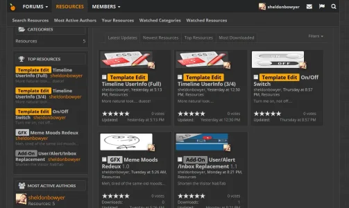
wooooooooooooooow this something i like to do in my RM *-*
hope u can share the modification
It is now available... not much support on it, still a WIP....
http://xenadmins.com/resources/resource-manager-new-look.45/
TBDragon
Active member
np i will try to make some edit also and help with some ideasIt is now available... not much support on it, still a WIP....
http://xenadmins.com/resources/resource-manager-new-look.45/
also i give u some comment in ur forum but u didnt say any thing about them hope u read them and comment if u have some time
TBDragon
Active member
look great
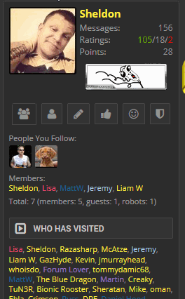
is it possible to share the code for the icon
as i have something similer in mind
small icon once user hover the mouse on it its display a small msg and when he/she click on the icon will open a url for him/her
<<< i wana put the request in ur site but its not working now for me i will try later =(
Similar threads
- Replies
- 1
- Views
- 2K
- Replies
- 1
- Views
- 366
- Replies
- 4
- Views
- 2K
- Replies
- 1
- Views
- 643
- Replies
- 1
- Views
- 1K


