You are using an out of date browser. It may not display this or other websites correctly.
You should upgrade or use an alternative browser.
You should upgrade or use an alternative browser.
Need Customization?
- Thread starter Sheldon
- Start date
@Sheldon, you are getting quite a set of skills there. Keep up the fantastic work!
Thanks Tracy.
You could have used these to choose your logo of choice.... having them displayed in your Visitor Panel, footer, wherever...

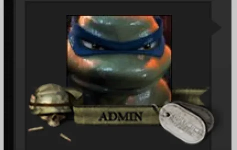
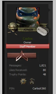
Better placement/design for "staff" ribbons. Admin/Mod/Recruit/ VIP, etc...
View attachment 60042
View attachment 60041
*cough* finish my style *cough*
Better placement/design for "staff" ribbons. Admin/Mod/Recruit/ VIP, etc...
View attachment 60042
View attachment 60041
Sod @Shelley 's style, come and add some more funkiness to DJ LOL*cough* finish my style *cough*
Seriously though, those ribbons look amazing.
MichaelDance
Well-known member
Two young ladies fighting over you bud haha 
Carlos
Well-known member
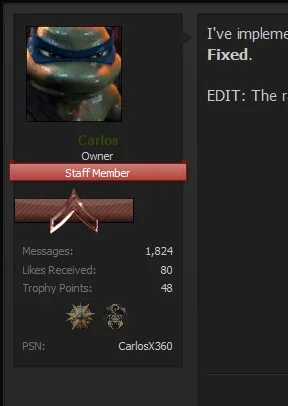
I'm flattered I was your test subject!Extremely bored this morning while my son plays PS3, so @Carlos you got to be a test subject...
I NEED these images. I'd LOVE to use these for advertising purposes.
That looks fantastic. I'd love to use that as the site's main logo. Especially 4 & 5.
Yeah, it would, but I don't really know how to pull that off without breaking the site in some way. But I could allocate at least 2 different logos since there's forum view, and responsive view. Check the site on your phone to see what I mean.Would have been cool to allow members to select their own based on preference.
I was looking for a nice "digital" looking logo... I could... I could never do what you have done in your bored-@$$ time!
May I have these? Please @Sheldon, please? *Prays and gives a face*
Would that require a mod? Do you know how to accomplish this? I approve of this.Better placement/design for "staff" ribbons. Admin/Mod/Recruit/ VIP, etc...
View attachment 60042
View attachment 60041
Also, just a note: If I widen the actual "userblock" it'll look ugly. I tried it during the whole "add user ranks" thing the other day. How it looks? It looks like it's merged into the actual post...
Last edited:
Check the site on your phone to see what I mean.
I am fully aware of what responsive it. You don't need two logos for that. You change your setting so that your main logo shrinks down with the size of the screen.
Also, just a note: If I widen the actual "userblock" it'll look ugly. I tried it during the whole "add user ranks" thing the other day. How it looks? It looks like it's merged into the actual post...
No it doesn't look ugly. You change the message content margin to offset the width you made the message user info. I have changed that area many times. Simple procedure.
Last edited:
Carlos
Well-known member
You're right. I don't need to have two logos, but it was an experiment I did.I am fully aware of what responsive it. You don't need two logos for that. You change your setting so that your main logo shrinks down with the size of the screen.
That's not what I meant.No it doesn't look ugly. You change the message content margin to offset the width you made the message user info. I have changed that area many times. Simple procedure.
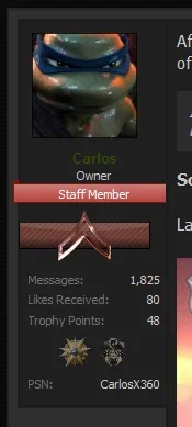
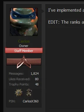
View attachment 60097 View attachment 60098
When I enlarged the userblock potbit, the right side of that box... Looked like it's glued to the actual message box. That's what I was saying.
I realize I can just change the avatar size to conform to the edited width for the userblock - I've seen it done for a few sites, like your old PlaySt4tion site.
Carlos
Well-known member
Holy Double Post, Batman! 

Precisely what I said.Can you not see your avatar is still too the left and the red ribbon is much larger? Same spots, postbit and message margin changed only. ...
Carlos
Well-known member
Carlos
Well-known member
I wouldn't know where to edit that.And in real time you didn't change the message left margin like I said in my first post.
No it doesn't look ugly. You change the message content margin to offset the width you made the message user info.
Similar threads
- Replies
- 1
- Views
- 2K
- Replies
- 1
- Views
- 366
- Replies
- 4
- Views
- 2K
- Replies
- 1
- Views
- 643
- Replies
- 1
- Views
- 1K
