[Suggestion] Concise - or LESS SCARY - forum list

Stuart Wright

Well-known member
Back when AVForums was a small forum, I distinctly remember visiting our American cousin AVSForum and being utterly intimidated by the sheer number of forums on the forum list.

WHOA! A huge long list of forums and subforums. It was overwhelming.
Now I know xenForo presents forums in a clearer, more friendly way than vB, but I still want to give new visitors a more friendly, easier to navigate presentation of the forums, AND give regulars the option of reverting to the standard view.
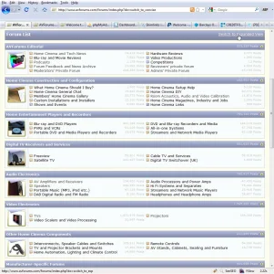
We paid for a modification to the style of the forum list on AVForums to, by default, show people a concise version of the forum list:
1.webp

I think this is much more user friendly when you have a huge list of forums.
At the top is a link to change to the Expanded View. This is a cookie based setting.
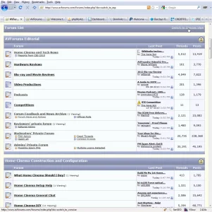
Our expanded forum view is basically the same as all other vBulletin forums:
2.webp

except it offers the choice to switch the the Concise View at the top.
You can have a play with this setting yourself at www.AVForums.com/forums/
The problem with our solution is that the Concise View performs the same, mostly unnecessary database queries as the expanded view.
A proper concise view of the forum list, making only the necessary queries and shown by default would be less scary for new visitors, and much more efficient while showing Google all the information it needs and less information it doesn't need (last poster stuff etc.)
If you agree this is a useful option, please Like this post.
Thank you.
 
Upvote 12
Perhaps if this was a switchable option it'd be nice to have.

For our forums I personally like the latest post to be displaying on forum home, but I can understand why larger forums would need the cleaner layout.
 
Yep I do like this if a site has a huge # of forums. I always hated that looooooong scroll down the page.
 
Yep I do like this if a site has a huge # of forums. I always hated that looooooong scroll down the page.
It's, as you say, the loooong scroll which I think really is a problem. If there is a way to present people with all the categories on one page or in a shorter scroll then I think it's much easier to absorb the structure of the forums and therefore decide where you need to navigate to.
But I also think that the latest discussion information as displayed on xF at the moment is really not of interest for people new to the forums, so let's dispense with that and the nice but large left-hand-side forum status graphics and 'concensify' (as Bush would put it), the whole forum list.
I know Kier and Mike will say that this would be easy with template edits, but I think we could cut down on queries also if we dispense with the latest discussion info, and we need the cookie based option to switch between the two views, so it's probably a little more complex than a simple template edit.
 
IMO - not needed

1)__ You are probably the only one with that many forums (just teasing); I'm aware that there are others like you but the number is very small.

2)__ Usability still suffers as the fonts are too small to read (build for your target-audience - the older they are the worse their vision gets)
2)__ XF provides it's users' the Quick Navigation Menu (utilize it's functions to create similar option)


Do you have a percentage of how many people who use this option?
Actually I don't think it takes much to have a forum where people have to scroll down to see the whole forum list, but you are right that the number of forums with pages and pages is relatively small. Having said that I hope that Mike and Kier intend for xenForo to be the software of choice for big forums because it is they who have the biggest influence on what other forum owners choose. In my opinion.

Font size is easily adjustable.

The forum list is the most accessed page of a forum. It needs to be perfect. For that reason, I think extra options need to be there for admin who need them.
With regard to the number of people who use the expanded vs the concise, I would expect the vast majority of regular forum users choose to use the traditional (expanded) forum list. That is my intention.
But those people who are new to the site benefit from having the concise overview of the forum list the first time it is displayed so that they are less likely to be intimidated by the sheer quantity of text and are less likely to be phased by 'choice overload'.

This is why I considered this change to be so important that I was prepared to pay for it. I won't mind paying for it for xenForo either, because my forum will look better and more unique than everyone else's. But my helpful nature compels me to suggest it as a standard feature because it solves so many problems.
 
I am not understanding, I seem to be having an off day.

Forgetting all about xf for the moment: In vb3, there are categories which can be clicked on to expand/collapse the forums under them. Could not people use that to hide/unhide various areas of your forum?
 
I am not understanding, I seem to be having an off day.

Forgetting all about xf for the moment: In vb3, there are categories which can be clicked on to expand/collapse the forums under them. Could not people use that to hide/unhide various areas of your forum?
Yes but by default you want those categories expanded so people can get an idea of what forums are in them, at least.
 
Yes but by default you want those categories expanded so people can get an idea of what forums are in them, at least.
I just checked out your forum (again), you should be extremely proud, very nice!

The video electronics category has TVs/Video scalers/projectors when collapsed, and many more subforums show up when they are expanded. In addition, it retains the ability to collapse the category other vb forums do.

If you retained just the collapsed view of the video electronics category you have now, then had a xf type drop down subcategories, how do you think that would affect the UI in that area?

Right now when I click on the video electronics category I enter into, and see, all subcategories (I think).
 
I actually don't like the way subforums are handled on xenForo. It's the only thing about xenForo which I don't think looks right.
The concise and expanded views of the forums are intended to exist together. The concise view doesn't need additional drop-down menus or references to the deeper sub forums. The idea of the concise menu is to give people a gentle introduction to the categories and top level forums therein.
Once people have become familiar with the forums, they have the option of switching tot he expanded view for the forum list.
Remember this is only for the forum list. When you open a category or a forum with sub forums, the display of those forums remains expanded like it is normally.
 
I actually don't like the way subforums are handled on xenForo. It's the only thing about xenForo which I don't think looks right.

With this, I completely agree:

3 forum home points that could be re-examined

I have 3 instances where I think the outstanding interface of XenForo could be different/re-examined. And they all have to do with forumoverview:

* Forum descriptions only show on mouse-over. Making it hard for new users to our platform to see at a glance what the forums are about (Kier stated it can be changed with a very easy template edit)
* Subforums are hidden behind an arrow/dropdown
* Categories can not be unfolded (when you click on a Category in XenForo, nothing happens), see this remark from another discussion about it:

-

I think the whole of XenForo's UI/UX is simply outstanding. It is only the above points (and #1 and #2 are the most important) that I need to change on my own forums if I ever decide to go for XenForo. No problem. But I keep agreeing with everybody who states those points are in the way of the usability if this will be the default style for the UI.
 
Top Bottom