Header background image or the logo itself?Thanks! That worked.
Now I cannot figure out how to change logo. I search "logo URL" in admin search but it doesn't show anywhere now where I can change logo
You are using an out of date browser. It may not display this or other websites correctly.
You should upgrade or use an alternative browser.
You should upgrade or use an alternative browser.
Shades of Grey v2.2.10
No permission to download
- Thread starter Gator
- Start date
Resolute
Active member
LogoHeader background image or the logo itself?
In the upper right side of the ACP, type "logo"Logo
or, go here and upload the image:

Thank you, sir. It's always nice to hear.@Gator I have to say, this is a nice style xml. Simple, effective and clearly stands the test of time. was set up almost 5 years ago and I still love it.
Congrats
Very nice theme, I do have a question though (hopefully not a silly one and not too much trouble to explain):
In my old xenforo board (1.x) I could easily go to the Default Style Dark templates, select the ad_sidebar_bottom (or any other of the ad_* templates) and drop ad scripts there. Is there any way to do that with this theme?
I scrolled through the list and I don't see any ad_* type templates. Totally understandable of course if this just isn't possible w/this free theme, but I figured it didn't hurt to ask.
This would be a question better answered hereVery nice theme, I do have a question though (hopefully not a silly one and not too much trouble to explain):
In my old xenforo board (1.x) I could easily go to the Default Style Dark templates, select the ad_sidebar_bottom (or any other of the ad_* templates) and drop ad scripts there. Is there any way to do that with this theme?
I scrolled through the list and I don't see any ad_* type templates. Totally understandable of course if this just isn't possible w/this free theme, but I figured it didn't hurt to ask.
Gator updated Shades of Grey with a new update entry:
Shade of Grey 2.2.8 Update
Read the rest of this update entry...
Shade of Grey 2.2.8 Update
Nothing earth-shattering here, just a few adjustments and enhancements. I hope everyone had a nice holiday.
- Fixed an issue with the uFurl sizing on mobile. I also made it slightly larger (as seen below)
- View attachment 263454
- Changed the hover color on some elements to be more uniform
- Changed the border on some button elements
- Changed the color of the scrollbar so it stands out more
Read the rest of this update entry...
.png")
I am trying to darken up these tabs to straight black because on the default Xenforo theme these tabs are darker and right now they blend too much into the lower bar.
.png")
So the grey tabs in the first picture for me should be straight black which is darker than my background (poor picture)
Does anyone have an idea how to change these tabs to black on the shades of grey theme?
At this point I have not been able to change the colour of those tabs.
You can see my edited version of shades of grey in use at https://namepost.com
When making a dark theme, what was once dark is now light, and vice versa. However, please change it to whatever you think makes it look good to you. I personally don't like styles that are black, hence why I made this one. Shades of Grey is designed to be subdued in a way that makes it easier on the eyes.View attachment 264095
I am trying to darken up these tabs to straight black because on the default Xenforo theme these tabs are darker and right now they blend too much into the lower bar.
View attachment 264096
So the grey tabs in the first picture for me should be straight black which is darker than my background (poor picture)
Does anyone have an idea how to change these tabs to black on the shades of grey theme?
At this point I have not been able to change the colour of those tabs.
You can see my edited version of shades of grey in use at https://namepost.com

The tab color location you inquired about is located here:

When making a dark theme, what was once dark is now light, and vice versa. However, please change it to whatever you think makes it look good to you. I personally don't like styles that are black, hence why I made this one. Shades of Grey is designed to be subdued in a way that makes it easier on the eyes.
I absolutely love your theme and gave you a 5 star review, it's simple and to the point.
I agree with you that shades of grey are better than black but in this case I just thought that particular element strayed from the origional Xenforo theme because there the tabs are a bit darker than the background in that section.
Thank you so much for your help in locating that setting, I am very pleased with the outcome.
Before and after
 (1).webp")
.webp")
Last edited:
Has anyone made a change to enhance this skin?
I find newer posts harder to see
I find newer posts harder to see
Has anyone made a change to enhance this skin?
I find newer posts harder to see
That is next on my list to do and yes I saw that too.
The difference between new and read posts in the title is a bit difficult to read and I struggle with it unless I put on my glasses.
It's an easy enough tweak in your setting though.
Has anyone made a change to enhance this skin?
I find newer posts harder to see
Could you be more specific? Show me an example
That is next on my list to do and yes I saw that too.
The difference between new and read posts in the title is a bit difficult to read and I struggle with it unless I put on my glasses.
It's an easy enough tweak in your setting though.
Please show me an example of this. I don't know what you are seeing
So the posts go:Could you be more specific? Show me an example
Unread
Unread
Read
Unread
But as you can see it's hard to notice the difference.
Attachments
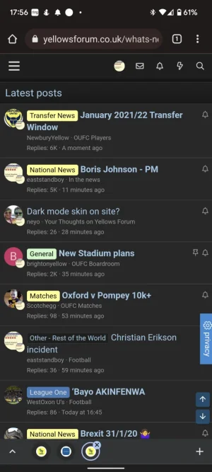
So the posts go:
Unread
Unread
Read
Unread
But as you can see it's hard to notice the difference.
Yes exactly that, seems to be harder for me on mobile.
Mind you if you know what to look for its easy, the newbies struggle until they know bold to non bold. Its just that on a dark skin its a bit harder to see than on a lighter skin but I played with it and I was not able to improve it unless you switch color but that messes things up.
I decided to leave it as is.
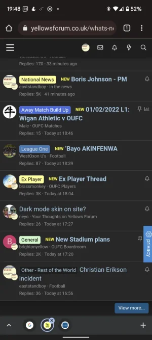
Gotcha. I will make a change to the style to make it easier to distinguish the "unread" from the "read". For now, if you want to at least change the "unread" bubble icon color, you can change it here.So the posts go:
Unread
Unread
Read
Unread
But as you can see it's hard to notice the difference.

Ok thanks, can we replicate the style change you make?Gotcha. I will make a change to the style to make it easier to distinguish the "unread" from the "read". For now, if you want to at least change the "unread" bubble icon color, you can change it here.
View attachment 264148
What happens if we make changes then install an update you provide? Are all the changes undone?
I added this to extra.less, much better
.structItem.is-unread .structItem-title a:not(.labelLink)::before {
content: "NEW";
display: inline-block;
background:xf-uix_primaryColor;
padding: 1px 4px;
font-size: 11px;
color: #FF0;
border-radius: 3px;
margin-left: 5px;
position: relative;
top: -2px;
}
.structItem.is-unread .structItem-title a:not(.labelLink)::before {
content: "NEW";
display: inline-block;
background:xf-uix_primaryColor;
padding: 1px 4px;
font-size: 11px;
color: #FF0;
border-radius: 3px;
margin-left: 5px;
position: relative;
top: -2px;
}
Attachments
Similar threads
- Replies
- 1
- Views
- 361