CONTENGHT - Your Art Designation

Serpius

Active member
Finally!!

After many months of designing the website, CONTENGHT IS NOW OPEN!!

Go to CONTENGHT and register!

Are you an art student?
Are you a person who loves to create artwork?
Are you an art connoisseur?

CONTENGHT is the place for you to go to!

Creators (artists) can sell their creations/products through Contenght! You do not have to worry about setting up your own website to sell your creations/products!

Come out and check out CONTENGHT!

CONTENGHT does have two main groups on the website.

Creators - For artists who make their own creations/products.

Viewers - For non-artists who are in some way involved in the art world.

Come to CONTENGHT and start enjoying the benefits of being involved in the art world!
 
Hello, I find it a bit easy to get lost in different parts of the site in my opinion, by clicking on the internal links we do not know where we are. On a forum? on a media list?

Otherwise why did you put this purple veil on all the images of galleries, forums and home page ? It's a bit redundant and aggressive for the eyes, and then it's a very cleavage color, we like or we do not like but it is not trivial.

But clearly we see that there has been a lot of work, congratulations.

The Purple/Blue color scheme is the official color of CONTENGHT.

After looking at different color schemes, this is the color scheme that was picked out. That color scheme worked best in both light and dark themes.
Right now, CONTENGHT is on light theme. We will have a dark theme in the near future, but no definite timetable has been set.

We put out the color scheme to each major section of the website, Forums, Marketplace, Media, and so on. We were attempting to get those main sections to be close to as seamless as possible when you click on each section.

Regarding the navigation of the website, it should be clear as to which webpage you landed on.
Maybe you can give a few examples of what you mean by "easy to get lost" so that we can see exactly what you are referring to.
 
Personally I find it a bit risky to use only one color scheme throughout the site (knowing that you are speaking to artists who are inherently all different and who have a color expert eye).
A different color for each area of the site would help to locate a little better.

You know it's a hard resentment to explain, when you arrive on a new site sometimes you feel immediately comfortable in navigation, everything is intuitive, you do not know the site but you walk there always knowing where you are. On yours I felt pretty quickly "lost." But it's a personal feeling, wait for other opinions that may contradict mine. I give you my first impression when visiting your site, that's all.

One of the issues of using multiple color schemes is that it would have increased the cost of designing the website.

Using different color schemes for each major section of the website potentially could cause confusion for some people.
If the main landing page was in the Purple/Blue scheme, then you jump to the Media section which has the Black/Gold scheme, users might wonder if they are still on the same website. If the user is asking themselves, "Am I on the same website?", that would be a major red flag, something that we want to avoid.

Did you register on the website?

You might view the website differently if you are registered.

I don't see yours on the user list.
 
Did you register on the website?
You might view the website differently if you are registered.
For visitors to register they have to like it... You can't tell them you'll like it if you register :)

But don't worry about my opinion, i'm not a web designer so my opinion doesn't have much value, it's not like I created mozilla.org! Site that I find absolutely perfect! (and there's purple on their site!)

Good luck and congratulations for the work (y)
 
I think a site called CONTENGHT should have some real content before anybody else should join. Between random test images and the broken styles switcher this looks closer to a development site than a ready community. Maybe you can start by posting about the thoughts you put into the design and go from there.
 
I think a site called CONTENGHT should have some real content before anybody else should join. Between random test images and the broken styles switcher this looks closer to a development site than a ready community. Maybe you can start by posting about the thoughts you put into the design and go from there.

All brand new websites have to start somewhere.

The content you are referring to was mainly for testing purposes. Those will be phased out over time.

What do you mean by 'broken styles switcher'? There is only ONE theme on CONTENGHT at this time.

As I mentioned in my reply to @nicodak, the dark theme will come later. There will only be 2 themes in CONTENGHT.
 
All brand new websites have to start somewhere.
Is it a "brand new website" or one that has been "many months in designing the website?" We are giving you feedback based on how you've worded the post and what now shows on the site, and the two don't add up.

What do you mean by 'broken styles switcher'? There is only ONE theme on CONTENGHT at this time.
The styles switcher allows me to switch to a couple of test styles you probably don't want your visitors to see.
 
Is it a "brand new website" or one that has been "many months in designing the website?" We are giving you feedback based on how you've worded the post and what now shows on the site, and the two don't add up.


The styles switcher allows me to switch to a couple of test styles you probably don't want your visitors to see.

It's many months in creating/designing/coding the brand new website. I fail to see what part(s) do not add up.

The issue with the styles switcher will be fixed shortly. Styles switcher is now fixed.
 
Hello again,

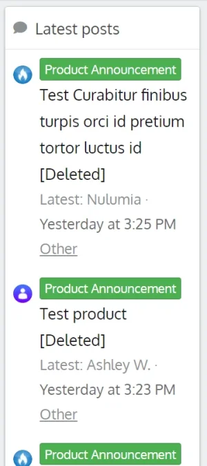
You should hard-delete threads... It's not very professionnal for visitors to see test threads

Capture d’écran 2020-10-19 120946.webp

Also, as a visitor, i can see some admin options in media categories, you should hide them.

Capture d’écran 2020-10-19 120806.webp

Finally, the link in the footer to the forums does not refer to the home page of the forums but brings the actual page back to the header
https://contenght.com/#

Back to work! 💪
 
For visitors to register they have to like it... You can't tell them you'll like it if you register :)

You have the wrong idea.

I am NOT forcing anyone to LIKE my website BEFORE they register.
There's no popup window stating that you must like the website before you can register. Not on my website.

Yes, I have seen it on other websites before and if I saw that popup window on that website, I skip that website and move elsewhere.

What I am saying that you will see MORE of the website AFTER you register, then you may have a different opinion.
But then... you may not change your opinion. I don't know.

That's why I asked you if you had registered or not.
 
Hello again,

You should hard-delete threads... It's not very professionnal for visitors to see test threads

View attachment 237923

Also, as a visitor, i can see some admin options in media categories, you should hide them.

View attachment 237924

Finally, the link in the footer to the forums does not refer to the home page of the forums but brings the actual page back to the header
https://contenght.com/#

Back to work! 💪

Test messages have been deleted.

Regarding the usergroup permissions, a lot of the user permissions were re-done yesterday prior to opening up the website, but a few permissions did not stick for some reason.

This is being worked on and should be updated/fixed later today.

As for the footer links, that will be fixed sometime today.

It's those SMALL details that drive me and the developer crazy! 😝

Thanks for the feedback!
 
I like the overall design, the front page seems unfinished but shows great potential.

May i ask how you acheived the front page? did you use the xenporta addon to bridge with wordpress?

Good luck with your forum, the first year is the hardest then it gets easier!
 
I really like the theme, it is good to see you doing something a bit more bold with you colour choices.
 
I like the overall design, the front page seems unfinished but shows great potential.

May i ask how you acheived the front page? did you use the xenporta addon to bridge with wordpress?

Good luck with your forum, the first year is the hardest then it gets easier!

Thanks for the feedback!

The front page is a custom design. No add-ons were used for the front page.
In fact, literally, every webpage on my website was custom made.
The add-ons we are using were also re-designed to match the overall style/theme of the website.

What do you mean by "the front page seems unfinished"? What gives you that impression?
 
Back
Top Bottom