i just want your logo in the sticky header. that was my suggestion. vs. the word home.sticky header.
You are using an out of date browser. It may not display this or other websites correctly.
You should upgrade or use an alternative browser.
You should upgrade or use an alternative browser.
Is this good UI design ? (example Xenforo.com) - content starts 11 areas down
- Thread starter Digital Doctor
- Start date
-
- Tags
- design user interface xenforo
You can have your site customised.
But the problem is you will find it needs doing again and again each time new major versions come out.
I suggest that you buy one of @Russ themes over at his @Pixel Exit site and ask him to customise it for you
But the problem is you will find it needs doing again and again each time new major versions come out.
I suggest that you buy one of @Russ themes over at his @Pixel Exit site and ask him to customise it for you
my webpage is originally in Turkish. Sometimes mistakes can happen if you are using Google Translate. and theme is responsive. I don't know how left and right sections overlapped the title. If you view the website in mobile or other small screens, sections will be hidden from right to left.I liked your site. When I clicked on the articles section View attachment 303130 , there was a left side bar (I like it) AND a right side bar.
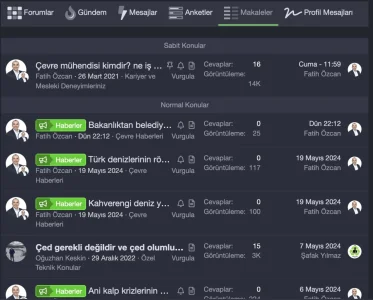
Makes sense.Sometimes mistakes can happen if you are using Google Translate.
The titles are getting truncated WAY TOO SHORT.
to see how it should work
(1) open a new browser window.
(2) go to https://xenforo.com/community/forums/announcements/
(3) click the restore down button
 (middle icon)
(4) drage the window edges of the browser window to make it almost as big as the full screen.
(5) now drag the right edge to make the browser window smaller.
(6) on a good responsive theme, the title should always display in full. your site fails this test.
I got your point. Thank you so much. I will ask for a solution for this from developer.Makes sense.
The titles are getting truncated WAY TOO SHORT.
to see how it should work
(1) open a new browser window.
(2) go to https://xenforo.com/community/forums/announcements/
(3) click the restore down button View attachment 303154 (middle icon)
(4) drage the window edges of the browser window to make it almost as big as the full screen.
(5) now drag the right edge to make the browser window smaller.
(6) on a good responsive theme, the title should always display in full. your site fails this test.
This is true.The problem with XF is that it is developed entirely by developers, with no UI/UX designers on the team. The user experience could be significantly improved if UI/UX designers were involved in the development process.
See invision community v5. Ehren from IPS Focus is lead UIX designer there. He has done really great things, where as XF can improve significantly in this area.
@Digital Doctor must say cunning plan
“As cunning as a fox who’s just been appointed Professor of Cunning at Oxford University?”

“As cunning as a fox who’s just been appointed Professor of Cunning at Oxford University?”
@Digital Doctor
I am curious what you think of Inforge's design, I have personally worked on it for several iterations and think I have arrived at a good compromise between functionality and usability.
Sure there are definitely things that can be improved, for example the forum list which I wanted to deeply modify with the integration of Widgets showing the latest “hot” discussions in the area (Gaming, Hacking, Tech, Development, Fintech and Market).
Inforge is a community that has been going on for more than 10 years, so if you find some smudges it is due to its seniority (you can see the evolution of our style here)
I am curious what you think of Inforge's design, I have personally worked on it for several iterations and think I have arrived at a good compromise between functionality and usability.
Sure there are definitely things that can be improved, for example the forum list which I wanted to deeply modify with the integration of Widgets showing the latest “hot” discussions in the area (Gaming, Hacking, Tech, Development, Fintech and Market).
Inforge is a community that has been going on for more than 10 years, so if you find some smudges it is due to its seniority
I absolutely agree all these can go but more crucially I have got rid of Whats New altogether. New Posts is what my users use the most - I view that as the most important page of all and so I got rid of all that stuff at the top. When I removed it I only got one complaint because somebody missed Latest Activity, but once I put that back under Forums main tab he was happy.Line (6) + Line (9) - this is absolutely duplicate content. It creates a very uninviting wall of text. Change desperately needed.
Line (7) - Home. This is the bread crumb - it's too sparse. Change needed.
Line (8) - What's new - this is the page title. Too sparse. Change needed.
Line (10) - Latest posts - another title. Really feels like overkill. People just want content. Almost no one needs this title to know what it is.
So I think The New posts page is a decent compromise between having reasonably sized header and logo (which I mentioned above) and still having plenty of new content above the fold.
Last edited:
I am using one of @Ozzy47 addon. Second tab is combination of last posts, new threads, likes, profile posts, media etc. I think Xenforo whats new page can evolve by selecting what to show in this page.
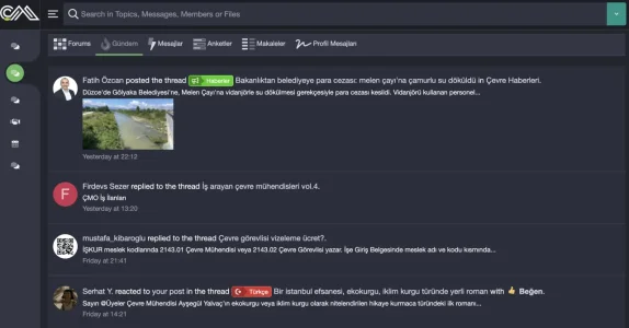
Enhance your forum browsing experience with tabbed content lists
- Painbaker
- ajax loading content tabs customizable tabs dynamic counters forum navigation tabbed lists widget integration
- Add-ons [2.x]

Oo, I do like this. Is it custom to you or built with off-the-rack style/add-ons? Not sure I am up for a redesign now but maybe when the 3.0 upgrade comes and I have to get my styling redone anyhow.So I think The New posts page is a decent compromise between having reasonably sized header and logo (which I mentioned above) and still having plenty of new content above the fold.
As It was mentioned here, some customers like the attractive design with a big header and some shapes around the forum page. We designed and developed this forum and you can find many improved areas but we keep in mind what the customer is looking for.
I think xenForo design is doing well, If you are looking for a better UX you can search for a suitable pre-made or fully customized theme that meets your requirements. however many big forums are using the default xenForo style with some color changes but I see that making your own theme with your ideas is the best solution. xenForo gave you a good base to build up your desired experience.
It's custom. I just did a few template edits to new_posts and new_posts_wrapper and extra.less.Is it custom to you or built with off-the-rack style/add-ons?
D
Deleted member 25216
Guest
My landing page is pretty simple and the content quite accessible (I think) although I do have other sections where you maybe have to click a few more times and the content isn't so visible (articles, recipes, groups etc)
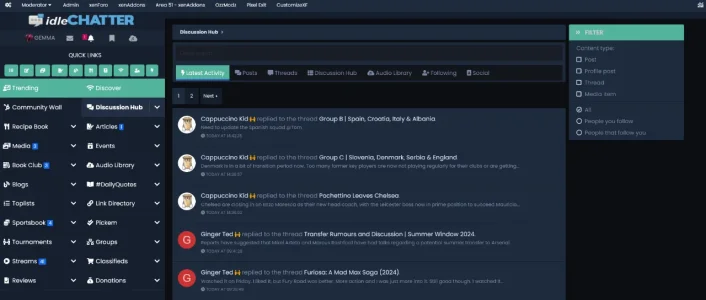
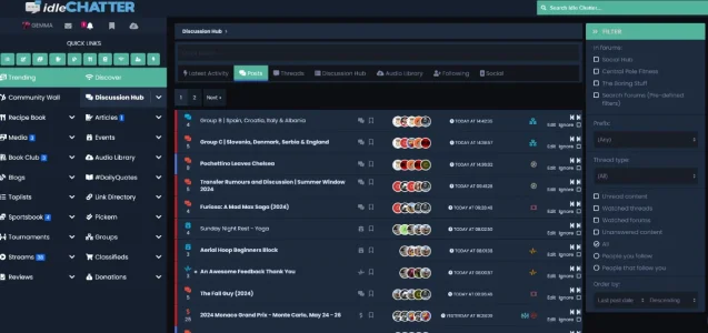
A smaller logo, vertical double column navigation with quick links button to create new content.
I've got content tabs showing the latest activity, latest posts and new threads, profile posts, your news feed, a quick search function and a link to the forum index.
Every site and admin is different - this works for us, other sites may want a big header or more minimalistic approach. I don't think there is any right or wrong, at the end of the day it is what your members are most comfortable with that matters.
I think it depends on what the user wants and the designer. If you can believe this - The header on your screenshot was larger then it i now and I had DohTheme make it smaller because I only use a 14in laptop and it took the entire page up. I do love the design but after using it for a bit I do wish there were a few things different.
Do you mean the same @Ehren as from XenFocus? He is the best at highlighting the important things in designing. From the hierarchy of importance of titles, to the shades and colors, just perfect and relaxing to read.Ehren from IPS
Very true. That is the one. Absolute legend.Do you mean the same @Ehren as from XenFocus? He is the best at highlighting the important things in designing. From the hierarchy of importance of titles, to the shades and colors, just perfect and relaxing to read.


