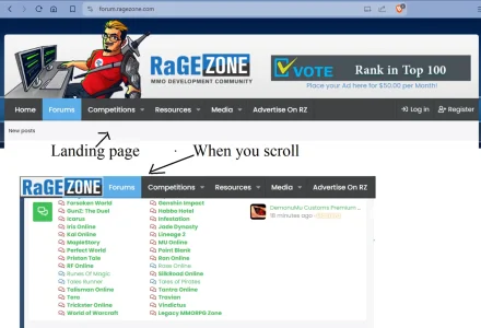
This has been prompted by me using my first wide screen monitor. Most of my monitors are square and have a wide screen monitor in portrait orientation.
I'm also reminded that websites have to deal with opposite situations:
desktop: wide screen
cell phone: tall screen.
Most people use 1 wide screen monitor on the desktop.
The most common resolution is 1920 x 1080.
Which is exactly what I have.
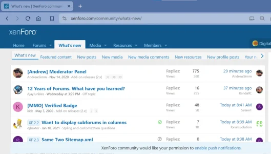
Here is Xenforo.com ... click what's new

Problem 1) browser takes up alot of space.
Roughly 20% of the height of the screen is browser overhead. I could lessen it by removing the bookmarks bar. My wife wouldn't know how to do that.
Websites need browsers so this is hard to change, but it does waste valuable screen real estate.
The browser problem is the first 3 lines (1), (2), (3)
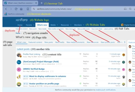
Line (4) is the logo, it looks nice when it's on it's own line. This luxury should stay if possible but major tabs may benefit from being beside the logo.
Line (5) The Tabs: hard to wean Xenforo off Tabs. Especially because each Tab is a product (Forum, Media, Resource).
Line (6) + Line (9) - this is absolutely duplicate content. It creates a very uninviting wall of text. Change desperately needed.
Line (7) - Home. This is the bread crumb - it's too sparse. Change needed.
Line (8) - What's new - this is the page title. Too sparse. Change needed.
Line (10) - Latest posts - another title. Really feels like overkill. People just want content. Almost no one needs this title to know what it is.
Line (11) - The first actual glimpse at content - KEEP IN MIND it's just the title. No full content even.
This really feels like the structure is more important than the content. It just cant be right if the goal is content.
The problem looks worse if my browser is at a zoom on 100%.
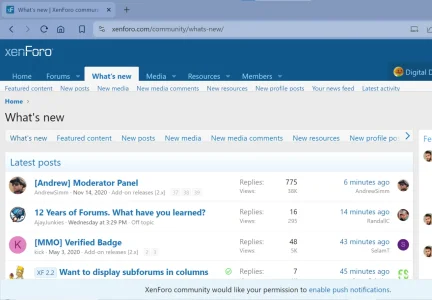
So I get four lines of content TITLES on the first screen ?
It's just not enough.
What's the Future Design of Xenforo ?
How can the content be delivered with less structure ?
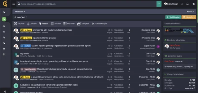
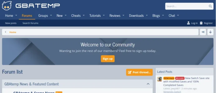
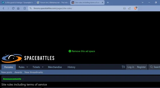
Do other forums do this differently ? How does it impact the end user ?
I'm also reminded that websites have to deal with opposite situations:
desktop: wide screen
cell phone: tall screen.
Most people use 1 wide screen monitor on the desktop.
The most common resolution is 1920 x 1080.
Which is exactly what I have.
Here is Xenforo.com ... click what's new

Problem 1) browser takes up alot of space.
Roughly 20% of the height of the screen is browser overhead. I could lessen it by removing the bookmarks bar. My wife wouldn't know how to do that.
Websites need browsers so this is hard to change, but it does waste valuable screen real estate.
The browser problem is the first 3 lines (1), (2), (3)

Line (4) is the logo, it looks nice when it's on it's own line. This luxury should stay if possible but major tabs may benefit from being beside the logo.
Line (5) The Tabs: hard to wean Xenforo off Tabs. Especially because each Tab is a product (Forum, Media, Resource).
Line (6) + Line (9) - this is absolutely duplicate content. It creates a very uninviting wall of text. Change desperately needed.
Line (7) - Home. This is the bread crumb - it's too sparse. Change needed.
Line (8) - What's new - this is the page title. Too sparse. Change needed.
Line (10) - Latest posts - another title. Really feels like overkill. People just want content. Almost no one needs this title to know what it is.
Line (11) - The first actual glimpse at content - KEEP IN MIND it's just the title. No full content even.
This really feels like the structure is more important than the content. It just cant be right if the goal is content.
The problem looks worse if my browser is at a zoom on 100%.

So I get four lines of content TITLES on the first screen ?
It's just not enough.
What's the Future Design of Xenforo ?
How can the content be delivered with less structure ?
Do other forums do this differently ? How does it impact the end user ?
