XenForo 2.0 Discussion

Status
Not open for further replies.
I find that estimate to be a bit on the high side.

A lot of platforms provide something similar by default without, AFAIK, any way to turn it off. As it happens, it should be possible with CSS (at minimum, at least, if there isn't eventually a way to switch it off).

It's a relatively big change that certainly not every forum will want to implement (or not right away), so a way to disable it (and still get rid of those #"%& gender images that overwrite with every upgrade) should be possible by default.
 
You know that this really should be optional, half the people will want to turn it off most likely.
Most of the social networks have started using this, notice YouTube comments. It's actually quite nice, and you can still promote users to have their own avatars via notices/trophies etc. I don't see why there is a need to complain on something which is an improvement (lesser images loading thanks to the default not being an image now!)

On features, so far we have -
- a navigation control system we don't need. Nodes as Tabs does the navbar beautifully. If XF had put in a navig control system years ago it would have been great. They didn't. I can't see why time is wasted on this when we already have the functionality - free, strong simple interface, well supported.
- widgets - not my passion but I do notice there are lots of addons for this. I see that some are maturely developed and have a good reputation. Is this necessary? Wouldn't it be better to use this energy on the CMS product masses of people have yelled for since XF started?
(Both these features are duplicated effort then)
Some people (like me) prefer not to depend too much on add-ons and rather have features in the core product. Why? Because an add-on can just stop being supported one day, but the feature in the core will not. It is not duplicated effort at all, it's an improvement to the core.
 
  • Like
Reactions: rdn
It's a relatively big change that certainly not every forum will want to implement (or not right away), so a way to disable it (and still get rid of those #"%& gender images that overwrite with every upgrade) should be possible by default.
If you have to overwrite them after every upgrade, you should consider changing the imagePath style property. It is "styles/default" by default, you can change it to another path and copy the desired images into there. If you require support for this, please post in the Styling and Customizations forum.
 
I need to rephrase my question. It this avatar info stored in template so we can use it afterwards like a regular variable for example?
Not really. It's only available in that avatar template method at the moment. This could be posted as a suggestion, but include a more specific usage example.
 
Not really. It's only available in that avatar template method at the moment. This could be posted as a suggestion, but include a more specific usage example.
Done!

Another question, can we invoke LESS functions inside regular templates or it's just limited to CSS templates?
 
Just to be totally clear, users can of course still upload any avatar they like, and there is still Gravatar support.

If users do not upload an image, instead of serving one of the current gender based (or question mark) default images, the default avatar is basically a piece of HTML with a background colour and a slightly darker or lighter text colour, and the text inside the avatar is just a single letter from their name.

You would be able to reintroduce an image avatar yourself, likely with some CSS, or change the appearance of the default letter styling with CSS.

A way to introduce the image avatar yourself would likely involve some CSS which effectively hides the text, and replaces the solid background colour with an image, and position it accordingly.

As for whether we would change the behaviour, a suggestion could be made for consideration; this is just what we've got so far.
Personally I dislike this move and as I'm not a coder and would have to rely on one to do css just to deal with butt ugly avatars is down right a stupid move for 2.0. At least the way it is now if I don't like the default ones I can just upload different ones.
A lot of platforms provide something similar by default without, AFAIK, any way to turn it off. As it happens, it should be possible with CSS (at minimum, at least, if there isn't eventually a way to switch it off).
Which is one of the reasons I did not choose one of those platforms in favor of the XF user friendly platform where more often than not I didn't have to learn code to change simple things.
 
Thank you for the update.

I wonder how the alert animation will work. Currently when you hover over alerts, they are marked as read, and the red balloon disappears from the top. From the screenshot, the alert count appears to the right which would suggest the rectangle becomes narrower and the whole section shifts to the right upon reading the alerts.
 
Are you referring to this screenshot in particular?

xf2-nav_form-png.138997


They are in the correct place, and should be staying there.

It's actually a similar location to where they are in XF1:

View attachment 139131

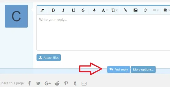
Take the above as an example; if you consider that effectively the labels and the controls are in different columns, the submit buttons are always in the controls column. So it's effectively not actually changed.

That and the quick reply.

I guess my brain just finds the button overlapping a border strange and wrong... I'm sure I'll get used to it ;)

Liam
 
Ah, it was suggested to me earlier that might have been what you were referring to.

It has never occurred to me that it is odd or wrong. Obviously it has been deliberate, but now it has been pointed out to me I can understand why people might come to the conclusion that it's wrong. It's the kind of effect you get when you place a floated element inside a block element that has no fixed height.

It serves as a more subtle indicator of where the footer of a form is vs the alternative which would be extending that footer so the button "fits" within it. Another alternative is super subtle which is similar to what we have now in XF1 which is generally just a very light coloured border, but I think in the wider context it will make sense when you see it in action.
 
If you have to overwrite them after every upgrade, you should consider changing the imagePath style property. It is "styles/default" by default, you can change it to another path and copy the desired images into there. If you require support for this, please post in the Styling and Customizations forum.

Yes, I know, I could change it myself, like a few dozen other things... but some things I remember by heart already now and with XF2 coming up soon(ish), I can wait for that.
 
@Chris D, in regard to the default avatars when a user has no avatar (or has removed theirs), XenForo 2.0 will provide a generic avatar with the first letter of their username instead of the current male, female, and unspecified avatars there are. Is this absolute or flexible? By which I mean if I were to change my username from Amaury to Brownie, would the avatar change to a B?
 
@Chris D, in regard to the default avatars when a user has no avatar (or has removed theirs), XenForo 2.0 will provide a generic avatar with the first letter of their username instead of the current male, female, and unspecified avatars there are. Is this absolute or flexible? By which I mean if I were to change my username from Amaury to Brownie, would the avatar change to a B?
Correct. If the name changes, the avatar changes.
 
It's the kind of effect you get when you place a floated element inside a block element that has no fixed height.

Is floated the word you wanted to use there? :)

Sounds as if the buttons float as you scroll? I can see this being okay in the ACP with a long options list on a page but not so much in say the tread view.
 
Does XF 2 use jQuery tools by any way? (concerned about jQTools slow mask still present)
What jQuery Core version are you using?
 
That and the quick reply.

I guess my brain just finds the button overlapping a border strange and wrong... I'm sure I'll get used to it ;)

Liam

Ah, it was suggested to me earlier that might have been what you were referring to.

It has never occurred to me that it is odd or wrong. Obviously it has been deliberate, but now it has been pointed out to me I can understand why people might come to the conclusion that it's wrong. It's the kind of effect you get when you place a floated element inside a block element that has no fixed height.

It serves as a more subtle indicator of where the footer of a form is vs the alternative which would be extending that footer so the button "fits" within it. Another alternative is super subtle which is similar to what we have now in XF1 which is generally just a very light coloured border, but I think in the wider context it will make sense when you see it in action.

I can vouch for this. I thought it was a styling bug.

+1
I thought it was a bug, specially in thread view

upload_2016-8-15_7-34-15.webp
 
I am really surprised that you guys could post these screenshots. They look so amateur , please don't get me wrong but i can point tons of bugs on those screenshots.

It is very nice to get an update but this also made me a bit depressed honestly. As stated earlier , please take your time and don't rush anything.

The design looks it needs major major attention.
 
Status
Not open for further replies.
Top Bottom