You are using an out of date browser. It may not display this or other websites correctly.
You should upgrade or use an alternative browser.
You should upgrade or use an alternative browser.
Xen Notices [Deleted]
- Thread starter Chris D
- Start date
@RAHSTYLESYes, that's possible with CSS too.
For example, each notification has a unique ID so you could do something like this:
Code:#gritter-item-2 .gritter-item { position: fixed; top: 50%; left: 50%; margin-top: -150px; margin-left: -250px; width: 500px; height: 300px; }
View attachment 71529
The beauty of this add-on is, is it's so simple. You can create a notification, display it anywhere, with any colour, and text, and loads more options. But the beauty of the add-on also is how powerful it is.
Obviously the powerful stuff (JS, advanced styling etc) requires work and knowledge to get it to where you want it, but it would be worth the effort.
I've run into user confusion a few times now. In their preferences, users have "restore dismissed notices" and "restore dismissed notifications". Their question is, "what's the difference?". Maybe adding more info to the description phrases will help. I'll try that  Just a FYI - not sure if these prefs can be combined into one? I know that if I disable notices, it'll disable notifications as well, right?
Notices are notices. Notifications are notifications.
So restoring notices will restore these:

And restoring Notifications will restore these:

They're two completely different things so no, they can't be combined into one and no, disabling Notices will not affect Notifications.
So restoring notices will restore these:

And restoring Notifications will restore these:
They're two completely different things so no, they can't be combined into one and no, disabling Notices will not affect Notifications.
That's not possible with XenForo criteria, unfortunately.Any chance to set to show up in one thread only? I see in ACP criteria only for node.
I want to show notice when user open one thread or even better if he start to quick reply in that thread
D
Deleted member 77670
Guest
Thanks sir! I'll let you know ASAPYes just PM me the email address you paid with, and the email address of who will be using the license going forward and I'll update the order.
Hello @Chris D I´m trying to hide notifications in responsiveNarrow and resposiveMedium for mobiles phones and tablets.This is really easy with some built in XenForo CSS classes. When editing your notification:
View attachment 78203
Select advanced custom style and add the above CSS class.
That will hide when the device width is below 480px. You can, of course, change that responsiveNarrowWidth value in Style Properties if you would prefer it to be 500px.
Or, of course, there's nothing to stop you from assigning your own class that is set to display: none when the media query sees a device below 500 (I am just recommending the default class for simplicity).
You can add more than one CSS class in that field, so you may also want to add some custom CSS to style the notifications accordingly.
I put hiddenResponsiveNarrow hiddenResponsiveMedium in Advanced Custom Style box:

But only the notifications hidden in ResponsiveNarrow. I tried with:
Code:
hiddenResponsiveNarrow hiddenResponsiveMedium
Code:
hiddenResponsiveNarrow, hiddenResponsiveMedium
Code:
hiddenResponsiveMedium hiddenResponsiveNarrow
Code:
hiddenResponsiveMedium, hiddenResponsiveNarrowBut only hide in ResponsiveNarrow.
How to add more than one CSS class in that field correctly?
Thanks in advance.
Now I tried, but not work.Have you tried just resposiveMedium
Even I tried putting only hiddenResponsiveMedium
or only resposiveMedium
but is not working!
What is the problem?
Apparently is not the correct CLASS name for medium responsive?
Well, the difference between Widget Framework and this add-on is it doesn't have the ability to add a CSS class. I refuse to make something a checkbox when it's already simple to start with.@Chris D maybe you could add an option for Disable on mobile phones in the next update like Widget Framework has.
Would be very helpful.
I have just tried:
hiddenResponsiveMedium hiddenResponsiveNarrow
And that works absolutely fine.
Bear in mind that responsiveMedium is still a bit narrow. There's only about 200px difference between responsiveNarrow and responsiveMedium.
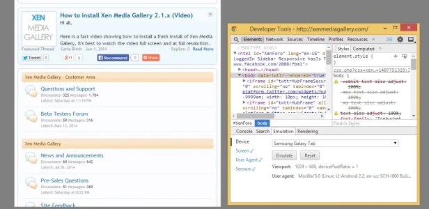
It depends a lot on the device too. If I use emulation in Chrome as a Samsung Galaxy Tab:

Portrait is a width of 600px. The notification is hidden.
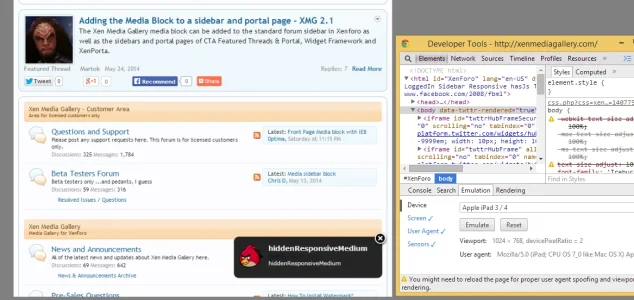
If I emulate an iPad, however, which has a portrait width of 768px:

The notification shows.
But, I would say, that on a wider tablet screen, the notification doesn't exactly get in the way of anything. But if you want to you can change the responsive widths in XenForo style properties or even write your own media queries.
How exactly are the notifications shown as? Is there an option wether you can have them up like notices or do they just show as like a pop up sidebar?
How exactly are the notifications shown as? Is there an option wether you can have them up like notices or do they just show as like a pop up sidebar?
If memory recalls you have the option to have them displayed in the top right > top left >bottom right and bottom left area of the forum.
I'm sure with some additional css you can have them displayed like notices if your fluent with css. I'm sure I did an example of it sitting in the middle spanning across the bottom but I suspect having it sit correctly at the top could prove a little more difficult to accomplish. http://xenforo.com/community/threads/notifications-paid.33906/page-38#post-481030
Alright Shelley, thank you.
Similar threads
- Replies
- 3
- Views
- 110