Quite honestly the angst is unjustified.
Simply recolour the icons to suit your own preference.
I don't get it.
I could understand hey guys we're busy with function edits but we'll get to it.
But XF is going to deliberately roll out an ugly feature tons of people are saying they don't like already? XF is sleek - XF is tightly integrated - XF listens!
XF has a wonderful vanilla design. Those that love design/ are pernickety about 'my design' or really really need a niche design to represent their board, do complain about it a bit. But overall the great majority seem to like XF basic design.
It certainly looks like trouble was taken to make it soft and sleek and integrated - but not here. I don't understand why this is an exception.
I understand from statements elsewhere on this board that it's actually a minority of admins who redesign. A great many want to use XF out of the box.
Huge numbers just slap on a logo, change a few key colours, and get on the road. So the major market is being short changed here!
The editor is a frequent use item, and we all WANT it to be!
XF did a divinely brilliant design feature of placing user avatar by it to encourage its use. A great deal else is done to ENCOURAGE users to post. So why dump an ugly toolbar on them which doesn't integrate with the rest of the XF design? Surely this is DIScouragement?
We don't get an ugly navbar, and it's dismissed with - design it yourself.
We don't get an ugly postbit, and it's dismissed with - design it yourself.
We don't get an ugly XENFORO and just get told clean it up yourself.
Come on guys. If not now, put it on the pretty soon priority list to link the colour to a pale blue Palette.
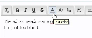
Make Bold bold. Colour the font colour button. Separate the Left/ Centre/Right alignment - 2 clicks there is too much.
Let's keep the Beautiful XF tradition!

