Very very very bad editor design!

Status
Not open for further replies.
WTF? New editor?? Baddest editor design on the planet!

Very very very bad editor design!
It's ALPHA/EARLY BETA... what do you expect? Stability first.

I don't mind having a bad editor design but stable and great... its better than a good looking editor but buggy and troublesome.
 
Actually, @Sheratan, yes it is a alpha/beta but I believe the current editor appearance is representative of the final product.

If you don't like it for your own board then you may style it yourself.
 
If you don't like the look of the editor, you need to be specific. This stands for various people not just the OP.

We'll take feedback on board (note that I'm not guaranteeing that we'll follow it), but feedback like this really doesn't give us anything to work with.

Of course, keep in mind that various people complained about how the editor looked in 1.1 so there will always be personal preferences.
 
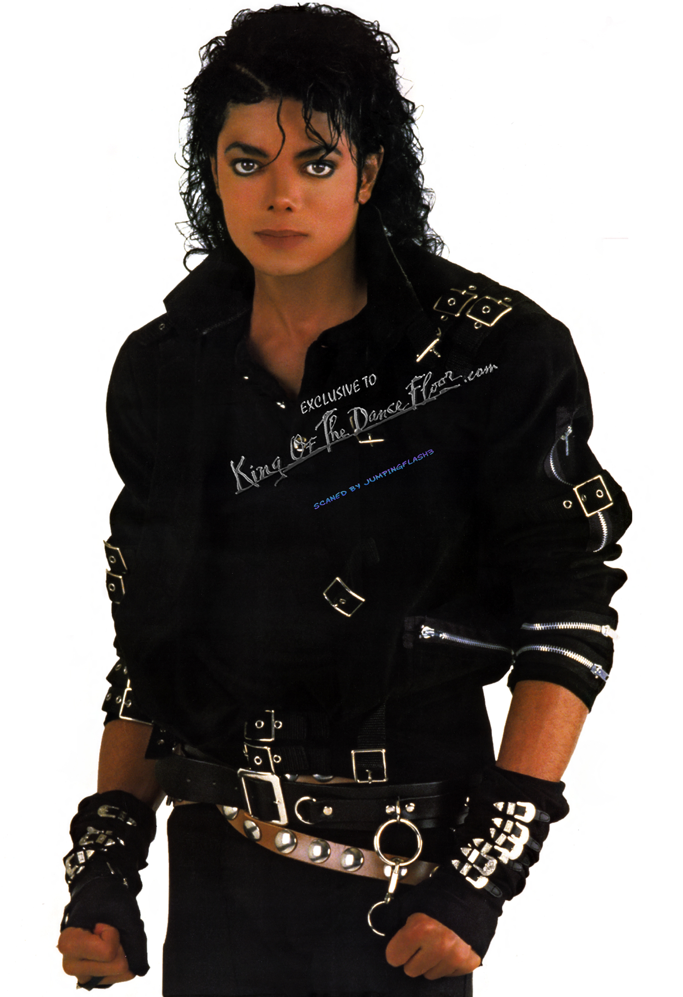
Doesn't "bad" mean "good" these days? :cautious:

Maybe in the 80's and early 90's:
Michael-Jackson-BAD-Photoshoot-HQ-michael-jackson-30904810-1370-2000.jpg
 
As long as @Shelley is here, then we have no problem to style it.

By the sound of it you don't need me here in that there are plenty of people who will also now be able to adjust the icons and implement their own design. :) From what I've heard the editor is significantly easier to style than the previous editor thus making it easier for people to style it which will be very easy for them. Not only that, and correct me if I'm wrong here but i'm sure i heard you can style this editor via the style properties making it even easier.

Take for example the previous editor and dark styles. How many partial designed tinymce editors on dark styles have you seen? practically all. The only two people that has fully styled the tinymce editor that i know of his myself and forsaken. This is because the previous editor is just such a pain to style (believe that). This editor I expect will be very easy to style for dark backgrounds and none of the adverse affects you get with tinymce or with the spritesheet as @Sheldon demonstrated that by posting re-coloured sprites for redactor in the RM.

When I personally get my hands on it i'll be styling it to my preference (replacing all icons with my own design) and I know it will be easier since the icons in tinymce spans on 2 spritesheets and individual images making it significantly harder and more work for the user.

Is the OP actually referring to the design? They don't go into much what they don't like and feel is very bad. If it's the visual then this can be changed easily, much easier than it would be had you tried to style tinymce.
 
Last edited:
I like the features and non-existend TinyMCE bugs of Redactor more, but I like the style of TinyMCE more than Redactor's. When I get my hands on 1.2 I will style Redactor to look similar to TinyMCE and eventually make a guide, so this hopefully will satisfy people on both sides.
 
It's really easy to style the editor, so I don't think this should be problem although I don't like the look neither

for example:

Bildschirmfoto 2013-06-05 um 16.25.22.webp Bildschirmfoto 2013-06-05 um 16.31.30.webp Bildschirmfoto 2013-06-05 um 16.27.42.webp done in less then 5 minutes. You even could easily switch to prettier icons like the original from redactor.
 
I like the features and non-existend TinyMCE bugs of Redactor more, but I like the style of TinyMCE more than Redactor's. When I get my hands on 1.2 I will style Redactor to look similar to TinyMCE and eventually make a guide, so this hopefully will satisfy people on both sides.

Nice one.

Now you try and style Tinymce to look like Redactor and you'll find that would entail far more work. More so if you built it around a dark theme. Personally i don't think default Redactor visual looks bad, infact i think it looks far cleaner than tinyme but I myself will still replace the default look because I can't help myself. :P
 
If you don't like the look of the editor, you need to be specific. This stands for various people not just the OP.

Okay, can you please try flipping the toolbar gradient - or alternatively, flipping the icon gradients - whichever looks better; but have them going the same way.

And slightly darken the button outlines too - but only by a smidge. :D
 
The buttons should be of different colors to make it easier to identify by colors and not by the symbols (black and white is hard to read specially when we are talking about symbols). I can't think good reason to keep black and white buttons.

I know that anybody can customize the buttons but which is the reason to keep them black and white?

does somebody agree with me?
 
The buttons should be of different colors to make it easier to identify by colors and not by the symbols (black and white is hard to read specially when we are talking about symbols). I can't think good reason to keep black and white buttons.

I know that anybody can customize the buttons but which is the reason to keep them black and white?

Clean look? But i agree with you to an extent (like the text-color button) that could be red/dark red as that conveys to change the text colour better imo. Not a biggie though because on hover lets you know what icons do what and what they are.
 
The editor as the defeaut style it's way simple. But hopefully it looks very easily customizable with CSS, what is nice.
What i will try to go is take off the menus from Align text/links as add them as separate buttons.

In the user side in some things comparing with the old one, this one requires more clicks to do the same thing.
 
What about an option in the ACP to use the old editor, at least until there is a overwhelming preference for the new editor version.

That should keep both sides happy (y)
 
Status
Not open for further replies.
Back
Top Bottom