Text Editor: Blueish smaller icons

Status
Not open for further replies.
Dang, neutral is the word I needed to hear. If Brogan said this I missed it. Yeah, I can understand know why Mike chose grey. You are right, grey is more neutral than blue. Basically the probability of people changing a blue default editor for their custom style is bigger than the probability of people changing a grey default editor. Because it's neutral it can be used with more styles than blue. Still, that doesn't change the fact that it doesn't match xenforo's blueish-white style although it doesn't stand out that badly.

But that is just it, it's not a fact it's your opinion. I think it does match the theme which is my opinion and is the opinion of many others.

I believe the editor looks (visually) excellent so I have to stand by what I feel is a more than acceptable styled editor as you do with your own opinion where you may not think it's acceptable and deem the blue better.
 
I think it does match the theme which is my opinion and is the opinion of many others.
What in the rest of XF design does it match Shelley?

I'm not trying to wind you up. The issue of consistency is a very important component of this debate and I see it one way and you another. I have said specifically I haven't seen this grey on any other bars on XF like breadcrumbs, or Likes which are on all or most pages in pale blue.

You'd know better than me where IS this grey used elsewhere in the default design?
That might enlighten the consistency area of opinion conflict.

Also we mustn't forget this is also about correcting the gradients which clash in opposing directions.
 
The old one did stick out, but the new one with the gradient shading effect stands out even more.
Luxus - That would have been perfect!
People will have to style it to suit their sites anyway, might as well make it harmonious with the default theme at least :)
This is the post that follows Luxus' where he gave specifics here (he linked this above) and it's by a much admired designer. I think she puts it very well.
 
What in the rest of XF design does it match Shelley?

I'm not trying to wind you up. The issue of consistency is a very important component of this debate and I see it one way and you another. I have said specifically I haven't seen this grey on any other bars on XF like breadcrumbs, or Likes which are on all or most pages in pale blue.

You'd know better than me where IS this grey used elsewhere in the default design?
That might enlighten the consistency area of opinion conflict.

Also we mustn't forget this is also about correcting the gradients which clash in opposing directions.

This is the post that follows Luxus' where he gave specifics here (he linked this above) and it's by a much admired designer. I think she puts it very well.


Yes you are just be honest about it I might respect your POV a little more. As it stands, Kim put it very well because it falls in-line with your suggestion that is all, that is why Kim put it well whilst in other disagreements you overlooked, ignore what input she had to provide. Remember that critique thread? The one you had deleted.

The grey matches the theme in that it provides a focus point away from the blue, it's a neutral color so it would match just about any style (apart from dark themes). Really Morgain, you could not even figure this out yourself? after the amount of times I've posted about it. Just prooves you do not read anyones word other than your own (pending that it falls in-line within morgains demand).
 
@Shelley I can see you're getting a bit irritable because you're being personal and rude. Let's try to stick to the editor, not opinions about each other's brainpower ;)

I already covered the neutrality point. For almost all users who customise, grey does not match (I already gave full detail on this0. So they'd have to change it anyway.
The pale blue eg Likes bar, is actually quite popular as part of the XF default. It's the least often changed colour in the palette. A great many admins just change logo, background, navbar colours. Second priority comes the register button and category bars. The pale blue elements for this type of admin generally stay the same so clearly they are liked, or at least found acceptable.

You say the grey editor "matches" because it is completely different to the rest of the default style.
That doesn't make sense to me. 'Matching' means there is something the same, or closely similar.

I covered the point about use of an exception colour as an attention getter.
That doesn't apply to grey
which is an evasive colour, not a grab colour. Also exception colours don't (or shouldn't) be one offs. Colour runs in triads, which has been known since classical Greece, and underscored by modern psych, to give balance.
You CAN get away with a single exception colour for priority content, or user content.
But not standard elements on repeatedly generated pages.

# If the editor is aimed to be a grabber, it can't be grey which is not a grab colour. Unless that is intended to be a striking contrast to the rest of the design, in which case it would need two other grey elements to balance it, as above, in the overwhelmingly classic art tradition it is very difficult to break. successfully. Many artists have mourned this.
# If it's aimed to be an evasive, non-intrusive, merging discreetly back, yes grey is good. But it would need to be one among other grey elements , or else it sticks out and is not evasive.
Also XF goes to some trouble to get the user to NOTICE the quick editor - placing your vatar beside it, not having to click it open, ven the cursor is there all ready to go. So I do not think this element was ever intended to "grey out."

So it comes back to where the OTHER grey elements in default XF are to be found, which has not yet been answered.
 
@Shelley I can see you're getting a bit irritable because you're being personal and rude. Let's try to stick to the editor, not opinions about each other's brainpower ;)

I already covered the neutrality point. For almost all users who customise, grey does not match (I already gave full detail on this0. So they'd have to change it anyway.
The pale blue eg Likes bar, is actually quite popular as part of the XF default. It's the least often changed colour in the palette. A great many admins just change logo, background, navbar colours. Second priority comes the register button and category bars. The pale blue elements for this type of admin generally stay the same so clearly they are liked, or at least found acceptable.

You say the grey editor "matches" because it is completely different to the rest of the default style.
That doesn't make sense to me.

I covered the point about use of an exception colour as an attention getter.
That doesn't apply to grey
which is an evasive colour, not a grab colour. Also exception colours don't (or shouldn't) be one offs. Colour runs in triads, which has been known since classical Greece, and underscored by modern psych, to give balance.
You CAN get away with a single exception colour for priority content, or user content.
But not standard elements on repeatedly generated pages.

# If the editor is aimed to be a grabber, it can't be grey which is not a grab colour. Unless that is intended to be a striking contrast to the rest of the design, in which case it would need two other grey elements to balance it, as above, in the overwhelmingly classic art tradition it is very difficult to break. successfully. Many artists have mourned this.
# If it's aimed to be an evasive, non-intrusive, merging discreetly back, yes grey is good. But it would need to be one among other grey elements , or else it sticks out and is not evasive.
Also XF goes to some trouble to get the user to NOTICE the quick editor - placing your vatar beside it, not having to click it open, ven the cursor is there all ready to go. So I do not think this element was ever intended to "grey out."

So it comes back to where the OTHER grey elements in default XF are to be found, which has not yet been answered.

No, your resort to what you do when a post doesn't fit your line of thinking. You try to tap into what people are feeling, I'm quite fine thankyou and as for being rude I think you did that back in a previous thread to Mike and Brogan when you questioned Mikes abilities in design and Brogan . Stick to the editor? Yes please do.

Nothing makes sense to you if it does not fall inline to your way. Plenty of greys throughout the forum to put it briefly, Goodnight Morgain.
 
This is how I would have styled the default look of redactor for xenforo:

View attachment 48484
It uses the same colors as xenforo's blue bb code block and on hover it uses the same colors as xenforo's quote block, making it consistent with the default style.
Nice, and remove also those useless button frames. When you hover over it, it encapsulates anyways the button. It will make the bar more compact.
 
Last edited:
@Luxus and I have both asked you to tell us where these greys are.
No information yet.

You got the information. Sounds like you just didn't bother to read and in the other posts also that got locked because it resulted in your persistent demand. I'm not repeating myself, goodnight Morgain.
 
You got the information. Sounds like you just didn't bother to read and in the other posts also that got locked because it resulted in your persistent demand. I'm not repeating myself, goodnight Morgain.

Thanks Shelley. As readers of this thread may also like me not know to whch post you refer could you give the link? That other thread was quite long so not really fair to demand others go all through it looking for your one post that covers this point.
Either a link or just briefly mention 3 or more examples.

Not the main point here but I should hate nasty gossip to float about Mike or Brogan so I'm putting this in small text so as not to take up space, but here if needed.
.. as for being rude I think you did that back in a previous thread to Mike and Brogan when you questioned Mikes abilities in design and Brogan
I have the greatest respect for Mike's code as the backbone of XF. But it's always been well known going right back to another company before XF that Mike was less interested in GUI design and Kier far more so. To refer to that is not being rude. Developers have their particular areas of interest and it's possible the lack of interest in the editor design is because of this. I ahve also seen it suggested on another thread about another problem with the editor design that Mike has bugs as his first priority. Quite right and proper, and a shame Kier is preoccupied with a big location upheaval so he can't take care of the other side of it.
However XF always comes right in the end so I'm still loyal and hopeful.

On Brogan I have said that things he has said are irrelevant to the point. With someone else I'd have said it more softly, but Paul is a big guy, and he prefers to talk sharp and straight himself. He knows I respect him going back a long way so I'm sure he's not crying on his pillow ;)


Not forgetting of course we also have clashing gradients in this design.
 
Thanks Shelley. As readers of this thread may also like me not know to whch post you refer could you give the link? That other thread was quite long so not really fair to demand others go all through it looking for your one post that covers this point.
Either a link or just briefly mention 3 or more examples.

Not the main point here but I should hate nasty gossip to float about Mike or Brogan so I'm putting this in small text so as not to take up space, but here if needed.

I have the greatest respect for Mike's code as the backbone of XF. But it's always been well known going right back to another company before XF that Mike was less interested in GUI design and Kier far more so. To refer to that is not being rude. Developers have their particular areas of interest and it's possible the lack of interest in the editor design is because of this. I ahve also seen it suggested on another thread about another problem with the editor design that Mike has bugs as his first priority. Quite right and proper, and a shame Kier is preoccupied with a big location upheaval so he can't take care of the other side of it.
However XF always comes right in the end so I'm still loyal and hopeful.
On Brogan I have said that things he has said are irrelevant to the point. With someone else I'd have said it more softly, but Paul is a big guy, and he prefers to talk sharp and straight himself. He knows I respect him going back a long way so I'm sure he's not crying on his pillow ;)


Not forgetting of course we also have clashing gradients in this design.

Predictable. goodnight_morgain.webp
 
Plenty of greys throughout the forum to put it briefly,
You got the information. ... other posts also that got locked ... I'm not repeating myself, goodnight Morgain.
For anyone who doesn't know the thread Shelley meant as she was in a hurry to get to bed and didn't give the link ;) here it is
http://xenforo.com/community/threads/very-very-very-bad-editor-design.51813/
Have a nice zzzz Shelley.

However I have faithfully searched that thread on Shelley's posts - there are two whole pages of them! and I scanned them all. Lots of interesting stuff about redesigning the editor -
but NOTHING giving examples of the "plenty of greys throughout the forum" in XF default design Shelley tells us are here.

So we're still waiting this important point which is key to supporting the concept that the new editor matches and integrates with XF default design.

I'm not going to bed, if so it'll be for an hour.

On that note:

goodnight_morgain2.webp
 
@Shelley if you're not going to bed, and I haven't said I'm going to bed it seems a bit like my dear bipolar friend who does just this, to say Good Night.
(She says good night and good evening etc quite randomly, very sweet)

So Good Morning Shelley.
Still no sign of that information on all these instances of that grey in XF default you have said several times there are.

More waiting required?
 
For anyone who doesn't know the thread Shelley meant as she was in a hurry to get to bed and didn't give the link ;) here it is
http://xenforo.com/community/threads/very-very-very-bad-editor-design.51813/
Have a nice zzzz Shelley.

However I have faithfully searched that thread on Shelley's posts - there are two whole pages of them! and I scanned them all. Lots of interesting stuff about redesigning the editor -
but NOTHING giving examples of the "plenty of greys throughout the forum" in XF default design Shelley tells us are here.

So we're still waiting this important point which is key to supporting the concept that the new editor matches and integrates with XF default design.

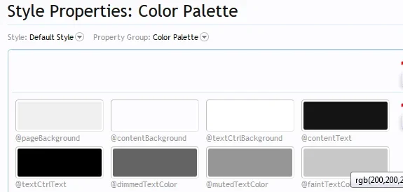
what the heck. Meet the colour palette. I would have thought you would have used some common sense, took away at what i've been saying in other related threads what I think but I guess one track mind.

Meet the colour palette. Plenty of greys. I only wish we could have had gandalf the grey as a colour option. There used throughout the style. Now you tell me why you think the editor is inconsistent? Which you have said?

hys-sp.webp
 
A blue colour scheme for the default editor makes so much sense compared to a greyish look. This greyish look makes it feel as though the editor has just been thrown into the software without much consideration of consistency. The default theme's primary colour is various shades of blue, it only makes sense to style the default look of the editor in a similar colour.
 
OK good some progress I think as it identifies the misunderstanding.

I hope I'm right that the grey the editor uses is @pageBackground? if not no big deal, it's one of them thar greys you displayed! Though the older editor had a warmer, more delicate grey.

Well what Luxus and I have been asking you for is examples where the same grey is used in the default XF design. (We were not asking how many greys there are in the XF default palette.)

The reason we were/ are asking for where this grey gets used on key elements of the XF default design, is because IF it gets used quite a bit like the pale blue, peach, darker blues, that would support the idea that this grey is consistent and integrated with XF design.
If it doesn't get used as a key colour on standard elements, that means this editor colour is non--standard, does not fit with the default XF design.
 
Status
Not open for further replies.
Top Bottom