Implemented  [Suggestion] Some sort of divider above signatures

This suggestion has been implemented. Votes are no longer accepted.
That did not go unnoticed. :)
I tried using = but it didn't look so hot.

=================================

You can always use the underline and change the color:

_____________________________________ or
_____________________________________

Or get fancy with it:

***********************************************

OR

<><><><><><><><><><><><><><><>

OR

><><><><><><><><><><><><><><><

OR

~~~~~~~~~~~~~~~~~~~~~~~~~~~~~~~

OR

.............................................................................

Use your imagination :p
 
I find it hard to distinguish between posts. Whatever about seperating the sigs more clearly the posts blend too easily. This is even worse when there are mutiple quotes in a post. Sorry to be negative, it's just visually indistinct, nothing is clearcut. I can see it being a problem for forums where debates are heated such as politics. I can foresee statements being attributed to the wrong poster ; we all know the grief that will cause.
 
Suggestion? Maybe moving the line down about 20pixels. Then it would line up to the light/dark blue transition of the avatar area. Then for short messages there would be separation.

Then add maybe 5 - 10 pixels between the divider line and the start of the signature.

I think that would still keep the same clean feel, and make things much easier to read.
 
And if there is no signature line, move the "Abomination, a moment ago" down the same 5-10 pixels from where the signature divider line would have been, if I had a signature line.

(with no sig, there is not divider line shown)

?
 
Suggestion? Maybe moving the line down about 20pixels. Then it would line up to the light/dark blue transition of the avatar area. Then for short messages there would be separation.

Then add maybe 5 - 10 pixels between the divider line and the start of the signature.

I think that would still keep the same clean feel, and make things much easier to read.

And if there is no signature line, move the "Abomination, a moment ago" down the same 5-10 pixels from where the signature divider line would have been, if I had a signature line.

(with no sig, there is not divider line shown)

?

Pictorial of what my suggestion is:
a-request-for-the-community-jpg.183
 

Attachments

  • A request for the community.webp
    A request for the community.webp
    8.3 KB · Views: 115
I see it when I tilt my monitor far back... it needs to be a little darker at least.

Kier&Mike, the same goes for the [NEW] indicator on the right side of a new posting. I am now using a Dell E6400 laptop today and that screen is way worse (less contrast) then the monitor I normally work on. On this laptop one can barely see the white fonts used for [NEW]. This is worse on this screen then the signature line.
 
Kier&Mike, the same goes for the [NEW] indicator on the right side of a new posting. I am now using a Dell E6400 laptop today and that screen is way worse (less contrast) then the monitor I normally work on. On this laptop one can barely see the white fonts used for [NEW]. This is worse on this screen then the signature line.
That suggestion about the New indicator was made a couple of days ago.
 
Agreed, the line is to thin. Especially on high resolution displays.

Not too thin, just too faint.

For what it's worth, I've never calibrated my monitor and while the line is visible, it's very faint and very hard to notice unless you're looking at it. :)

Actually, it's not even a solid line. It's dotted. I would suggest this:
Code:
border-top:1px dotted #B5D8F1;

which looks like:
ejqA5.png

(Apologize for what looks like a double signature :P)
 
I said that earlier. Its not such a big deal as it can be edited by us. It would be nice just to have a little more contrast as default though.
Unfortunately, its a bit of an issue on this forum itself. Imo the line is a bit too faint. I tend to pass over siggy's on most forums but somehow its a bit tough here. Giving it a bit more though, its apparently due to the padding line above siggy being a bit too light. The only issue with that could be the post separation line and the siggy line appearing almost similar.
 
I must admit that I didn't notice the line at first and I thought some signatures were part of the post and it confused me a couple of times until I realized there was a faint line there.
 
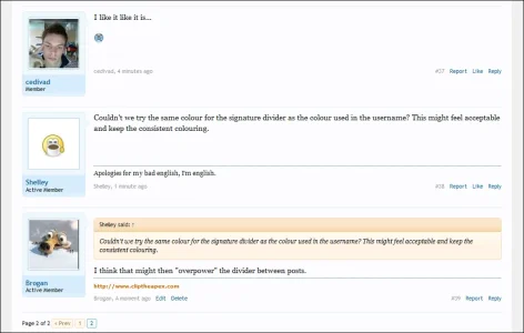
Couldn't we try the same colour for the signature divider as the colour used in the username? This might feel acceptable and keep the consistent colouring.
 
Couldn't we try the same colour for the signature divider as the colour used in the username? This might feel acceptable and keep the consistent colouring.
I think that might then "overpower" the divider between posts.

Image below shows it edited to #176093

signature-png.475
 

Attachments

  • signature.webp
    signature.webp
    43.9 KB · Views: 68
I think that might then "overpower" the divider between posts.

Image below shows it edited to #176093

You are right it does look a little over powering. thanks for the mockup. Maybe try a little css3 magic that will also look better in older browser. *clutching at straws*
 
Top Bottom