Implemented  [Suggestion] Some sort of divider above signatures

This suggestion has been implemented. Votes are no longer accepted.
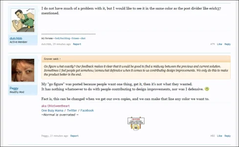
My "go figure" was posted because people want one thing, get it, then it's not what they wanted.
It has nothing whatsoever to do with people contributing to design improvements, nor was I defensive. :)

Ah, okay Peggy, thanks for explaining :). Electronic communication is not always easy. Just that I get the impression sometimes (see also here) that suggestions (and lively discussions) about UI elements sometimes get a bit of a defensive feedback from some. Maybe defensive is not the right word, but if people think an improvement should be made and an offered solution is not quite what works perfect yet, then it only needs some fine tuning. 'Go figure' sounds a bit negative to me, in relation to our positively meant feedback. That's all. But I am a sensitive guy. :p:D. I refused to go to the army (that would've made me hard as... vB4' UI/UX). Go figure. ;)
 
Ah, okay Peggy, thanks for explaining :). Electronic communication is not always easy. Just that I get the impression sometimes (see also here) that suggestions (and lively discussions) about UI elements sometimes get a bit of a defensive feedback from some. Maybe defensive is not the right word, but if people think an improvement should be made and an offered solution is not quite what works perfect yet, then it only needs some fine tuning. 'Go figure' sounds a bit negative to me, in relation to our positively meant feedback. That's all. But I am a sensitive guy. :p:D. I refused to go to the army (that would've made me hard as... vB4' UI/UX). Go figure. ;)
LOL, I gotcha. Nope I wasn't being defensive. I'm sensitive too, so don't make me cry.
 
That post divider is too dark imo, erich37, I think the current one is perfect. Maybe the signature divider can be a bit lighter.
 
whatever color you use is not important.
It is just that the color of the post-divider-line should be darker than the Signature-dashed-line.
 
Yes looks nice, and I really like the little icon that shows which posts are new since last visit. Nice touches :)
 
I really like Brogan's example. Bottom line is that the signature line now is too obtrusive, it is more visible then the post divider and that is no good. Talking about dark post dividers, remember this?:

View attachment 1957

:).
That style makes me feel depressed every time I see it :s

The light blue lines here look nice, making them darker ruins the whole style imo.

PS: I see the signature line is made lighter, but it's much lighter now. Edit: it's the same color as the other dividers.
 
Nope the post divider line is definitely darker than the sig divider line.
Not according to the CSS it isn't.

Code:
.messageList .message {
border-bottom:1px solid #D7EDFC;


Code:
.message .signature {
border-top:1px dashed #D7EDFC;


It's because one line is dashed and one is solid which is giving the illusion that they are different colours.
 
I am sure you have send some "CupCakes" or something to Kier :p
naw just did what any good woman does...............


.... planted the idea and shut up til he changed it, letting him think it was his idea, when in fact it was mine.
frog.gif
 
Back
Top Bottom