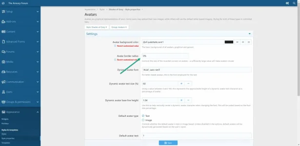
Did not help.Go here and select "Revert customized value" and then "Save" Please let me know if it works
You are using an out of date browser. It may not display this or other websites correctly.
You should upgrade or use an alternative browser.
You should upgrade or use an alternative browser.
Shades of Grey v2.2.10
No permission to download
- Thread starter Gator
- Start date
Okay, let me take a look again.Did not help.
I'm not sure ...give it a try. You can always delete it.If I install it under default style where I got all changes made, will this theme inherit those changes in default style? e.g. extra.less
Gator updated Shades of Grey with a new update entry:
Shades of Blue 2.1.9.8
Read the rest of this update entry...
Shades of Blue 2.1.9.8
Change log:
- Added missing borders
- Tweaked tab colors to ensure consistency
- Returned/replaced orange tab with the green tab on "Blue accent" style
- Multiple other minor fixes and enhancements
- Added version numbers to file names for easier recognition
Read the rest of this update entry...
Gator updated Shades of Grey with a new update entry:
Shades of Grey 2.1.10
Read the rest of this update entry...
Shades of Grey 2.1.10
Shades of Grey is now a single download with the default accent color of "blue".
If you liked the "cream" colored accent (or any other color for that matter), simply go to:
Admin CP > Appearance > Style Properties > Shades of Grey > Color Palette > Color 4 and change it to rgb(226, 226, 188) (see image below)
View attachment 229070
Also, I've added some additional CSS to enlarge the unfurl image (see examples below) I felt the image was...
Read the rest of this update entry...
Thanks for the new version.
I'm one of the few that liked the cream version better, and unless I'm missing something about this I believe there are far more changes to the color palette than just color 4:
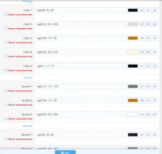
So are we to save all these other cream color codes as well and change them all by hand at each new update?
It's not that much of a big deal, I just want to make sure I understand what are we supposed to do, that's all.
I'm one of the few that liked the cream version better, and unless I'm missing something about this I believe there are far more changes to the color palette than just color 4:

So are we to save all these other cream color codes as well and change them all by hand at each new update?
It's not that much of a big deal, I just want to make sure I understand what are we supposed to do, that's all.
Hi @jpratesThanks for the new version.
I'm one of the few that liked the cream version better, and unless I'm missing something about this I believe there are far more changes to the color palette than just color 4:
View attachment 229074
So are we to save all these other cream color codes as well and change them all by hand at each new update?
It's not that much of a big deal, I just want to make sure I understand what are we supposed to do, that's all.
I'm glad to hear that someone else besides myself liked the "cream" style.
Last edited:
Hi @jprates, I feel there might be others who share your concerns as well, so I will be adding the "cream accent" style when XenForo 2.2 releases.
For now, all the changes I made in the recent update (2.1.10) are located in the "extra.less" under "templates", so all to have to do is copy and paste the contents from the new to the old to be properly updated.
Take care,
Gator
For now, all the changes I made in the recent update (2.1.10) are located in the "extra.less" under "templates", so all to have to do is copy and paste the contents from the new to the old to be properly updated.
Take care,
Gator
Wonderful, thank you so much!
So while changing 'Color 4' is sufficient, comparing the Blue and Creme options in style version 2.1.9.7 actually show three changes, not one, all under 'Color Palette':
And reading above, I don't understand why someone would want to mess with extra.less under templates just to get the Creme version back.
I simply upgraded the regular blue version to template version 2.1.10. Then I deleted the Creme version 2.1.9.7 (I never downloaded 2.1.9.8).
And then I clicked 'Add style'. I called it Shades of Grey (Creme Text/Round Avatars), and choose the Shades of Grey (2.1.10) as the parent). And hit save. At this point the two Shades of Grey styles are identical.
Then under basic colors I changed the 3 'Color Palette' settings as listed above. That seems to be all there is to it. So now when I upgrade to Shades of Grey next version 2.1.11 or whatever, the creme version should automatically follow.
For more info: I'm letting my users choose between the Xenforo Default style, two styles we custom created from scratch intended to mimic vBulletin 3.x,, and Shades of Grey (blue and creme). 5 basic choices. And then for each we have an option that just makes the avatars basically square (with tiny rounded edges) instead of round. So 10 variants total.
I run 2 systems that have been on vBulletin 3.x for years. The small system converted to XF a month ago. The large one I'm cutting over this week. vBulletin uses square avatars, and many of our existing images don't look great cropped round. So that is why I give people the choice of seeing square avatars.
So my 4 Shades of Grey styles (parent and then children) look like this:
Level 1: Shades of Grey (Blue Text/Round Avatars)
Level 2: Shades of Grey (Blue Text/Square Avatars)
Level 2: Shades of Grey (Creme Text/Round Avatars)
Level 3: Shades of Grey (Creme Text/Square Avatars)
The Level 2 Creme style includes only the 3 color changes listed above.
Both of the square options contain only a single change. Under 'Style properties', I changed 'Avatar border radius:' from the default of 50% to 2%.
I hope this post is helpful...
- Color 3: rgb(54, 100, 132) to rgb(54, 108, 54)
- Color 4: rgb(112, 171, 203) to rgb(226, 226, 188)
- Accent 2: rgb(163, 102, 41) to rgb(107, 173, 109)
And reading above, I don't understand why someone would want to mess with extra.less under templates just to get the Creme version back.
I simply upgraded the regular blue version to template version 2.1.10. Then I deleted the Creme version 2.1.9.7 (I never downloaded 2.1.9.8).
And then I clicked 'Add style'. I called it Shades of Grey (Creme Text/Round Avatars), and choose the Shades of Grey (2.1.10) as the parent). And hit save. At this point the two Shades of Grey styles are identical.
Then under basic colors I changed the 3 'Color Palette' settings as listed above. That seems to be all there is to it. So now when I upgrade to Shades of Grey next version 2.1.11 or whatever, the creme version should automatically follow.
For more info: I'm letting my users choose between the Xenforo Default style, two styles we custom created from scratch intended to mimic vBulletin 3.x,, and Shades of Grey (blue and creme). 5 basic choices. And then for each we have an option that just makes the avatars basically square (with tiny rounded edges) instead of round. So 10 variants total.
I run 2 systems that have been on vBulletin 3.x for years. The small system converted to XF a month ago. The large one I'm cutting over this week. vBulletin uses square avatars, and many of our existing images don't look great cropped round. So that is why I give people the choice of seeing square avatars.
So my 4 Shades of Grey styles (parent and then children) look like this:
Level 1: Shades of Grey (Blue Text/Round Avatars)
Level 2: Shades of Grey (Blue Text/Square Avatars)
Level 2: Shades of Grey (Creme Text/Round Avatars)
Level 3: Shades of Grey (Creme Text/Square Avatars)
The Level 2 Creme style includes only the 3 color changes listed above.
Both of the square options contain only a single change. Under 'Style properties', I changed 'Avatar border radius:' from the default of 50% to 2%.
I hope this post is helpful...
Thank youYes, go to Appearance > Styles > Shades of Grey - Style properties and set the "Avatar border radius" to 0%
View attachment 233038
I decided to keep the version before the last update because I liked the color scheme better. Other than the larger unfurl images, were there any other significant updates (i.e. security) that I need to be aware of?
None that I can remember.Thank you
I decided to keep the version before the last update because I liked the color scheme better. Other than the larger unfurl images, were there any other significant updates (i.e. security) that I need to be aware of?
Gator updated Shades of Grey with a new update entry:
Shades of Grey v2.2
Read the rest of this update entry...
Shades of Grey v2.2
- This is a xenForo 2.2 compliance upgrade only (nothing new).
- The style has been exported as an "archive" so you do not need to "extract" the zip file
- Simply import the .zip file
Read the rest of this update entry...
Thanks!
I've a strange behavior on my site when the local Portuguese language is selected, that does not appear when English is selected.
The "New posts" and "Post thread..." buttons are fine right justified on English, but appear collated to the site name when on Portuguese:

Above is English version - all fine.

Above is Portuguese version - weird buttons positioning.
What could be causing this? Any ideas anyone?
Site homepage: https://ecomove.pt
I've a strange behavior on my site when the local Portuguese language is selected, that does not appear when English is selected.
The "New posts" and "Post thread..." buttons are fine right justified on English, but appear collated to the site name when on Portuguese:

Above is English version - all fine.

Above is Portuguese version - weird buttons positioning.
What could be causing this? Any ideas anyone?
Site homepage: https://ecomove.pt
Last edited:
Thanks!
I've a strange behavior on my site when the local Portuguese language is selected, that does not appear when English is selected.
The "New posts" and "Post thread..." buttons are fine right justified on English, but appear collated to the site name when on Portuguese:
View attachment 236480
Above is English version - all fine.
View attachment 236481
Above is Portuguese version - weird buttons positioning.
What could be causing this? Any ideas anyone?
Site homepage: https://ecomove.pt
Not really sure, but this is not caused by my style, Shades of Grey. You might contact the author of the language pack. As you can see here, it is the same in this style as well.
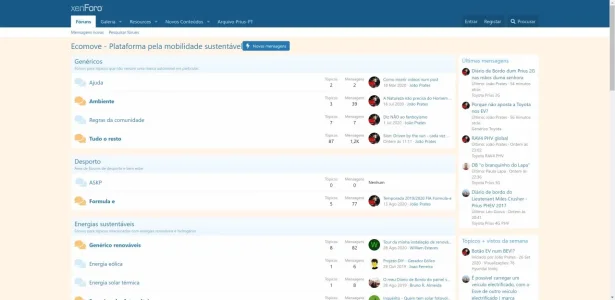
It's a problem with the language pack, I'm facing the same problem.Thanks!
I've a strange behavior on my site when the local Portuguese language is selected, that does not appear when English is selected.
The "New posts" and "Post thread..." buttons are fine right justified on English, but appear collated to the site name when on Portuguese:
View attachment 236480
Above is English version - all fine.
View attachment 236481
Above is Portuguese version - weird buttons positioning.
What could be causing this? Any ideas anyone?
Site homepage: https://ecomove.pt
ok, so I have this user that is getting selected text inside quotes written with the same color as the background, it seems like rgb(144,144,144):
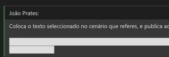
I already asked him to try it out with the default theme, but meanwhile I have tested the same scenario, even with his browser (Edge) and got nothing alike what he's getting:

How come using the same theme we are getting totally different results by doing the same steps?
What could be wrong here, and how to fix it?
Does anyone have a clue of what is going on?

I already asked him to try it out with the default theme, but meanwhile I have tested the same scenario, even with his browser (Edge) and got nothing alike what he's getting:
How come using the same theme we are getting totally different results by doing the same steps?
What could be wrong here, and how to fix it?
Does anyone have a clue of what is going on?
Similar threads
- Replies
- 1
- Views
- 361
