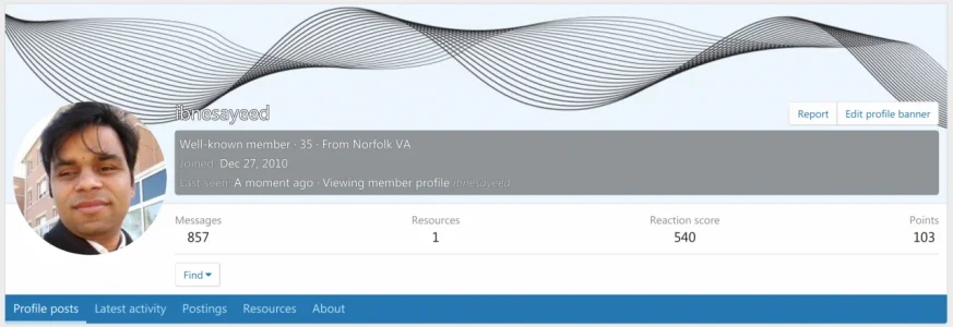
Won't fix Profile name legibility issue with tricky banner image colors

ibnesayeed

Well-known member
Affected version
XF2.2
I uploaded a new profile banner image with black curvy lines and transparent background, which caused my name appear in white with black outline/stroke/shadow. In the full profile view it is not very legible and in the tooltip mode the background color beneath the text is the same as without any banner images, but the color of the name is now different, which does not look good.

I know the text stroke is there to make it legible in difficult situations, but how about using CSS mix-blend-mode and letting the browser manage the contrast rather than relying on determining dominating color in an image and using hacks like text stroke? This will work even if the background is partially covering a letter.


xf-fofile-full.png
xf-profile-tooltip.png
 
Last edited:
Also, a member's tooltip looks a little off when a profile banner is expected but the banner image hasn't finished downloading. For instance:
xenforo-2-2-member-tooltip-with-banner-background-still-downloading.gif
 
There's room for improvement for sure.

:(
pMBVgZs.png


:)
XjfitEO.png
 
I backdrop-filter is another CSS property that can help in fixing this issue.

 
I'm not sure which blend mode you'd propose, as there isn't really a one-size-fits-all approach here?
 
I'm not sure which blend mode you'd propose, as there isn't really a one-size-fits-all approach here?
I am not sure either, otherwise I would have been more explicit about a suggestion in the first place. I mentioned backdrop-filter and mix-blend-mode properties to do some experiments with and see if anything works. I guess we need a good set of test cases with challenging backgrounds and text on top with different color combinations.
 
Note: When I hover your name it looks 10x better than your screenshot, not sure if something changed. I think it's just being sized down here and looks bad. The live one looks fine to me.
 
Could applying the same opacity background on these low contrast cases to the username be a simple solution here?

Screen Shot 2020-09-08 at 1.35.16 PM.webp
 
I backdrop-filter is another CSS property that can help in fixing this issue.

Applying a blur with backdrop-filter helps a lot.
 
I think I'm going to call this "won't fix" for now, but it's worth noting that we have actually adjusted the approach here more recently, so it might look slightly different now (and the text stroke may be a bit clearer). For me, the example case does still remain readable, though obviously that may differ between people. (If you feel it's significant, there are some style properties

We may consider alternative profile approaches in the future, for example, that would probably implicitly resolve this, though that's not really something that would change in 2.2.
 
Back
Top Bottom