Implemented  Navbar Gradient

Shelley

Well-known member
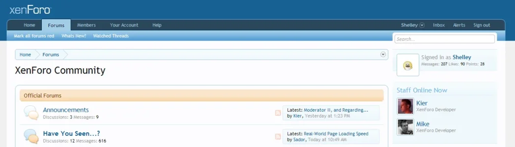
Where the "Marked all forums read" "what's New?" and "watched threads" I feel the gradient should be more gradual rather than 50/50 split so the text is more readable. Below is a mockup just wondering if a gradual gradient would be implemented? Entertatined? Not to mention I feel it looks better.
 

Attachments

  • Navbar_Mockup.webp
    Navbar_Mockup.webp
    26.7 KB · Views: 131
  • Navbar_improved_mockup.webp
    Navbar_improved_mockup.webp
    13.9 KB · Views: 125
Upvote 6
This suggestion has been implemented. Votes are no longer accepted.
We need to make sure that it's consistent with other places in the forum as the 50/50 split theme could be used elsewhere and in that case should be changed also.
 
I honestly don't think it is. The only other headers used I seen are the tanned colour (forum cats) and the blue toned used in the footers (thread display for example) I'd need to explore around more but I'm sure they are the only other headers used throughout.
 
I too prefer Shelley's recommendation

Right now the navbar feels late 90's, as if somebody got overzealous about gradients :p
 
Just uploaded a more refined (seamless transition between the nav Gradient & tab) mockup. Gives you a better visual when quality isn't compromised and me taking shortcuts in photoshop.
 
+1 for a smoother navbar gradient. :)

Navbar? or shall we say Tab Links as that's what it's named in the html source.
 
Should just be a stylevar property you can change to a darker color.

Nice suggestion Shelley.

I am glad "What's new" btw, .. isn't in the middle - I really would dislike that :)
 
it is just the light-blue-color at the upper-side of this navbar-element, which makes the white text a bit hard to read........

Also, when hoovering over the word "Forum", there is no indication that you can actually click onto the word "Forum" in order to get back to the Forums-list.
Meaning, the word "Forum" should get underlined or something else in order for the user to recognize that he is still able to click on the word "Forum". If you do not like to underline the word on hoover, maybe make it with a background-change on hoover, so that the user understands he can click on the owrd "Forum".
 
The change of the arrow cursor to the hand/pointer cursor is a universal indicator that an item is clickable.
 
Our gradients don't contain any color, they just lighten or darken what's there. This is to make base color changes much easier. The color also has to come from our color palette set, which has more than enough blues in it as is (we have a selection of "primary" and "secondary" colors). As far as we can tell, the gradient doesn't pull from one of the colors in our set.
 
Top Bottom