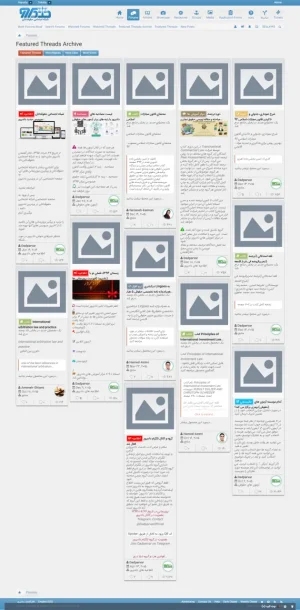
[HA] CTA FT Layouts

[HA] CTA FT Layouts 1.2.6

No permission to download
Thanks to @Brad P and @Gemma for letting me know about this add-on :)

I'm curious as to what size of featured thread icons you guys are defining in the main CTA Featured Icons options area.

What dimensions do you recommend for three or four columns?

I assume the slider option is better used with the list view template too.
I am currently using 313x313 for my featured thread icons.

not sure if this works for you. How are you finding the addon?
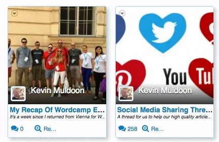
 
I am currently using 313x313 for my featured thread icons.

not sure if this works for you. How are you finding the addon?
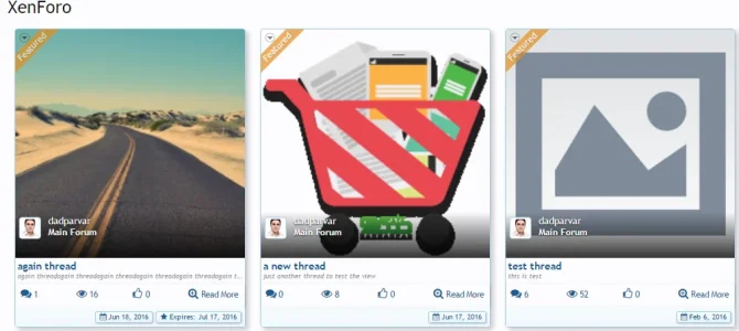
Yeah it seems great. No errors and does exactly what it promises.

I was using the automatic featured option in CTA Featured Threads. I am going to manually set them now so that I can point users to the best discussions. :)
 
Thanks to @Brad P and @Gemma for letting me know about this add-on :)

I'm curious as to what size of featured thread icons you guys are defining in the main CTA Featured Icons options area.

What dimensions do you recommend for three or four columns?
Sorry, I don't use this add-on so I can't help you with layouts or dimensions. But if I was using a fixed style I'd tend to go with 3 columns (in fact I don't think I would use 4 columns at all as it tends to give a "squashed" look but that's just my opinion)
 
Dadparvar updated [HA] CTA FT Layouts with a new update entry:

Fix of conflict between AMS and SC and CTA FT Layouts's Grid View!

Because AMS and Showcase add-ons are using the same way as XFMG to control the responsive elements on Grid View, and my add-on was also using the same way, so when we wanted to have latest of Showcase and AMS in Grid View in portal page and then also wanted to show the featured threads in Grid View, then there would be a conflict between their setting of the number of Grids in a row.

Now the problem is fixed and you can activate Grid view for all of them together on portal page. ;)
  • ...

Read the rest of this update entry...
 
On the Masonry layout how do you reduce the amount of text shown on the portal page?
When you are featuring a thread or editting featured thread, you can set whqt to show as description.
Masonry is free in this situation and its its advantage.
Masonry is not to be like Grid view ro have all grids in the same height and width. It is to have all grids free in height but stick them together to fill the free spaaces vetween them.
If you have any opinion, feel free to post it so thqt I know.
 
I love the masonry concept I just don't want it to show so much text 200-300 characters only maybe and I can't figure out how to do that.
 
is it possible to click on the entire box to go to the thread? something similar to what happen in sonnb gallery and xfmg
 
is it possible to click on the entire box to go to the thread? something similar to what happen in sonnb gallery and xfmg
Grid View is behaving exactly like XFMG and Masonry layout is behaving exactly like sonnb Gallery in this situation.
 
Great work updating the add-on so frequently @Dadparvar

I noticed some things in the layout that I think could be improved slightly.

The "Read More" link, for example, displays as Re... even though there is lots of room for the full phrase to be displayed.

cta-ft-layout-1.webp

I'd also like to remove the excerpt so that the full article title could be displayed. So instead of having ... after so many characters, the article title will simply break to the next line(s) so that it is displayed in full.

Can this be easily done using existing settings?
 
The "Read More" link, for example, displays as Re... even though there is lots of room for the full phrase to be displayed.

cta-ft-layout-1-png.137172
Its weird! Its OK in my local:
2016-07-05_17-45-00.webp

But I'll take a look to see if I can find any problem with it or not. If found, will fixed for next version.

I'd also like to remove the excerpt so that the full article title could be displayed. So instead of having ... after so many characters, the article title will simply break to the next line(s) so that it is displayed in full.

Can this be easily done using existing settings?

Honestly speaking, it won't be a good idea for Grid View. Because Grid View layout is not like Masonry to fill the blanks in other rows. So when one of Grids in a row, get more height than others (for example because of having longer title or description) then Grid of the row below it will be displayed with different spaces and its not good at all.

If you want to have full title + freedom in description feel free to use the Masonry. Its so nice and I really like it. It also shows the images in the description and will resize it to fit the Grid. It also parses all bbcodes:
2016-07-05_17-54-10.webp

Its easy to add an option to let you choose if you want to have full title in Grid View or not, but because it is not what Grid View was designed for, so prefer not to add it (as you know, the more options, the more questions from users ;))
 
Would it be possible to extend the post length to a set amount for all grid items?

For example, expand the space for the post title to two lines instead of one for all grid items. Or extend it to three lines?

This would ensure that the grid layout remains intact.

:)
 
Would it be possible to extend the post length to a set amount for all grid items?

For example, expand the space for the post title to two lines instead of one for all grid items. Or extend it to three lines?

This would ensure that the grid layout remains intact.

:)
As I explained to a user in this thread, before; still we don't have a css that be supported by all browsers to limit the lines (we have some, but most browsers still doesn't support it. I explained it before in this thread)
And about expanding description, again I explained it before in this thread that how I limited it. So you just need to reverse it.

All the things you want is possible to be done with a few css tricks and so, but three reasons don't let me to make them in core:
  • Some of them are not really suitable (although in first sight they seem to be good, but as time goes by you won't use it)
  • The add-on is free and its not really in priority. (although I supported it like paid add-on so far :LOL:)
  • Some requests are so personal and not all user will need it. So they are like custom requests. (I try to do them too as free, but it time taking as you know and its not really in priority. Although they can be done as custom work)
Now I'm working on a new add-on to add more widgets. Which I think it is needed now. I added 4 widgets so far and working on other things + making them good looking ;)

After that I'll work a little more on it to implement a few more options and features. But anyway, if you want something fast, you can contact me to do it as custom work and you and others be able to use them.
 
Back
Top Bottom