Flexile

Flexile 1.1.5.1

No permission to download
Status
Not open for further replies.
anybody ? :(
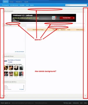
I'm not really sure why you would want to do this (I think it breaks the design of the style personally), but the best way to do it would probably be to add the ad divs within the <body> or <html> tag at the bottom of the page and then do something like this:
Code:
#adDiv1, #adDiv2 {
position:absolute;
top: 35px;
}

#adDiv1 {
left: 0;
}

#adDiv2 {
right: 0;
}

Erik,

Are any of the style icons changed in either flexile & flexile dark styles? I am referring to all the png and gif files in folders such as acp-icons, avatars, color-picker, etc. Are they all identical to the standard XF install?
Only the avatars are changed in Flexile Dark. As far as am I aware everything is the same, unless something was changed on me in the default style and I didn't catch it.
 
Hey,

Future suggestion: There's a handful of png images included in the style that could be optimized, perhaps consider running the images directory for Flexile/Dark through PNGGauntlet or some other useful tool to help keep loading as quick as it can be... :)
 
Hey,

You're correct, I wasn't thinking about the true source of the majority of the images. My apologies lol

I'd like to see this done with the core images, obviously... Thanks for the correction, Oracle.
 
How would I go about using my own custom read/unread icons? I tried using some I made but they come up all weird. My site, they have a white/transparent background, but the style is making it have a blue background.
 
Just to confirm this is what you want, try adding the following to EXTRA.css

Code:
.nodeIcon { background-color: #ffffff !important;}
 
I had removed my breadcrumb early after my install. I recently added them back in and have some CSS issues.

For the forums they look perfect. I wish to have my breadcrumbs appear on all pages as they do on the forums.
XFBreadcrumbGood.webp

On my Wiki page the top breadcrumb is too wide. I know the issue is related to the margins. My current margin is set for 0 -20px; which works perfect for the rest of the site, but it causes this issue only on my Wiki page. How can I adjust the margin only on the wiki page? I have tried dozens of combinations in EXTRA.css and couldn't get anything to work.
XFBreadcrumbBad1.webp
 
I was able to fox the issue, but would prefer a cleaner solution if anyone knows of one.

I modified the code in breadcrumb.css to the below. It works, I just think it can be written cleaner. I prefer not to modify this template but instead add something to EXTRA.css
<xen:if is="{$contentTemplate} != 'EWRcarta_PageView'">
margin: 0 -20px;
<xen:else />
margin: 0;
</xen:if>

I thought I had this thing beat but I do not. Issue still remains.
Finally got around to looking into this. It's because the little bit of code you have to remove the page container on the Wiki pages also removes the 20px of left and right padding inside the #mainContent container, so there's nothing to balance out the -20px margin.

The easy fix is this (add to EXTRA.css):
Code:
.breadBoxTop, .breadBoxBottom {
    margin: 0 -20px; /* restoring to default */
}

.EWRcarta_PageView .breadBoxTop {
    margin: 0 !important;
}
 
I fix the arrow?

Img:
View attachment 14120

Thx ;)
This is kind of a visual quirk that has existed since the very first release of the style. It's not really an issue without the black unselected boxes, though. If it's really bothering you, try adding this to EXTRA.css for the Flexile style:
Code:
.navTabs .navTab.PopupClosed .SplitCtrl {
    margin-left: -24px; /* move to the left 10 more pixels */
}

.navTabs .navTab.PopupClosed .navLink {
    padding: 0px 20px 0 10px; /* add 10 more px of padding to the right */
}

.navTabs .publicTabs .navLink {
    padding: 0 25px 0 15px; /* make the padding consistent for opened tabs, too */
}

Just be aware that I think this looks worse, personally. :)

THX, I only used this part of code

;)

Code:
.navTabs .navTab.PopupClosed .SplitCtrl {
    margin-left: -20px; /* move to the left 10 more pixels */
}

.navTabs .navTab.PopupClosed .navLink {
    padding: 0px 15px 0px 10px; /* add 10 more px of padding to the right */
}

nav.webp
 
A really small detail I noticed in a convo today. Either the bottom corners of the Conversation Participant box should not be rounded, or the Invite More box should be round or lowered or ?something. It just seems a bit off.

xfflexile.webp
 
Yeah that's an issue with a few add-ons too (such as Recent Status, etc.) when used with this style... That added section footer should maybe have slight padding and rounding placed with it. Not sure what else would look better than that...
 
Yeah that's an issue with a few add-ons too (such as Recent Status, etc.) when used with this style... That added section footer should maybe have slight padding and rounding placed with it. Not sure what else would look better than that...

that would work too. Either leave it connected and take away the rounded edges of the upper block, or separate it further and give the lower block rounded edges to match.
 
You could try adding a margin-top to the sectionFooter class to separate it from the content.

It will affect all elements using that class though.
 
Status
Not open for further replies.
Top Bottom