Flexile

Flexile 1.1.5.1

No permission to download
Status
Not open for further replies.
Jaxel said:
The limitations on Flexile are due the nature of how it removes the content box from around pages that have sidebars. It makes the skin look a TON better, but XenForo wasn't originally designed for this purpose.​
Can someone show me an example/screengrab of this feature of Flexile ?

I can't understand the benefits of removing the content box around pages with sidebars.

I still don't understand this feature of Flexile. Is there an explanation that would be understandable by a non-style designer.
 
Erik, I can't find where I can change this - see screenie. That blue line.
Can you help me out (again)?

mod bar.webp
 
This seems to be another Flexile issue. When I change that color in the default style it does change. But changing it in Flexile doesn't work.

ohhhhh ERIK! :)
 
Peggy, you need to change the border-bottom property of #userBar in user_bar.css. :)

Code:
#userBar
{
    background-color: @veryDarkMonochrome;
    border-bottom: 1px solid @primaryHighlight; /* @primaryLightish*/
    font-size: 12px;
}

In the default style, this is called #moderatorBar, but I restructured some things for Flexile because of the additions I made to the bar. :)
 
Don't mean to sound impatient but I'm curious how the dark style is coming along. :) Still planned for the next few days? Any screenshots we can see ahead of time?
 
Don't mean to sound impatient but I'm curious how the dark style is coming along. :) Still planned for the next few days? Any screenshots we can see ahead of time?
It's coming along. I've been very busy this week so I'm not sure whether I'll be able to get it done by the end of this week or not.

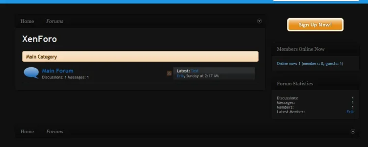
flexiledark.webp

Obviously this is still very much a WIP, and there is a lot of tweaking to do (I'm worried the overall tone may be too dark), but since I've been quiet lately I figured you at least deserved a screenshot of what I currently have. :)
 
Yeah, thats way too dark... the background should be dark, but the actual block elements should be a little lighter.
 
It's coming along. I've been very busy this week so I'm not sure whether I'll be able to get it done by the end of this week or not.
Obviously this is still very much a WIP, and there is a lot of tweaking to do (I'm worried the overall tone may be too dark), but since I've been quiet lately I figured you at least deserved a screenshot of what I currently have. :)

Very Nice. I will definitely be using that. I have been struggling to choose a default theme for my forum,but I think that will be it!
 
Thanks, looks great, I'm really looking forward to it!

I do kind of agree about the blocks, maybe a tad lighter.
 
Hey Erik, question. I have placed a Twitter logo in the right container on the header. However, I feel that it is a bit too far over to the right.
So, how would I adjust that to move the container over to the left a bit. Which template? or is it a margin? If so, I can't find either one.
 
Status
Not open for further replies.
Back
Top Bottom