You are using an out of date browser. It may not display this or other websites correctly.
You should upgrade or use an alternative browser.
You should upgrade or use an alternative browser.
XF2 [8WR] XenPorta 2 (Portal) PRO [Paid] 2.3.0.4
No permission to buy ($40.00)
- Thread starter Jaxel
- Start date
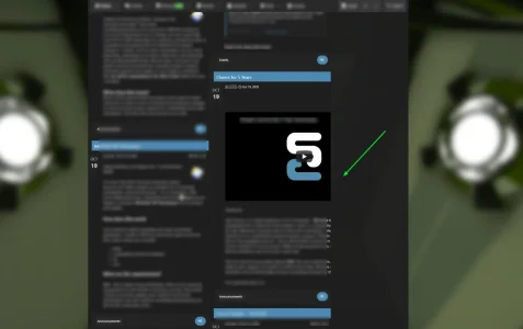
Add to extra.css:Hi Jaxel, nice update! One issue I noticed after the update is some posts do not seem to fit properly:
View attachment 243613
.porta-article-item .message-main { max-width: 100%; }I will add it in the next release in the core code.
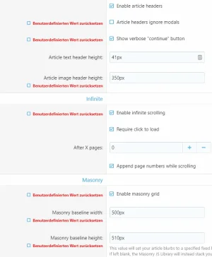
In the Style Properties, make Masonry Baseline Width higher. It defaults to 350px but I found 500px worked to get the two column look. I do plan to experiment more on the weekend.@Jaxel Is there any way to have two columns again? I'm not happy with 3 on desktop. Thanks.
Scratch that. Doesn't work on mobile. Too wide. Hadn't tested on my phone yet (I only have the new version in my dev).In the Style Properties, make Masonry Baseline Width higher. It defaults to 350px but I found 500px worked to get the two column look. I do plan to experiment more on the weekend.
Actually, even the default 350px is a bit too wide for my Galaxy S9. Not enough to affect readability but I can slightly side scroll. Turning off Masonry gives the best results on mobile, actually. I am thinking I might keep my prod on 2.2.0.5 for now until I can tinker more. This doesn't quite work as i would like.
Thanks, Mendalla. It worked well on desktop, but not on tablet or mobile. This update is a disaster. My portal is totally ruinedActually, even the default 350px is a bit too wide for my Galaxy S9. Not enough to affect readability but I can slightly side scroll. Turning off Masonry gives the best results on mobile, actually. I am thinking I might keep my prod on 2.2.0.5 for now until I can tinker more. This doesn't quite work as i would like.
Your live? Restore or remove Xenporta and reinstall 2.2.0.5 (or whatever version you used to be on) and restyle. That's why I tried in my dev first.Thanks, Mendalla. It worked well on desktop, but not on tablet or mobile. This update is a disaster. My portal is totally ruined
Yes. Jaxel's updates are usually stable and improve things, but this one failed big time with the new flex box thingy. It doesn't fit well on mobile or tablet.Your live? Restore or remove Xenporta and reinstall 2.2.0.5 (or whatever version you used to be on) and restyle. That's why I tried in my dev first.
D
Deleted member 25216
Guest
I've not used xenPorta for a while but I used to set the widths at either 500px or 250px for mobile device, not sure if that would be any help here thoughIt worked well on desktop, but not on tablet or mobile. This update is a disaster. My portal is totally ruined
Code:
.porta-masonry {
    grid-template-columns: repeat(auto-fill, minmax(500px, 1fr));
}

@media (max-width: @xf-responsiveWide)
{
.porta-masonry {
    grid-template-columns: repeat(auto-fill, minmax(500px, 1fr));
}
}
@media (max-width: @xf-responsiveMedium)
{
.porta-masonry {
    grid-template-columns: repeat(auto-fill, minmax(250px, 1fr));
}
}

@media (max-width: @xf-responsiveNarrow)
{
.porta-masonry {
    grid-template-columns: repeat(auto-fill, minmax(250px, 1fr));
}
}Thanks a bunch, Gemma. Unfortunately, the issue goes further than width. There used to be a nice gap between the articles on tablet that is no longer there. And I cannot revert to the older version either. Hopefully Jaxel will rectify all these issues soon.I've not used xenPorta for a while but I used to set the widths at either 500px or 250px for mobile device, not sure if that would be any help here though
Thanks, Mendalla. It worked well on desktop, but not on tablet or mobile. This update is a disaster. My portal is totally ruined
Me too. I have Infinite an Masonary disable in the Style Property. At the moment I use 1 boxes with the same width. But this cannot be the future.
You are correct, Jaxel. Upon further inspection, some of the custom changes on many of my styles were responsible for the issues. However, when I tested the portal on a fresh default style, some issues such as horizontal scrolling and the blocks not fitting right remained on mobile and tablet. I have now reverted to the previous version and all is good again.You'll have to show screenshots or links. Because everything looks fine for me. On every skin.
Okay, some screenshots to illustrate. These are done "out of box" with Default Style so that my styling is not a factor.
With the default "Masonry baseline width" setting of 350px, we get this on desktop:
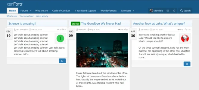
Which does this on mobile (it's just a bit too wide, not terrible but a bit messy):
Now, that is fixable by changing to 300px but it still leaves us with three columns on desktop.
However, what I want (and I think @l3ta, too ) is something like this, which requires going to a higher px (this is 500):

However, that gives us this on mobile, which I cannot go to prod with:
So what we are asking is how to get a 2 column display on desktop and still have it adapt properly to a mobile screen. With the previous version, we could set "Masonry columns" to 2 to get the desired desktop display and that adapted properly down to one column on a small screen like my Galaxy.
With the default "Masonry baseline width" setting of 350px, we get this on desktop:

Which does this on mobile (it's just a bit too wide, not terrible but a bit messy):
Now, that is fixable by changing to 300px but it still leaves us with three columns on desktop.
However, what I want (and I think @l3ta, too ) is something like this, which requires going to a higher px (this is 500):

However, that gives us this on mobile, which I cannot go to prod with:
So what we are asking is how to get a 2 column display on desktop and still have it adapt properly to a mobile screen. With the previous version, we could set "Masonry columns" to 2 to get the desired desktop display and that adapted properly down to one column on a small screen like my Galaxy.
How does it look on a mobile device, though? I can get it the way I want on a desktop. It's on phones that @l3ta and I are having problems.I played around a bit and tested. This are my preliminary results.
View attachment 243788
View attachment 243789
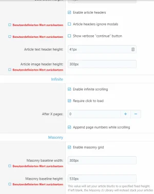
I have made the following settings.
2 columns
View attachment 243791
3 columns
View attachment 243792
It does not work 100%, but its near by.
Thanks for the input.
Similar threads
- Replies
- 0
- Views
- 527
- Replies
- 0
- Views
- 739
- Replies
- 485
- Views
- 38K
- Replies
- 384
- Views
- 26K
- Replies
- 65
- Views
- 6K
