Style XenBase Framework - pixelExit.com

It's been awhile since an update so... :)

In 1.4.4 one of the bigger changes is a complete redo of our footer system. Previously we had set footer layouts where you could go in and do basic editing. We've gotten rid of the layouts completely and now you have total control over them using the new setup. Tutorials will come shortly following the release but now you can set each blocks width/disable certain columns and re-arrange things easily.

Here are some examples I whipped up really quick(super easy!)

View attachment 94958 View attachment 94959 View attachment 94960 View attachment 94961


The footer area supports a maximum of 4 columns, and you can go down to even a single row with no columns if you wanted too. One of my favorite parts is you can easily add widgets using the Widget Framework :)


On top of that we also have some new post layouts that are shipping out with all of the styles.
Optional horizontal postbit(can disable/enable the message elements like normal)
View attachment 94962

"Modernized" layout, it's the one we use on our official site, quite popular so we stuck it in for all the styles :).
View attachment 94963


Another note... we've made improvements so the Font Awesome Message User Info. Previously you could only use 3 with this setting(Messages/Likes/Trophies). We've since re-worked it a tiny bit, there's still no easy way of getting every message element to show up condensed like the others but this is our little fix for it:

Normal with just the default 3 enabled:
View attachment 94964

Now if you enable anymore it will take the default form but use font awesome(optional).
View attachment 94965
Of course you can disable the boxes and have just:
View attachment 94967

Or the regular phrases:
View attachment 94968


Past these features we've made a lot of nice smaller additions, improvements and various fixes.

Email notifications will be going out when the styles are fully updated and ready to be downloaded.

Awesome Font Awesome tweaks! Love it.
 
Looking nice Russ! Loving the four columns!

As suggestion, maybe implement the classic postbit but with a horizontal layout.

We've made a few of these changes on the 1.4.3 version ourselves and it looks rather nice, see here for an example.
 
Looking nice Russ! Loving the four columns!

As suggestion, maybe implement the classic postbit but with a horizontal layout.

We've made a few of these changes on the 1.4.3 version ourselves and it looks rather nice, see here for an example.

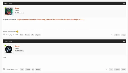
Technically you still can with the new setup. You just enable "Enable Message Header" and the Horizontal Post bit:

Screenshot_6.webp

I just added a margin top to the user bar of like 5px.
 
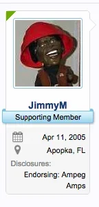
I'm loving the FA message user info. @Russ , just because we can never get enough... any tips on if/how we can add FA to custom user fields displayed in the postbit? So for example instead of "Disclosures", it'd be a FA icon instead:

Screenshot at Jan 20 23-53-57.webp
 
I'm loving the FA message user info. @Russ , just because we can never get enough... any tips on if/how we can add FA to custom user fields displayed in the postbit? So for example instead of "Disclosures", it'd be a FA icon instead:

View attachment 95595

You may be able to achieve it via a conditional on the messageuserinfo but not entirely sure.

You can use some CSS trickery though:

Code:
.messageUserInfo .userField_disclosures.xbCustomField > dt:before {
  content: "\f0f7";
  font-family: FontAwesome;
  font-weight: normal;
  padding-left: 2px;
}
.messageUserInfo .userField_disclosures.xbCustomField > dt {
  height: 16px;
  overflow: hidden;
  width: 13px;
}

Replacing the f0f7 with an icon you want, currently it's a building. I don't think this method has any adverse effects :)
 
@Russ, just a very small suggestion: What about adding the following to the XenBase framework
  • Center usernames and usertitles
  • Current Style
  • Alternative "like system". EG: View Likes: 999
  • Tooltips
My reasons:

  1. The framework is called XenBase, so why not have 2 options to center your usernames and usertitles?
  2. Current Style. You should add this as a extra feature(seeing as not much people have "Current Style: Style"
  3. I like the idea of having an alternative "like system". Again, not much people have this on their site at all.
  4. XenForo tooltips(See here)

So, but adding these 4 suggestions you're improving the framework. A bonus is that all of the suggestions are really easy to do.

Oh, and I'm aware that you can add text-align: center in message elements to center your username and usertitle, but again, if it was a part of the framework it would be a bonus.
 
Last edited:
@Russ, just a very small suggestion: What about adding the following to the XenBase framework
  • Center usernames and usertitles
  • Current Style
  • Alternative "like system". EG: View Likes: 999
  • Tooltips
My reasons:

  1. The framework is called XenBase, so why not have 2 options to center your usernames and usertitles?
  2. Current Style. You should add this as a extra feature(seeing as not much people have "Current Style: Style"
  3. I like the idea of having an alternative "like system". Again, not much people have this on their site at all.
  4. XenForo tooltips(See here)

So, but adding these 4 suggestions you're improving the framework. A bonus is that all of the suggestions are really easy to do.

Oh, and I'm aware that you can add text-align: center in message elements to center your username and usertitle, but again, if it was a part of the framework it would be a bonus.
Hey Demon

1. I think most if not all our styles already center the username, if not it is a simple property change.
2. Not sure what you mean by this, the chosen style is shown in the footer if more than one is available to choose.
3. Again not sure what you mean here.
4. If you would like to make a suggestion you can post that on our site for consideration as it will get lost here but it seems like a good idea for the most part.
Hi Steve,

I'll make a account now and explain it better their.
 
@Demon regarding your first point this 1.4.5 release we're about to get out is primarily an improvement based release. The message layouts have been revisited to make for far easier styling, part of that is the usernames will be centered by default. Also going forward you can adjust just the message user info width and the layout will automatically adjust, previously it was like a 3 step process to explain.


Thanks for the suggestions:), we're always looking for ways to improve it without going too crazy
 
Look great already and I like working with it. There is however 1 thing I would like added and that is more social media links.

I understand that not all of them can be added, but maybe a few empty fields where people can add some custom ones, including a custom icon.

The one I am looking for in particular is player.me (a relatively new social media site for gamers)

Using the Frag Zone style btw

It is hard to get all the social icons but we add them as Font Awesome does(has a good selection).

But with that said it's pretty easy to add your own.

Open up: xb_social_links

Find:

Code:
  </xen:contentcheck>
</ul>

Add this right above that:

Code:
<li class="xbslPlayerMe"><a href="playermelink" target="_blank" title="RSS"><span class="PlayerMeIcon"></span></a></li>

Then in extra.css:

Code:
.PlayerMeIcon
{
   background: url("http://static.wixstatic.com/media/f5ffa7_d670d83c6df1477591efd13da5219b67.png") no-repeat scroll center center / 100% auto;
   display: block;
   height: 30px;
   margin-top: 5px;
   width: 30px;
}

Of course save/find your own player me icon and upload to your site.


Screenshot_1.webp
 
Last edited:
I'm playing around with ours and I am just trying to make things a bit neater for our mobile users.
As there's no app that works (forumrunner, tapatalk etc) I'm wondering if we can fiddle with Xenbase settings to make it a bit more user friendly for our mobile users.
Is it possible? This is a powerful framework and I know it's got a plethora of options and goodies, which is excellent, but it is also why I am asking if it can be change a bit for more mobile use?

The menus I need to play with specifically. If a user is on his mobile, the menus are a little bit tricky.
Would this be the theme (splash) or Xenbase that I can play with?
Any help would be most appreciated as I'm getting some feedback from people with mobiles who love it, but have asked if some of it can be tweaked..
Thank you so much. :)

Technically we ship it out stock to where the usernav works identical to the XenForo nav in responsive. We do have options which could change things like make entire link the pop hover which could have conflicts on mobile potential, and a few other navigation items.

With that said part of the next release of XenBase I am doing some general mobile tweaks(as an option) to clean up in mobile devices. If you want to PM me your site I could take a look and see if there's any quick fixes I can help with you in the mean time.

Yes this is what is a concern of mine personally, the default look is amazing and I do enjoy it, but some users find it difficult.. Grr
Oh great, that sounds very interesting!
I'd love to be able to use some font awesome icons on specific nav tabs, but that is on my wish list ha :D
Okay Russ, and thank you so much.. PM sent (y)
 
Back
Top Bottom