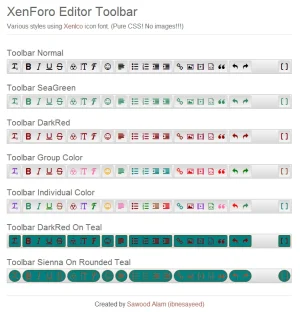
a little copy/paste background css from the like's div in firebug. Borders could go a bit darker I guess.
View attachment 48143
Look good and completely consist with default XenForo style.
a little copy/paste background css from the like's div in firebug. Borders could go a bit darker I guess.
View attachment 48143
Wow! So pretty!!!Are these the icons you were waiting for that were from the dark new horizons style I did?
edit: not all added yet. But these are kind of old designs but designs i'll probably release first.
View attachment 48149

The blue mockup isn't ugly at all. That's far better than the current iteration. But I'm guessing Kier & co implemented it just for testing in this early beta and will be fine-tuning it colorwise before the final release.Because its fairly ugly?
View attachment 48140
Grey is easier to create a gradient, it looks neutral and looks fairly decent in most styles (without edits).
I'll refer to Brogan's comment. It was designed to be grey, and doesn't look out of place or unfinished to me.
Same as TinyMCE then.Saying the grey version is good just because it was made that way just doesn't make sense. It clearly stands out of the general color scheme, making it look alienated and half-baked.
Same as TinyMCE then.
Same as TinyMCE then.
So, since something else is out of sync it's ok to make this the same way?
There were no complaints for three years.
Suddenly the editor is THE WORST EDITOR IN THE WORLD EVER, despite looking very similar and having more functionality.
You don't have to yell. They are not designed the same way, there are some important differences.There were no complaints for three years.
Suddenly the editor is THE WORST EDITOR IN THE WORLD EVER, despite looking very similar and having more functionality.
You can style that.The grey color is not the same, the old editor have a warmer tone which makes it far more compatible to the overall default theme. The new one is just colder and out-of-sync with the default theme.
You can style that.The new editor suddenly introduces two opposite gradients which makes it appear noisier
You can style that.The old editor has some color icons which makes it easier to find what you need
All of those points have been discussed ad nauseum.
Style it to suit, as with any other aspect of the design.
You can style that.
You can style that.
You can style that.
It is impossible to please everyone all of the time.
Changing the gradient to suit the preference of one group is going to annoy another group who happen to think it looks OK as it is.
It should be nice that XenForo developers talk together, adjust slightly their default design (the gradient "problem" on buttons, the font weight on italic, underline, strike, and why not integrate a font-icon like major editors do in their last versions) to make everyone happy and stop this debate on design that is a prejudice of the work that has been done in the background. Telling "You can style that" is not going to make those customers happy.
We use essential cookies to make this site work, and optional cookies to enhance your experience.