You are using an out of date browser. It may not display this or other websites correctly.
You should upgrade or use an alternative browser.
You should upgrade or use an alternative browser.
Fixed Title case inconsistency with Log in and Sign Up buttons
- Thread starter Paul B
- Start date
Alteran Ancient
Well-known member
Took me a minute to look at it before I noticed what was wrong with it. XD
Nice catch.
Nice catch.
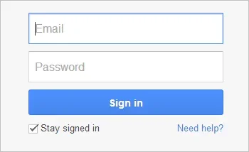
I mean the checkbox isn't needed when you sign up. Only when you log in. Hence why it should be disabled when trying to register."Stay logged in" is a checkbox, not a button, so it follows the same convention as the radio buttons.
I thought the same. But being the geek I am, I decided to check.You can choose to stay logged in when you sign up.
The checkbox has no effect on a new registration. When the registration has taken place it sets the remember key regardless of that checkbox state prior to registration. So as there is already some JS magic that modifies that area of the form depending on whether it is a Log in or Sign up it might be worth extending that to hide the remember checkbox. Or at least carrying that checkbox state through the registration process..
I don't disagree. But it seems some don't like the inconsistency. So what about Log in and Sign up vs. Log in and Sign Up?This was actually an intentional case as I simply didn't like the look of Log In rather than Log in; I figured that the lowercase i actually made it more readable. Anyone may feel free to disagree and I'll consider changing it
Null
Well-known member
I'd hate to disagree against you, but in this case I'm going to have toThis was actually an intentional case as I simply didn't like the look of Log In rather than Log in; I figured that the lowercase i actually made it more readable. Anyone may feel free to disagree and I'll consider changing it
I'd rather it be 'Log In'.
Moshe1010
Well-known member
CTXMedia
Well-known member
So what about Log in and Sign up vs. Log in and Sign Up?
Actually, yes, I think that looks better: Log in & Sign up
Carlos
Well-known member
For log in buttons, I would capitalize it... It feels correct that way. Thing is, what you're trying to do is a call-out to the user.This was actually an intentional case as I simply didn't like the look of Log In rather than Log in; I figured that the lowercase i actually made it more readable. Anyone may feel free to disagree and I'll consider changing it
Everything else is fine.
I'm not really bothered by it, that's just how I feel, that's all. It's your software.
Moshe1010
Well-known member
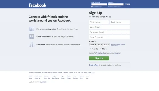
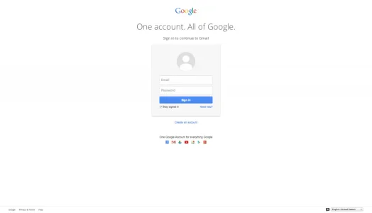
The only reason I can think of for these differences between us is maybe our geographic location. I guess Gmail and Facebook have different versions for UK and US.
Edit: Yes, I was right. Go to Facebook, choose English US, and you will see "Log In". Choose English UK and you'll see "Log in". I don't know any British English rules, so it's up to you guys.
Last edited:
Similar threads
- Replies
- 0
- Views
- 939
- Question
- Replies
- 7
- Views
- 2K


