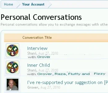
Implemented [Suggestion] Personal Conversations / showing Avatar of person initiated the conversation

erich37

Well-known member
when clicking onto "Inbox / Show all", then we see the list of all Personal Conversations we have had.

I was just trying to find a certain Private-Conversation in my Inbox.

It took some time to look for this, as the subject-title of most of my messages are very similar.
Also at most of those, my own Avatar is showing-up - as I assume it is always showing the Avatar of the person who started a specific Conversation.

As I have started most of the Conversations, it is showing my own Avatar on most of my Inbox, which does not help to find a specific Conversation.

BTW: looking onto the Inbox-Drop-Down, it is also showing my own Avatar. It does not help to see my own Avatar there, it would help in a big way to see the avatars of the users who are talking with myself.

Suggestions:
For the Inbox-Drop-Down-box, I would suggest to show the avatars of people who I am talking with, but not show the Avatar of myself (just because I had initiated the Personal conversations).

For the Inbox-list, I would suggest you show the Avatars of ALL people who participated in a certain conversation.
 
Upvote 14
This suggestion has been implemented. Votes are no longer accepted.
I wouldn't want a popup (neat design re space but not in terms of accessibility)

I recognise people as much or more by names rather than avatars. Avatars are nice but people do chjange them. So I want a text list of names. See below.

Peggy was worried (earlier) re holding up the rollout. I think if that;s a n issue the Suggestions area would be suspended. As it is K&M do a good job of noting and listing, then prioritising. They gave us a Suggestions area so we use it.
Also don't forget one of people's key dissatisfactions 'elsewhere' was not having a seriously handled suggestions area. XF is really good on that so far.

XFpostbit.webp

XF Convo.webp

If lots of names are a problem (admin seting 6+ then the no of names listed here could be restricted to the first 6 to use the convo.
 
I wouldn't want a popup (neat design re space but not in terms of accessibility)

I recognise people as much or more by names rather than avatars. Avatars are nice but people do chjange them. So I want a text list of names. See below.

Peggy was worried (earlier) re holding up the rollout. I think if that;s a n issue the Suggestions area would be suspended. As it is K&M do a good job of noting and listing, then prioritising. They gave us a Suggestions area so we use it.
Also don't forget one of people's key dissatisfactions 'elsewhere' was not having a seriously handled suggestions area. XF is really good on that so far.

View attachment 1309

View attachment 1310

If lots of names are a problem (admin seting 6+ then the no of names listed here could be restricted to the first 6 to use the convo.

Totally agree on everything you said.
 
I think this would be quite nice. I'd use the space under the personal conversation title for this. Always have the PC starter first, then add the other participants after that. Limit the total in case 100 people are participating in the PC.

pc.webp
 
Please include this in Gold

[No, thanks] <--- just kidding :p! Realize... when we have to mouseover something to see something that is important for us to see immediately, then it doesn't serve the purpose.

Why just not (for the time being) display ALL the participants usernames underneath (or next) the little grey username (the one who started the thread) in this list: http://xenforo.com/community/conversations/

That would solve it more or less. I mean the number indicating how much participants a PC has, is a bit useless isn't it? WHY do I need to know how many participants a PC has? I want to know WHO those participants are, that is much more important.

I am taking a break from XenForo for the coming time, but thanks for all the mockups that have been posted in line with the above suggestion. I just wanted to let the developers now that this really 'should' be in when XF becomes Gold. I just had a real-life practical example/experience with this issue... I wanted to look for a conversation I had with someone (in this case Kier, but it doesn't matter... /namedropping mode off ;)) and... I just couldn't find it :confused:! As erich37 (TS) and many people have pointed out indeed... it is just impossible to see with which person(s) you had a conversation in the overview... this really needs improvement to make the PC system pleasurable to use. Thanks.

! Please like the 1st posting of this discussion: only 2 persons have [Liked] it so far (wondering now... what the real practical value is of using 'likes' as a means of measuring the popularity and/or actual importance of suggestions, but that's another topic)... and this is an important suggestion for the usability of XenForo. Thanks.
 
Participants data on conversation list is seriously useless right now. I have a hard time trying to find my conversation with different people, especially if they have the same or similar topic.

It would be very useful if we can have a list of the participants appear in dhtml tool tip -- much like forum description -- if we hover our mouse over it. The list should probably show no more than 3 or 4 lines, and offer the remainder of the list as a scrollable pane or something along that line. This will help a little bit in finding the right conversation more quickly.

Alternatively, it wold be nice to be able to some how filter the list by participant(s). IE: Show me only conversations between myself, Kier, and Mike.
 

Attachments

  • participants.webp
    participants.webp
    1.5 KB · Views: 6
This would be nice! :) When you click on the inbox to view your conversations it doesn't say who you are in conversation with? It would be nice to know who you had a conversation with instead of looking through them all, as my memory does not last that long.... :D I think adding the person or person name beside yours in the conversations drop down would be nice!
 
If so many people agree this is a great (I believe it is a necessary one) idea, then please (as pointed out here in subtle big neon letters ;)) like the first posting. Only 3 persons so far... a bit remarkable because everyone will be using the PC system.
 
Back
Top Bottom