Style Critique: Echo

Status
Not open for further replies.

Trombones13

Well-known member
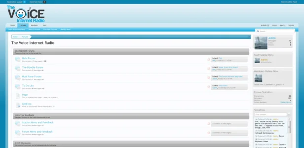
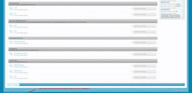
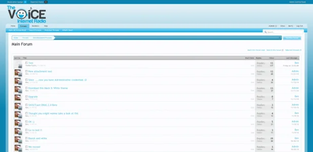
Time for part two to critiquing Kurt's work: the theme. :p Echo is a blue and gray theme I'm working on for my forum. I'm using style properties, so the colors can be easily changed (just needs a change in the background gradient image). I'll attach some images below, but if you'd like a live demo, you can see it in action here. I'm interested in hearing what you like and what could be improved. :) Thanks!

Special thanks to Shelley for her recolored post icons on the index. :D
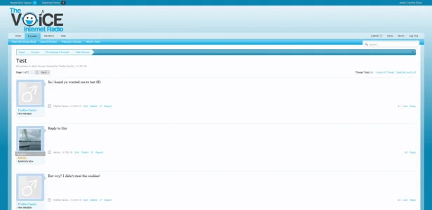
Echo Preview - Thread View.webp Echo Preview - Index.webp Echo Preview - Index Bottom.webp Echo Preview - Forum List.webp
 
Looking good - classy logo ... lol - my immediate first glance reaction is to darken the blue of the forum links.

I realise they tie-in with the text of the logo, but maybe try the darker blue at the bottom of your background gradient?

Cheers,
Shaun :D
 
Looking good - classy logo ... lol - my immediate first glance reaction is to darken the blue of the forum links.

I realise they tie-in with the text of the logo, but maybe try the darker blue at the bottom of your background gradient?

Cheers,
Shaun :D
Changed and looking better, I think. :)
 
Far too much blue. Loose the blue background and try something that isn't blue like a dar background gradient or pattern perhaps. As much as I like the forum icon colours the blue really spoils it within them. Perhaps an orange & grey? I'd advise that you work with a 3 colours system for the style and not over power it with blue.

Look forward in see what you come up with pending you make some changes and eliminate most of the blue. :)
 
Haha...that was my thought when I'd included the orange in my logo before and it wasn't well-received. :P Another color possibility: do you think gold highlights (i.e. the color I'm using as the admin usergroup markup) would work?

So, just to get your more experienced opinion since I'm not sure myself...what color do you think would work as a background? I'd prefer to do a gradient because I like how it works with the transparent "box" on the outside of the page content. :)
 
I think the blue needs to go dark .. and I mean blackish :D

If you look at the last attachment where the forum listing .. the blue is eye popping .. not good .. try a calm color :) this blue is restless, makes me want to hit the screen :D
 
I'd try something like this >> #4b4b4b or #2d2d2d and an overlayed #ffffff - Transparent gradient set at between 40-60% possibly lower depending on your preference.

As for the forum status icons, the yellowish/orange in your avatar might work. It's just something you should consider to break out the over powering blue which will only add to a nice visual experience to your style. Experiment with colours, you'll most likely fail in using some, we all do but you'll eventually get the right one that fits and more importantly break that hellish blue. :)

Goodluck with it. ;)
 
My first thought was the same as Shelley's... lottsa blue going on there :p

perhaps a contrast colour? Green, Orange, Red, Yellow - all excellent contrast colours to that blue.

The top area and background are a sea of blue, they need a little contrast in there, and the gray category bars also looks out of place.

Love the logo though :D
 
I'd try something like this >> #4b4b4b or #2d2d2d and an overlayed #ffffff - Transparent gradient set at between 40-60% possibly lower depending on your preference.

As for the forum status icons, the yellowish/orange in your avatar might work. It's just something you should consider to break out the over powering blue which will only add to a nice visual experience to your style. Experiment with colours, you'll most likely fail in using some, we all do but you'll eventually get the right one that fits and more importantly break that hellish blue. :)

Goodluck with it. ;)
"Hellish..." xD

I made that gradient using this site, so unless it can be done there, could you explain how to do that in Inkscape (since I think you said you've used that) if it's possible? :) I'll start playing with some colors on the site later tonight.
 
The Dynamic Drive site can't do transparent gradients.
I've got the same problem as I can't work out how to do them in PSP X2.
 
"Hellish..." xD

I made that gradient using this site, so unless it can be done there, could you explain how to do that in Inkscape (since I think you said you've used that) if it's possible? :) I'll start playing with some colors on the site later tonight.

Photoshop :) download the Trial ... you will have 30 days to get it right :D ... (err and it's tons of gigz ... so be patient ... Also MS Expression is very much capable of 'gradiating' stuff go to their site and search your way ;) )
 
I haven't used inkscape for a long time and wouldn't know (off the top of my head) how to direct you. Try the gradient I provided in the attachment with the background colour background:

Code:
 background: #4b4b4b url(styles/default/xenforo/gradients/titleyourgradient.png) repeat-x top;

edit: I also applied the .png optimised gradient just title it to your preference.
 

Attachments

  • gradient.webp
    gradient.webp
    170 bytes · Views: 70
  • gradient_optimised_png8.webp
    gradient_optimised_png8.webp
    142 bytes · Views: 69
Not everyone wants to spend upwards of $600 to do a simple gradient, Blandt.

Brogan, what's the specific thing you can't do - make them transparent?
 
save them as an alpha transparency png-8 gradient.

PSP X2 should be able to to that, I can do it in PSP 9. Check your file-save options, Brogan -- meanwhile I'll go look at mine and edit in the specific thing if I find it. (Often this is trial and error for me.)
-----
Sorry, posted before I saw your post. And I'll add this here too -- Elizabeth will be able to tell you how to preserve the transparency, she knows all the PSP versions backwards and forwards.
 
I haven't used inkscape for a long time and wouldn't know (off the top of my head) how to direct you. Try the gradient I provided in the attachment with the background colour background:

Code:
#4b4b4b background: #61bc33 url(styles/default/xenforo/gradients/titleyourgradient.png) repeat-x top;

edit: I also applied the .png optimised gradient just title it to your preference.
Thanks; that worked and it's now on the site. I'll post back later tonight once I've changed more of the colors--I have the navbar changed (except for the border) right now to a color that may change a bit (gotta play around some more in a bit :P).
 
btw remove the #61bc33 and replace it with #4b4b4b. If it works then you've made that change. :)

it should look like the following:

Code:
background: #4b4b4b url(styles/default/xenforo/gradients/titleyourgradient.png) repeat-x top;
 
Personally I would use red as the third color. Just some here and there, like maybe the forum status icons.
 
Status
Not open for further replies.
Top Bottom