Style Critique: Echo

Status
Not open for further replies.
Yes the text links on the "Sign up Now" button is white. Much clearer.
I don't know what I did, but I'll take it! haha Just gotta change the "Terms and Rules" link color now.

Also, what were you referring to with the html code from a few days ago and the white to transparent gradient? Sidebar blocks or the transparent thing?
 
I don't know what I did, but I'll take it! haha Just gotta change the "Terms and Rules" link color now.

Also, what were you referring to with the html code from a few days ago and the white to transparent gradient? Sidebar blocks or the transparent thing?

Oh that. For some reason you have a gradient on your side blocks where you never before I suggested it. Anyway, it's there now (the gradient) so there's no need to alter anything. :)
 
Oh that. For some reason you have a gradient on your side blocks where you never before I suggested it. Anyway, it's there now (the gradient) so there's no need to alter anything. :)
*shrug* OK! haha

Anything else you can think of? :D As an aside, I think I have another idea for a skin (maybe even to release; I dunno) that I'm gonna work on over break as well.
 
*shrug* OK! haha

Anything else you can think of? :D As an aside, I think I have another idea for a skin (maybe even to release; I dunno) that I'm gonna work on over break as well.

I would probably suggest doing something with the .messageUserBlock (as it's still the default colour). Perhaps style the whole postbit area a little.
 
LOL; I had it changed, but it looked weird, and when I changed it back, I think I subconsciously went to the default scheme. hahaha I'll play around with that in a bit. :D
 
oh wow, now this is looking really good!

Don't forget to change the background color in the chatbox. :)

Well spotted.

That'll be this code Kurt.

Code:
#taigachat_box {
    background: none repeat scroll 0 0 #F0F7FC;
    border: 1px solid #D2E1F0;
    font-size: 11px;
    height: 300px;
    margin: 5px -2px 0;
    overflow-x: auto;
    overflow-y: scroll;
    padding: 5px;
    width: 220px;
}
 
I just edited dark_taigachat.css and made it @contentBackground--I assume you didn't like the blue, right? Also added a border-radius to the chatbox though it looks a little weird with the scrollbar poking out.
 
Actually it's this code that I changed. In the dark_taigachat.css template.


Code:
#taigachat_box { width: 210px; height: 300px; border: 1px solid @primaryLighter; padding: 5px; margin: 5px -2px 0 -2px; overflow: auto; overflow-y: scroll; font-size: 11px; [B]background: @lightTextColor[/B]; }
.taigachat_reverse #taigachat_box { margin-bottom: 5px; margin-top: 0; }
#taigachat_box li { background: @lightTextColor; margin-bottom: 6px; }
#taigachat_controls { text-align: center; margin: 10px 0 5px; }
 
I just edited dark_taigachat.css and made it @contentBackground--I assume you didn't like the blue, right? Also added a border-radius to the chatbox though it looks a little weird with the scrollbar poking out.


Much better. Now the content (text) really oozes out nicely. Oozes? what the heck am I thinking?
 
All right; Iwas trying to mess with the postbit...gradients look odd (unless I added a new one just for it) and I'm having difficulties with something in the back covering up part of the border-radius...suggestions for changing that up? (No, what's currently on the site is not what I think is good, hahaha.)
 
This has been a super collaborative effort, I love it, you have ended up with a great skin Kurt :)

Shelley you are a doll to help so much!!!

I guess it helps having someone who actually listens to your advice :D

Great work guys!!!
 
Hi Kurt,

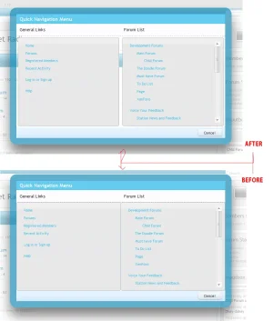
Just when you thought it was safe and your style finished. Well, almost. I noticed the many popups look a little odd with the radius enclosed inside the overlay container. One instance is the Quick Navigation Menu overlay I feel if you start adding some margins, the areas inside the overlays will not look crammed.

I made some alterations in firebug and added a margin in the (below) example and changed the blue border-left to the grey colour. I've provided a before and after screenshot so you know what I'm referring to. The margins should be added to the sub forum popups and other areas that looked crammed.

Quick-Navigation-Menu.webp
 
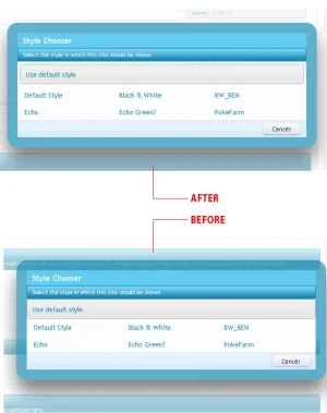
Same rule with the style chooser. I think you get the jist with regards to the areas I'm referring to. It's just a matter of cleaning up the style and your done. :)

style_chooser.webp
 
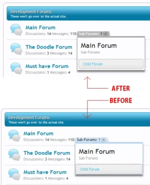
And with the sub-forum. A little more work involved but nothing major. Something like this (below). I would strongly suggest removing the dashed bored within the sub-forum popdown menu

I haven't tried. But you could even add a top-right, bottom-right, bottom-left 3px radius.

sub-forum.webp
 
Haven't updated in a couple days because I was finishing up final exams. I'm done now and am home for break (whoo!), so back to work on this :D:

I'm having issues with adding the margins you suggested, Shelley. I can see how to do them in Firebug, but they're mainly in secondaryContent, which would screw up a lot of other stuff if I changed it. The only one I managed to get was on the Quick Navigation Menu, and only on the right side (the left row is controlled by secondaryContent, from the look of it). o_O

Also, while I liked the border-radius suggestion on the subforum drop-down, I realized that if the popup goes above the "Sub-Forums" line (i.e. if "Sub-Forums" is down at the bottom of the screen), it would look weird with those same corners. :(

Finally, I tried to do more with the postbit, but I'd like a gradient to extend down the box (like I see on Kim's Christmas theme, for instance), so I'll try to whip that up tomorrow (I think Inkscape can do it after all...we'll see :P).

Any more suggestions are more than welcome...I'll do some more work tomorrow when I haven't been up for seventeen hours running on four hours of sleep. lol
 
I have to admit it's a little tricky to accomplish,but it can be done because I did it by directly adding to and editing the templates and it gives off such a nice clean look.

Keep tinkering in the templates I mentioned on twitter, it can be done and the results especially for the quick navigation and subforum popout look so much cleaner.
 
Status
Not open for further replies.
Top Bottom