Add-on Simple Portal

Status
Not open for further replies.
Agreed Shelley.

Could it have the option to include this in the right side sidebar?
We can hack it but better if you do it because of anything elase depends on it.

I make a lot of use of my sidebars so I want my users to feel comfortable that the sidebar is reliably on the right offering navigation.

I still think it would look odd even on the right hand side. it really throws the whole design off. I would re-think this and totally remove the design and have it like the sideblocks purely for consistency sakes, mainly because it fits better.
 
QUESTION By the way can Simple Portal pull items from the RM?

I still think it would look odd even on the right hand side. it really throws the whole design off. I would re-think this and totally remove the design and have it like the sideblocks purely for consistency sakes, mainly because it fits better.

Oh yes I meant make it a sidebar block - on the right.
 
More on the sidebar question. I don't think it works well to have two sidebars.

Users already have navigation along the top and down one side. For us who are used to it all it's easy, but for others it's often confusing. This is why I add my sidebar to almost all pages, and put key links in it quite large. Having THREE places to check to find what you want is too much.

Also there are still plenty of users who have 15" screens. Two sidebars cuts the content area too narrow.
If the content author elects to create two columns, we can then have two centre content columns narrower than the right hand sidebar! I have seen this on some sites on other people's computers.
Designers logically usually have good size screens because they use them a lot. They too often forget the very different level of users they design for.
 
More on the sidebar question. I don't think it works well to have two sidebars.
Agreed. I was so excited for this add-on, and very disappointed with its release having its own sidebar despite all the comments against it.
Cannot use it as it is now, unless they decide to change this or allow for it to be off.
 
The left sidebar won't be shown if you don't have any categories.

I thought that it's a good idea to use the xenforo help page design for the portal if it's using categories, because the normal sidebar on the right side is used by xenforo for general information and not page specific information, which are AFAIK always on the left side like in the xf help http://xenforo.com/community/help/ or in the RM http://xenforo.com/community/resources/
I just wanted to follow the xf design;)

I'm always open for suggestions:)
 
I just wanted to follow the xf design;)
Yes, but wastes a LOT of space below it. XF design doesn't always = great design, for every scenario.

I'm always open for suggestions:)
No need to repeat. Posts (#2 -> #4, #35 -> #36, #41, #43 -> #44, #59 -> #60) in this thread all give 'yucky' feedback on the category presentation, and suggestions for better placement and presentation.
 
  • Like
Reactions: Dan
Extra would it be possible to make this a let/ right option?
Because your thinking in following XF design - and the RM design - is sound. I think at least some would agree with you.
Why not leave this as coded but add option to add the same data but as a sidebar section.

We love options we admins and a sidebar section code wouldn't add bloat, it's not much.

Can you make the portal call RM Resources, and their threads ?
Ideally Pages too - not for me but I', sure others will appreciate the portal being comprehensive in covering nodes and Resources.
 
Can you make the portal call RM Resources, and their threads ?
Ideally Pages too - not for me but I', sure others will appreciate the portal being comprehensive in covering nodes and Resources.
The items are modular and handled by handlers.

This means => YES, YOU'LL BE ABLE TO SHOW WHATEVER YOU WANT IN THE PORTAL! (as long as a data handler exists)
If you find somebody who'll create an page handler, blog handler, etc... you'll be able to include everything you want;)

But first version will include probably only threads.
The RM handler is coded and working, but the templates aren't finished yet.
 
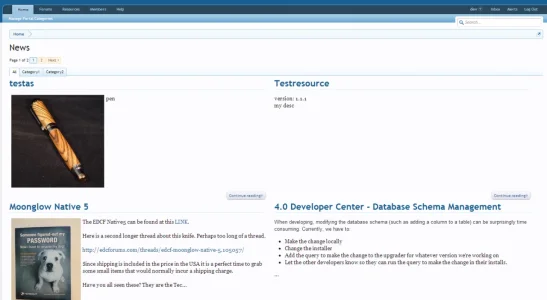
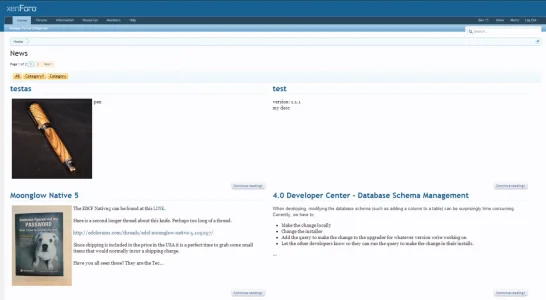
Some mockups:

Tabs:
test.webp


Prefix:
test2.webp

You really think that this looks better then sidebar?o_O


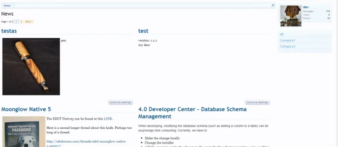
Another Position: Right Sidebar
sidebar.webp
 
Some mockups:

Tabs:
View attachment 43358


Prefix:
View attachment 43360

You really think that this looks better then the sidebar?o_O

No offence but if those tabs are categories I really think this is the wrong move to take.

Take into account

low res users
long category names

this would cause clutter imo and I think it just seems odd going in this direction with categories as tabs. Perhaps I'm misunderstanding those are really category tabs.
 
  • Like
Reactions: Dan
nice to see the ability for a 2-column layout at the Homepage !

question 1)
would there be an option to also display content at the Homepage in "Masonry layout" ?


question 2)
would there be an option to get rid of the pagination and display content at the Homepage as "Endless scrolling" ?


via the code from here:
http://masonry.desandro.com


Many thanks!
:)

Categories I still think (as you say ) as a sideblock. Personally, i like the categories on the left (like on the RM) in the same style as the xf sideblocks
 
  • Like
Reactions: Dan

will you be keeping categories on the right hand side or is this all subject to change as suggestions are coming in? Looks excellent btw few little niggles I have with it but otherwise it's shaping up nicely.

Suggestion: With the category block I don't think there is a need for the category titles to all have a border-bottom just have the title with the border-bottom and lower the size of the font of the rest.
 
  • Like
Reactions: Dan
will you be keeping categories on the right hand side or is this all subject to change as suggestions are coming in? Looks excellent btw few little niggles I have with it but otherwise it's shaping up nicely.

Suggestion: With the category block I don't think there is a need for the category titles to all have a border-bottom just have the title with the border-bottom and lower the size of the font of the rest.
The styling isn't finished yet. Needs some fine-tuning^^
The categories on the right side were just added today, i hadn't time for the styling, that's why i used the default xenforo h3 class for this.
 
Status
Not open for further replies.
Top Bottom