[Reply]-link need to be more prominent

Status
Not open for further replies.

Grover

Well-known member
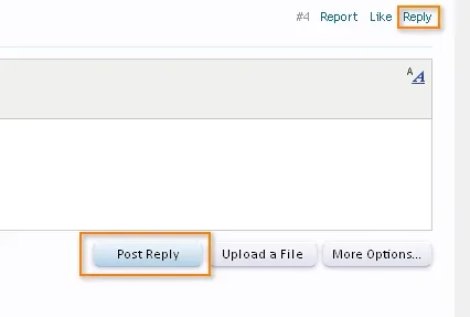
Do you find yourself sometimes clicking 'Report' instead of 'Reply' when you want to reply on a thread here at xenForo? I do.

Report, Like, Reply.

Those are the 3 links presented next to each other at the right corner of the posting.

I would find it more logical I think that 'Reply' comes first. Because you will need this the most.

Reply, Like, Report.

Furthermore, I also think that the Reply link needs to be made more prominent or easier to distinguish somehow between the Like and Report links.
 
Upvote 4
Do you find yourself sometimes clicking 'Report' instead of 'Reply' when you want to reply on a thread here at xenForo? I do.

Report, Like, Reply.

Those are the 3 links presented next to each other at the right corner of the posting.

I would find it more logical I think that 'Reply' comes first. Because you will need this the most.

Reply, Like, Report.

Furthermore, I also think that the Reply link needs to be made more prominent or easier to distinguish somehow between the Like and Report links.

I prefer it being the last in the list... it is where my eye naturally goes to... However I do agree it would be great if it was more prominent than the rest of the links... Even if the reply link was bold or something.
 
Consistency: maybe the [Reply] should always be the first option in line

I prefer it being the last in the list... it is where my eye naturally goes to... However I do agree it would be great if it was more prominent than the rest of the links... Even if the reply link was bold or something.

Well... I just made a 'mistake' again to press 'Report' instead of 'Comment' when I wanted to comment on a profile posting :confused:. It is because the Report link is first in line: Report, Like, Comment. For me it just doesn't feel natural to have the most used function at the end on the right. Wouldn't it be more logical to put it first in line? Look... the Quick Reply Editor even has it this way: [Post Reply] [Upload a File] [More Options...]. This makes really more sense to me. It is the first link you see, because your eyes read from left to right (at least in most languages). So you want the first link you see to be the link you simply use the most.

reply.webp
 
I prefer it being the last in the list... it is where my eye naturally goes to... However I do agree it would be great if it was more prominent than the rest of the links... Even if the reply link was bold or something.
I second that, my eyes go to the end of the three links so I always click reply.
 
Are you suggesting "reply-like-report" in the lower right hand corner of a post?

If so, I agree.
 
Are you suggesting "reply-like-report" in the lower right hand corner of a post?

If so, I agree.

Yes.

It's a bit amazing to me to found out that people's eyes go to the end of the line instead of the beginning when they need to look for a function that they use most. IMHO: first in line, is the foremost important function. At least, in this case.

Imagine the Quick Reply buttons going like this:

[Upload a File] [More Options] [Post Reply].

Really, for me it doesn't make sense. So, why does XenForo do it exactly like that inside postings and profile comments? If feels counter-intuitive for me.

Maybe someone can explain the thoughts/psychology behind it, because I am not seeing it at the moment.
 
I think it should coincide with the buttons on the editor. Reply is on the left but on the post it's on the right. With kier's left to right theory, our brain scans from left to right so we should order the list in order of most used items from left to right so it would be Reply Like Report and Post Reply Upload A File and More Options.
 
I'm not sure what's best, but I didn't have a problem with it.

TBH I like buttons (could be old habits).
 
As someone who will need to heavily modify the theme/style/skin*, I love the fact that they are basic links and not buttons.


* Delete as appropriate
 
As someone who will need to heavily modify the theme/style/skin*, I love the fact that they are basic links and not buttons.
true, but after thousands of forums are out there, with only minimal changes (possibly), swapping the buttons around will be confusing people as they go from xf forum to xf forum.
 
No different to any other forum software where owners have modified the default theme.
 
I don't know why I prefer it the way it is. Might be because when scrolling, my mouse is on the very right of the screen so when I have a post that I am interested in replying to, the reply button is very easy and quick to click as its the first link I come across coming from the right...
 
I don't know why I prefer it the way it is. Might be because when scrolling, my mouse is on the very right of the screen so when I have a post that I am interested in replying to, the reply button is very easy and quick to click as its the first link I come across coming from the right...
I agree, it's good where it is. And btw I'm beginning to get used to links instead of buttons. Links = cleaner + less bandwidth use/ server load.
 
I got into it with someone on vB about their tendency to slap a graphic on every little damn thing, to the point where instead of looking and seeing "multi-quote, quote, etc." you have to decipher the logo or hover over it (or just say to yourself "screw it" and don't reply)... they claimed that people need these visual cues, which is idiotic: if you're posting on a forum, you can probably read the word REPLY.

So to make a long story short: I don't care what's done with these links so long as they remain text links. Rearrange them, make them different colors, whatever ... but don't make me have to go scavenger-hunting through the code to find out how to change some fussy little mystery graphic.

But, I haven't had any trouble with it being on the right side at all.
 
Yep the Reply link is the most important and needs to be closest to the center. So should be Reply Like Report
 
I got into it with someone on vB about their tendency to slap a graphic on every little damn thing, to the point where instead of looking and seeing "multi-quote, quote, etc." you have to decipher the logo or hover over it (or just say to yourself "screw it" and don't reply)... they claimed that people need these visual cues, which is idiotic: if you're posting on a forum, you can probably read the word REPLY.

So to make a long story short: I don't care what's done with these links so long as they remain text links. Rearrange them, make them different colors, whatever ... but don't make me have to go scavenger-hunting through the code to find out how to change some fussy little mystery graphic.
I'm pretty sure that they'll remain text links by default.
 
Status
Not open for further replies.
Top Bottom