Something like this???
If we can find a good spot to put it, yeah. And then it acts like a "pull out tab".
Something like this???
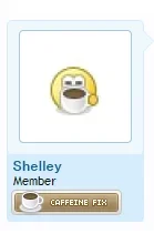
Postbit_view. (mockup below)
It's adequate, and looks alright, but I must admit and agree with Ceri May: it doesn't have the same "minimalistic" design that I find characteristic of XenForo. I'm still rather fond of the lone icon expanding into the bar somewhere in the post bit.Postbit_view. (mockup below)
I am not fond of this design, It isn't as balanced as it was...
")
What about having moods as icons with title attributes that appear next to the username?
To clarify my post: I'm talking about placement, and not your designs.
I should clarify so am I... I love the icon designs, I really do... I am just curious how we can do a minimalistic design that then expands/pull's out upon interaction.
Obviously we can have both options available. That's no issue, I don't think. It is in fact a good idea to me.Perhaps if we can have two options for the postbit view Pullout or full view? much like the type editors basic/advanced? or like the way the thread display options functions and any option change is saved.
But now we have two things to consider: what and where we place objects in "minimalistic mode"; and how do we switch between the two options or states (that is, where do we flick the switch for "full" view).Obviously we can have both options available. That's no issue, I don't think. It is in fact a good idea to me.
Edit: Or just have the setting global, like you suggest, which still leaves one "dilemma".
That's why it's not in the suggestions forumPresumably this is the kind of thing that would be implemented as a mod and not core functionality?
")
Presumably this is the kind of thing that would be implemented as a mod and not core functionality?
Presumably this is the kind of thing that would be implemented as a mod and not core functionality?
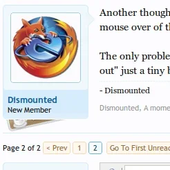
Another thought: how about if the mood slides out underneath the "info block" (i.e. avatar/username/title) on mouse over of the "info block"?
The only problem would be the lack of a visual cue to guide the user that something is there. Maybe if I can make it "poke out" just a tiny bit out the bottom?
We use essential cookies to make this site work, and optional cookies to enhance your experience.