Migrating to XenForo - 1st Live Preview [[WIP]]

Status
Not open for further replies.

JacquiiDesigns

Well-known member
So - I'm migrating my poetry forum from vBulletin 3.x to XenForo.

About JPiC Forum for Writers:
JPiC is an online Community where open-minded Poets & Writers of all backgrounds can freely share in the creation of literature. As a continuing work-in-progress, our poetry forum hosts a melanges of writing with new additions being posted daily. We celebrate diversity with the typed word.

I've been busy working on the new XenForo theme. It's not quite 100% there - but slowly approaching. So I'm ready to receive feedback, suggestions and constructive criticism on the style and setup. It's "Jacquii's Poetry in Color Forum" and my favorite color is purple. So no comments on the purple color, unless you just specifically hate it, in which case make your commentary amusing please. LOL

Keep in mind that this is a work in progress ==> http://xen.jpicforum.info -- I'm hoping to finish the styling and customizations in the next week or so...

What do you think about the progress? Suggestions and feedback very much welcome, especially as concerns ease of use, monetizing and ad placements. The link again ==> http://xen.jpicforum.info

Thanks!

J.
 
Overall it's a very nice style but there's a few issues at a glance (I've only glanced at the top)

The main navbar text sits very low on the navigation .navTabs area. what you have currently:

jacquii_navbar_before.webp

I think if you introduced a line-height to one of the classes .selected and altered the other line-height to 43px they would sit better like the following

jacquii_navbar.webp

Breadcrumbs in my opinion looks and feels a little noisy. I think a simplistic approach would look better so the navbar is the focus point in that area. The two dark (black) areas on each side looks odd as does the background colour on the selected links. To be honest, i've never been a fan of the xf arrow breadcrumbs and think something like the following would suit nicely enough for people to notice but not something that looks busy.

bread_jacquii-recommend.webp

Overall though liking it so far Jacquii. I'm liking your clean post area which is why i think the breadcrumbs above would suit nicely. If that is something your willing to accommodate and try let me know and i'll post the css which would go in your extra.css template. :)

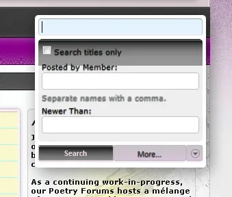
EDIT Some issues I encountered whilst browsing. The search inheriting images from what seems the navbar hover image and text inheriting some styling.

jacquii-search.webp
 
Overall it's a very nice style but there's a few issues at a glance (I've only glanced at the top)

The main navbar text sits very low on the navigation .navTabs area. what you have currently:

View attachment 33181

I think if you introduced a line-height to one of the classes .selected and altered the other line-height to 43px they would sit better like the following

View attachment 33182

Breadcrumbs in my opinion looks and feels a little noisy. I think a simplistic approach would look better so the navbar is the focus point in that area. The two dark (black) areas on each side looks odd as does the background colour on the selected links. To be honest, i've never been a fan of the xf arrow breadcrumbs and think something like the following would suit nicely enough for people to notice but not something that looks busy.

View attachment 33183

Overall though liking it so far Jacquii. I'm liking your clean post area which is why i think the breadcrumbs above would suit nicely. If that is something your willing to accommodate and try let me know and i'll post the css which would go in your extra.css template. :)

EDIT Some issues I encountered whilst browsing. The search inheriting images from what seems the navbar hover image and text inheriting some styling.

@kkm323 -- I tried to keep a very similar design, but simply enhance and update the look to a more current. I'm glad you noticed!

@Shelley you're brilliant. You know I do tend to struggle with the coding side of things a bit... I'd tried vertically aligning the navbar links, a myriad of different settings --- after an hour or so I just gave up. One thing I know I didn't try was adding the line-height attribute. Don't know why I didn't think of that duh! So thanks for that!

Lee was also saying something about my breadcrumbs on TAZ - I tend to like it actually :blush: I like the arrows and wanted to have a little something different than the default XF breadcrumbs...whilst keeping the default code ==> Tall order LOL -- I'll take your suggestions in mind though and may try a few options. I must admit - I love the breadcrumbs you have on bbsmiley! It's standard, but different. I'd LOVE if you'd share the code!

Speaking of which - I've tried to emulate what you've done with your post controls, wrapping the links in a button. Can you please share me the code that allows for the animated opacity on your links like below:

di-E02D.png


I'm pretty sure it's css styling of some sort?

As for the other issues - Yes! I know. Gonna hopefully have issues sorted in the next few days.

Anyway - I've got a lot more tweaking to do - but ya'll have validated for me that I'm at least on the right track LOL - So Thanks so much for the comments/suggestions you guys! ;)
 
The breadcrumbs I can share shortly that won't be an issue but in the middle of something right now. The button styling i will need to go into my extra css and dissect the css i used (old style) and i chucked the css all over the place. I'll post that at my site and you can grab which i'll post sometime this week.

The breadcrumbs i have organized which i'll post shortly. :)

I'll probably have the button css posted sooner but give me till the weekend in case something comes up (which is likely).
 
Add the CSS below to EXTRA.CSS template and upload the image into your /gradients folder. :)

Code:
/*BREADCRUMB ENHANCEMENTS*/
 
.breadcrumb  {
    background: url("@imagePath/xenforo/gradients/breadcrumb_grad.png") repeat-x scroll center #f6f6f6;
    border: 1px solid #e0e0e0;
    box-shadow: 0 0 1px #ffffff inset;
    color: #404040;
    border-radius: 3px;
}
 
 
.breadcrumb .crust a.crumb:after {
    color: #5D5D5D;
    content: "";
    font-size: 12px;
    position: relative;
    right: -10px;
    top: 0px;
    text-shadow: 0 0 0 transparent, 1px 1px 0 #FFFFFF;
    background-color: none !important;
}
 
.breadcrumb .crust:last-child a.crumb  {
    font-weight: bold;
    text-shadow: 0 0 0 transparent, 1px 1px 0 #FFFFFF;
    color: #6c6b6b;
}
 
.breadcrumb .crust a.crumb {
    background-color: transparent;
    text-shadow: 0 0 0 transparent, 1px 1px 0 #FFFFFF;
    line-height: 29px !important;
}
 
.breadcrumb .crust {
    height: 30px;
}
 
 
.breadcrumb .crust:hover a.crumb {
    color: #999999;
    -moz-transition: all 0.3s ease-in-out 0s;
    -o-transition: all 0.3s ease-in-out 0s;
    -webkit-transition: all 0.3s ease-in-out 0s;
    opacity: 0.5;
    background-color: transparent;
    border: none !important;
}
 
.breadcrumb .crust:hover .arrow span {
    border-width: none;
    background-color: transparent !important;
}
.breadcrumb .crust:first-child a.crumb {
    background-color: transparent;
}
 
.breadcrumb .crust .arrow span {
    background-color: transparent;
    border-width: 0px 0px 0px 0px;
}
 
.breadcrumb .crust .arrow {
    border-width: 0px
}
.breadcrumb .crust a.crumb {
    border-bottom: 0px solid #A5CAE4;
    color: #999999;
    line-height: 30px;
}
 
.breadcrumb .jumpMenuTrigger:hover {
    -moz-transition: all 0.3s ease-in-out 0s;
    -o-transition: all 0.3s ease-in-out 0s;
    -webkit-transition: all 0.3s ease-in-out 0s;
    opacity: 0.5;
}
 
/*BREADCRUMB ENHANCEMENTS*/
 

Attachments

  • breadcrumb_grad.webp
    breadcrumb_grad.webp
    256 bytes · Views: 23
The breadcrumbs I can share shortly that won't be an issue but in the middle of something right now. The button styling i will need to go into my extra css and dissect the css i used (old style) and i chucked the css all over the place. I'll post that at my site and you can grab which i'll post sometime this week.

The breadcrumbs i have organized which i'll post shortly. :)

I'll probably have the button css posted sooner but give me till the weekend in case something comes up (which is likely).
You are too fabulous for words! Much appreciation girl and take your time. I'll likely spend the next few days drunk bahahaha. Cheers
cheersc.gif
 
You are too fabulous for words! Much appreciation girl and take your time. I'll likely spend the next few days drunk bahahaha. Cheers
cheersc.gif

This may need some refining and tweaking Jacquii because it was catered for a custom style but this also goes into your extra.css plus you'll have to create the gradients to compliment your style.

There maybe some custom button classes in there as i have some add-ons that required some unique styling. I think. It's an old style so i'm unsure.

Code:
/*BUTTON ENHANCEMENTS*/

.button {
    background: url("@imagePath/xenforo/gradients/qr-buttons.png") repeat-x scroll top transparent;
    border-radius: 3px;
    color: white;
    text-shadow: none;
}

.button:hover {
    opacity: 0.5;
    color: white;
}

a.callToAction {
    background: url("@imagePath/xenforo/gradients/breadcrumb-grad.png") repeat-x scroll center top #fffffff !important;
    border: 1px solid #6a8e09;
    height: 26px;
    line-height: 26px !important;
    border-radius: 3px !important;
}

a.callToAction span {
    border-radius: 3px 3px 3px 3px;
    background: url("@imagePath/xenforo/gradients/qr-buttons.png") repeat-x scroll center bottom transparent !important;  
}

a.callToAction:hover span {
   opacity: 0.6; 
}

.message .ReplyQuote, .message .bookmarks, .message .report, .message .edit, .message .ip, .message .delete, .message .warn {
    background: url("@imagePath/xenforo/gradients/qr-buttons.png") repeat-x scroll center bottom transparent !important;  
    padding: 3px 5px;
    border-radius: 3px;
    border: 1px solid #4a5c03;
    box-shadow: 0 1px 3px #6e6457;
    text-shadow: 0 0 0 transparent, 1px 1px 0 #526e06 !important;
}

 .message .hashPermalink, .message .Bump {
    background: url("@imagePath/xenforo/gradients/hl.png") repeat-x scroll center bottom transparent !important;  
    padding: 3px 5px;
    border-radius: 3px;
    border: 1px solid #740000;
    box-shadow: 0 1px 3px #6e6457;
    text-shadow: 0 0 0 transparent, 1px 1px 0 #a8510f !important;
}

.message .privateControls .item {
    padding: 3px  5px;
}
.message .ReplyQuote:hover, .message .bookmarks:hover, .message .report:hover, .message .hashPermalink:hover, .message .edit:hover, .message .ip:hover, .message .delete:hover, .message .warn:hover, .message .Bump:hover  {
    text-decoration: none !important;
   -moz-transition: all 0.3s ease-in-out 0s;
    -o-transition: all 0.3s ease-in-out 0s;
    -webkit-transition: all 0.3s ease-in-out 0s;
    opacity: 0.5
}
/*BUTTON ENHANCEMENTS*/
 
Could you possibly link me to your forum and style?
Uh oh - I meant to ask the same thing... Multitasking with some 20 pages open in Opera and 10 in FF... I forgot. But yeah - what's your forum url?

Excellent work jacquii and improvements made look great. (y)
Thanks! There's still a bit to do - but the style is coming together nicely. You and Lee were spot-on about the breadcrumbs - so thanks again ;)
 
Looks really nice Jacquii, well done! It's good to have you join the XF world, too! :)
Thanks John!
Not as nice as some of your custom styles - but I'm working on me skillz :P

Speaking of which - I've posted a new thread here regarding a customization I'm working on with my member_view - Could ya'll take a look and perhaps advise on how I can accomplish the vertical/horizontal avatar placement?! I'd really appreciate it.

And thanks again for the love ya'll = it's much appreciated!

J.
 
Status
Not open for further replies.
Top Bottom