Keep avatars square in member card and profile page

RobinHood

Well-known member
I think I figured out why I've been so adverse to the change to circles in 2.1

They actually look alright in the thread view, the thing that I find really annoying is if the circle ends up cropping an image where I may want to view the whole thing, I'm completely unable to do so. So for example if it's an image with a detailed design or photo all the way to the edge, or if it has text in it.

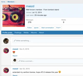
If the avatar remained square on the member card and profile page at least there would be some locations where you could view the full image.

This is what facebook does. Even though they've switched to circles in threads, it's still square in the pop up and on the full profile pages.
On IPS, you can click on the image on the profile page and view the full uncropped image.

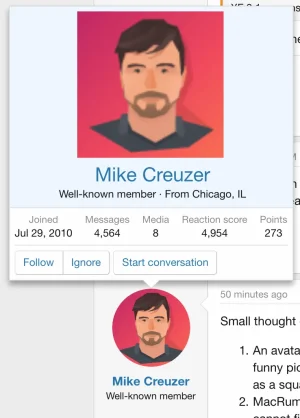
This is how macrumors have done it on XF1 and it works well

187605
 
Upvote 19
There are two aspects to this suggestion that I'd like to comment on:

Circular vs Square Avatars
In the XF 2.1 HYS announcment, Chris mentioned that the rounded avatars:

... are a bit more aesthetically pleasing

For me, the jury's still out on that but then again, there's no accounting for taste! ;) So, having the ability to style the avatar border radius is a great option, but I also support the idea of presenting the full (i.e. uncropped) image either on the Member Card and/or Profile page.

Relative Size of Avatar in Member Card
One of the reasons why I, and I'm sure other people, view a member card is to get a better look at the avatar image. I think since XF 2.x we've seen the Member Card's avatar actually reduce in size relative to, say, the avatar appearing in a post. This wasn't the case in XF1. So, if the intent is to show a more compact Member Card in XF2 compared to XF1, then perhaps do away with the smaller avatar altogether? It seems redundant now, especially if it's not providing additional information (i.e. higher res).
 
Yeah, quite a few people reacted to my post in the assorted improvements thread about making the member card avatar image bigger and more square. I'm not sure if there's an official suggestion for this, but that's one of the things that bugs me on a regular basis on all XF2 sites compared to the way it used to be.

I'm getting used to the circles in threads, but I would like the option to see the full square version on the member card and profile page as I mentioned here:

https://xenforo.com/community/threads/keep-avatars-square-in-member-card-and-profile-page.156108/

One thing that I dislike about the initial 2.0 upgrade is that the avatars are really small in the member card now. I frequently click an avatar because I want to get a better look at it. It's frustrating to then be presented with an even smaller version of the image and have to instead click through to their profile to see it. I may not want to do that if I don't want to lose my place in the the thread, or if I'm on mobile with a spotty connection.

I'd love it if they were increased in size again and high quality.

188102


I've tried to come to like the circular avatars more, and they're okay I suppose, but I think in the end I'm not a fan of them overall. Especially when I see them used more and more in add ons. IMO it's more aesthetically pleasing seeing a grid of squares than a grid of circles with a ton of wasted space between them. Seems like a needless change when most people are uploading square images to begin with. A little border radius to soften the edge as per XF2.0 still looks great.

It could work changing them to circles in threads, as long as we get bigger square ones on the member card and profile page still.

It's just annoying not being able to see the entire square image anywhere at all after it's been so long established for so many years that way. And if a large number users don't wish to alter their avatar to fit the new format, it will be a shame not no longer be able to appreciate them in the original form as they intended.
 
Relative Size of Avatar in Member Card
One of the reasons why I, and I'm sure other people, view a member card is to get a better look at the avatar image. I think since XF 2.x we've seen the Member Card's avatar actually reduce in size relative to, say, the avatar appearing in a post. This wasn't the case in XF1.
+1
 
I think I figured out why I've been so adverse to the change to circles in 2.1

They actually look alright in the thread view, the thing that I find really annoying is if the circle ends up cropping an image where I may want to view the whole thing, I'm completely unable to do so. So for example if it's an image with a detailed design or photo all the way to the edge, or if it has text in it.

If the avatar remained square on the member card and profile page at least there would be some locations where you could view the full image.

This is what facebook does. Even though they've switched to circles in threads, it's still square in the pop up and on the full profile pages.
On IPS, you can click on the image on the profile page and view the full uncropped image.

This is how macrumors have done it on XF1 and it works well

View attachment 187605

👍 +1
 
I haven't explicitly changed this, though it is trivial to make avatars square in particular places now (applying the avatar--square class). I felt like making the profile avatar square felt a bit random, though each to their own of course.

On profile pages, I have linked the main profile picture to the "o" avatar which I don't think we ever exposed anywhere in the past. This is the original size avatar that was uploaded, so it might even be bigger than what we exposed in 2.0.
 
Thanks for at least not completely removing the full avatar and making it available from an additional click on the profile page. Might be better if it was opened in a lightbox, maybe further down the line the profile image could become part of the gallery, so people can also comment and like the image, like on facebook.

I get that you probably want to keep this simple and have a single toggle or setting for the border radius throughout and be done with it, but I think circles throughout everywhere else will be problematic and frustrating on some forums when they find out that their images are clipped until you dive deep into loading their full profile and have to click yet again on the image to load the image on it's own, hence why I don't think it should be default, or it should be altered to be more mixed.

I think if you really want circles included as default, the best balance would be only having the circles in threads and comment sections, and the old squares everywhere else.


190578

190580


This is how facebook does it and it seems like a good balance.

190581

EDIT: Of course I go and check now and they changed the profile page avatar to a circle - I swear it was a square last month :rolleyes:🙈 But they do have a good lightbox that loads when you click it that shows it big and square, along with comments and reactions.


It feels like with each of the last two major updates you've been chipping away the really nice design of XF1 that allowed users to see other users avatars quickly and easily, nice and big and to the full.

Losing the member card meant we lost the overlay with the massive avatar image available with a single click from any thread/conversation. That was a great feature of XF1 and I miss it greatly as you could see loads of info or get a detailed look at a high quality large avatar with a single click focussed right in the middle of the screen, then click off and continue reading without having to load their full profile requiring a full new page load (especially useful on mobile). It was a great experience and lovely classic design on both desktop and mobile.

Now we not only have a much smaller image, but that image is essentially cropped down an additional 20% to a circle on every page making it even harder to enjoy avatars that utilise the full canvas available. These two changes both feel like a step backward from the really nice default XF1 UI in those areas, and really stand out to me when changing to XF2 as everything else in XF2 feels so much better or improved. IMO these changes feel like a step back in terms of default user experience out of the box.
 
Last edited:
Top Bottom