Features I don't like in xenForo

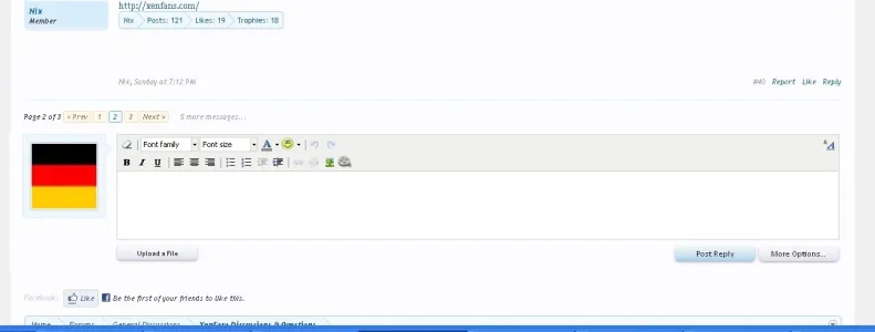
I don't like my avatar to show beside the reply box at the bottom of a page. I keep thinking that it's another post or the thread is finished.

If it's kept, then at least move the pagination links above the replybox.
 
I feel vBulletin went overboard with appeasing the "make it an option!" crowd. There comes a time when the developer has got to make a decision over items that aren't going to decide world peace. I would not be happy to see the following options in the Admin CP:

"Display thread pagenav: Below Quick Reply / Above Quick Reply"
"Display Quick Reply Avatar: Yes / No"

Everyone has strong feeling because the experience is new to us. Ask yourself if you really are going to be so invested in such matters way down the line. You'll care more about how you can reuse attachments in a sensible manner, can I leverage a notice system, where is that damned CMS.
 
Yeah, I'd rather change it with a template edit than have - sorry to keep using this word - bloat. Unnecessary options I guess is a better way to say it.

As for what I don't like...well, the Who's Online page for me is a bit difficult to read, BUT that's probably just because I'm not used to it yet. Though a link somewhere other than only on the forum home would be nice (though I might have just missed it). :)

:)
 
I feel vBulletin went overboard with appeasing the "make it an option!" crowd. There comes a time when the developer has got to make a decision over items that aren't going to decide world peace. I would not be happy to see the following options in the Admin CP:

"Display thread pagenav: Below Quick Reply / Above Quick Reply"
"Display Quick Reply Avatar: Yes / No"

Everyone has strong feeling because the experience is new to us. Ask yourself if you really are going to be so invested in such matters way down the line. You'll care more about how you can reuse attachments in a sensible manner, can I leverage a notice system, where is that damned CMS.

Yes, this is a good point and the decision should be made by common sense. There are some people, who have opionions contrary to the masses. Those opinions you have to filter out sensibly and with great care.;)

Scott
 
agree. People need to get this idea of trying to please everyone by adding on/off options in the admincp out of their heads. The decissions should be final by the developers weather it will serve a well enough purpose.
 
Here is a picture of my suggestion above to better show what I mean. I think it might even help with the "The avatar next to the editor throws me off." opinions a bit.:)

moz-screenshot.png

moz-screenshot-1.png

Scott
 

Attachments

  • xfpagination.webp
    xfpagination.webp
    21.4 KB · Views: 40
...Ask yourself if you really are going to be so invested in such matters way down the line. You'll care more about how you can reuse attachments in a sensible manner, can I leverage a notice system, where is that damned CMS.

Exactly.

Occasionally I get the impression people (on other forums) make suggestions and campaign to get them implemented just to accomplish something, whether it is important or not to them.
 
agree. People need to get this idea of trying to please everyone by adding on/off options in the admincp out of their heads. The decissions should be final by the developers weather it will serve a well enough purpose.

With some features, I will agree they don't really need an option so much.

However, with some things that are likely to be difficult to the USERS (Not the administrators), such options need to be offered. Users that feel frustrated with a site do not return to a site.
 
However, with some things that are likely to be difficult to the USERS (Not the administrators), such options need to be offered. Users that feel frustrated with a site do not return to a site.

Then it is a clear usability problem. Again, you have to make usibility for the masses and that means a common sense approach and also listening to the majority (of users too of course), not the minority.

Scott
 
Here is a picture of my suggestion above to better show what I mean. I think it might even help with the "The avatar next to the editor throws me off." opinions a bit.:)

moz-screenshot.png

moz-screenshot-1.png

Scott

Looks great. I agree, put the pagination above the quick reply. I also have replied to a thread a number of times without realizing there were more pages. :)
 
I think you anti-option people are crazy- by definition the more options the more people you please. If you can't be bothered setting options once then just use the default and be done with it.
 
Please pardon my language by i think that's just selfish and doesn't push the software forward as a whole for the entire community.

How exactly is my statement selfish? I would really like to see the logic, and I'm not trying to be rude, I just don't get what you mean.

Other then features I have suggested, I have only asked for changes from a usability standpoint. This is just for the default theme and I aware that I can change it, however I am thinking of ALL users on all XF forums, not just my own.

A single option, to let users (Not administrators) choose whether to display tooltip descriptions, or to display them inline on the page can be a potential issue for users. Most forum owners do not think of their users, and think more of how something looks, not taking into account forum names, or vague category/forum hierachy. The exampe I supplied, BleachExile, is a prime example for bad naming sense.

Many of my other suggestions, that do not include a user option, are things that are either vague, or are easily passed over, and shouldn't be. This includes the style switcher (Which should stand out more; I think coding it to be different from the bottom would be best, as people would know it is NOT just a link), Google Map in the profile card (It should either be styled differently to stand out from the age and gender, or have an icon to tell a user it is a link), forum name in 'What's New' needs to be darkened, so that it stands out, and several others.

Very few of my posts have been selfish, and much of what I have suggested is for the benefit of users of all XF forums, not just my own, nor for my own preference.

Then it is a clear usability problem. Again, you have to make usibility for the masses and that means a common sense approach and also listening to the majority (of users too of course), not the minority.

Scott

The thing is, most of the users of this forum are either a very experience administrator, a programmer, or designers.

We do not have many common users here for input, which would make people who are concerned about the smaller usability issues (This forum is highly usable, its just small things) the minority.

I think you anti-option people are crazy- by definition the more options the more people you please. If you can't be bothered setting options once then just use the default and be done with it.

I agree with less options; vBulletin had way to many, and many of which went unused, or just wasted space. However, for things that would and can effect the end-user, they need to be open-minded towards it.

I myself like the tooltip description, it makes it much cleaner, and at least on this forum, it causes no issues with bad naming-structure or category/forum hierachy. Other forums can and will definitely be an issue however.
 
As for what I don't like...well, the Who's Online page for me is a bit difficult to read, BUT that's probably just because I'm not used to it yet. Though a link somewhere other than only on the forum home would be nice (though I might have just missed it). :)
:)
I'm with you on that. It's not as easy to tell what people are doing...and guests are intermingled with actual users, so it's hard to see which members are online.
 
The thing is, most of the users of this forum are either a very experience administrator, a programmer, or designers.

We do not have many common users here for input, which would make people who are concerned about the smaller usability issues (This forum is highly usable, its just small things) the minority.

But we are common users on this forum. :)
 
There is very little I do not like in xenForo.

However:

Sometimes I have the feeling minimalism/the clean interface is chosen above usability. 2 examples:

  • Forum description in a mouseover popup. Not very userfriendly for every site... I want my users to see what the forums are about immediately. Now with this mouseover popup, people are forced to mouseover on every single forumtitle to learn what the forums is about. Really, it might look cool/modern, but the usability suffers,
  • Same more or less goes for the subforums being presented inside a dropdown in forumoverview. Why hide stuff like this? Again, it looks very slick/good as an interface, but does it serve the best overall purpose? I don't believe so for every site. However, point 1 (forumdescriptions) is the most important constructive critism I have at the moment)
 
Top Bottom