In our original builds there was no star, but when we rolled it out to one of our test communities they complained that new threads were not sufficiently distinct with just the emboldening used.
If there is a consensus here that the star is superfluous, we can probably remove it or make it less prevalent.
Are we having a hot, popular, and/or posted into icons?
xenforo is new, fresh, and modern - it's a fresh take at what a forum software should be
Currently, there's a lot that's familiar (easy to learn) features but we also have confusing or not-so-obvious features.
(Conversations is one that is confusing - imagine introducing this system to 440,000+ members. Is this thing private?)
We want to make sure there's some familiarity with it. We want the average visitors to learn the UI in an instance - not in a day, a week, or a month.
Let me first say that...
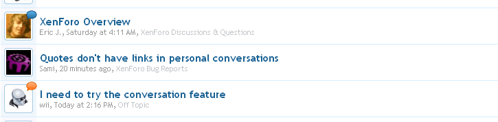
I love how a user's avatar is associated with each thread title.
I believe this will promote discussions.
It feels more personal especially when a "real photo" is used.
Anyway, the "new" icon is something that people look for; they have "learned" it.
To a lot of people, it IS an important piece of the UI.
(the new icon looks so much better but it still lacks some uniformity - it's all over the place)
Why not place the icon at the start of the second line? ie. left of the poster's name.
You can then have the icon change colors depending on how popular or how hot it is or if one posted into the thread.
 ) for this purpose, and consider using it for a new purpose-- to designate "hot" threads (threads with lots of recent activity), like vB3 did with the normally blue thread icon to an orangish color. (
 )
)

")
")