It's standard CSS so yes.Now instead of putting the white can we put #ffffff for white?
You are using an out of date browser. It may not display this or other websites correctly.
You should upgrade or use an alternative browser.
You should upgrade or use an alternative browser.
How can I set a custom user group / rank to be displayed above the Staff user banner? I have a rank called "Founder" and of course the founder is part of the Staff but he is above Staff in responsibility. How can I set up a custom user rank to be displayed about Staff? Thanx in advance.
Thanx for the prompt answer @Brogan. I knew that the system is not having that feature. I wished it would be a system option. The advantage of the staff group is that it is displayed in the sidebar who is online. Therefore I want the founder be in both groups Staff / Founder.
Is there any chance to manually change order or trick out the CSS somehow to achieve that?
Is there any chance to manually change order or trick out the CSS somehow to achieve that?

No, that's not correct.
The resource instructions explain how to do it correctly.
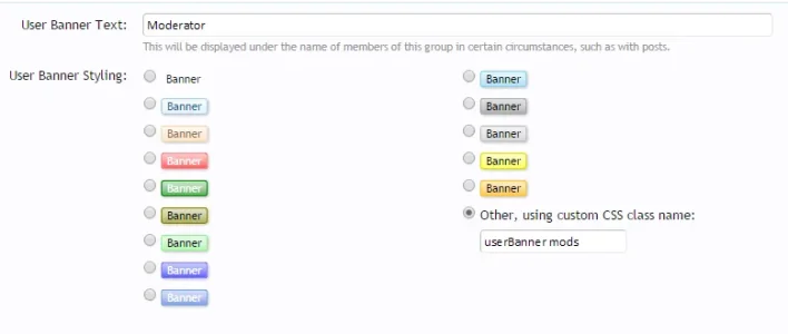
Creating custom user group banner CSS
The resource instructions explain how to do it correctly.
Creating custom user group banner CSS
No, that's not correct.
The resource instructions explain how to do it correctly.
Creating custom user group banner CSS
This is my version of the instructions.
I am totally new so it was my interpretation lol
Exemption
Active member
Yes I have already looked at the guide with changing user banners but that is not helping me with this:
I want my admins banners to be

With solid red and a rounded banner. I am using the same basic theme PixelExit Core but I dont know if Im using the EXACT same as theirs is custom
When I try it gives me

1) I dont like how the red is shaded and not just solid red
2) Instead of it a wrapped banner i want it like a rounded circle
Most and first, how can I get rid of the annoying shade on the banners like the white at the top, dont like that and I wanna make it solid red and the circle type as shown above
I want my admins banners to be
With solid red and a rounded banner. I am using the same basic theme PixelExit Core but I dont know if Im using the EXACT same as theirs is custom
When I try it gives me
1) I dont like how the red is shaded and not just solid red
2) Instead of it a wrapped banner i want it like a rounded circle
Most and first, how can I get rid of the annoying shade on the banners like the white at the top, dont like that and I wanna make it solid red and the circle type as shown above


hello,
Sorry for my English, I speak French.
I tried to put this pics for Admin group : http://merguezgaming.fr/banner/admin.png
So I added this code on the EXTRA.css :

and for the groups :

Results :

so what I did wrong ?
thanks for your help.
Sorry for my English, I speak French.
I tried to put this pics for Admin group : http://merguezgaming.fr/banner/admin.png
So I added this code on the EXTRA.css :
and for the groups :
Results :
so what I did wrong ?
thanks for your help.
This is very. All you have to do is Inspect Element. Can you give me a link to a post where I can find this postbit design?Yes I have already looked at the guide with changing user banners but that is not helping me with this:
I want my admins banners to be
With solid red and a rounded banner. I am using the same basic theme PixelExit Core but I dont know if Im using the EXACT same as theirs is custom
When I try it gives me
1) I dont like how the red is shaded and not just solid red
2) Instead of it a wrapped banner i want it like a rounded circle
Most and first, how can I get rid of the annoying shade on the banners like the white at the top, dont like that and I wanna make it solid red and the circle type as shown above
Is there anyway to get the banner to be sparkly. I'm currently using this image (That I use for the usernames to sparkle) and they're giving me transparent banners.

Code:
.userBanner.admn
{
color: white;
background: url(http://www.rpgmakermv.co/images/sparkles/background6.gif);
border-color: #300138;
}
So I'm having a bit of trouble with this. I suck at CSS but have managed to pull off what I have so far by following the guide (and thanks to @Brogan for all the work you do with XF!) and from scrounging up CSS code posted in this discussion thread so far, which almost has me where I want to be.
So, I'm trying to get a custom banner I've made to show below all the other standard XF banners. Everything looks pretty much how I want it to in threads. The problem I'm having is the profile page and on mobile phones in portrait view.
Currently this is what I have in the extra.CSS:
User Group settings:
.webp")
What's good with this setup:
Desktop thread view looks good.
.webp")
So does the mobile landscape view.

What sucks about this setup:
Strange going ons with the profile page on desktop. (This is the issue I'd really like to get resolved.)
.webp")
Mobile in portrait view is off. I can live with this since this is likely because of the responsive nature of the standard XF theme.....and it really isn't that bad (and I don't have many users on mobile.

I have tried several different things with this but nothing has worked so far. On page 6 of this discussion someone made a suggestion to try adding the following to the extra.CSS:
This didn't work for my setup. So I tried adding the userBanner class to the user group "custom CSS class name" field and then added ".userBanner.veteran" class names to the styling in extra.CSS I posted above. (Note I also tried it with and with out extra the "s" in the code suggested @batpool52! linked above.)
When I added the userBanner class I couldn't get rid of the border (again, I suck with CSS) and it threw the alignment way off. Here is what that looked like:
.webp")
I was able to make some progress with this but the only way I could get the banner to move was to remove the height/width styling and this completely screwed up the alignment and wouldn't show the entire banner. So I've removed the userBanner class name from everything and went back to the code I first posted above.
What I want to happen:
What I would like to have is for my custom banner in the profile page to be slid all the way to the left to line up directly under the other banners. I would also be satisfied if it could be moved up on the same line and placed next to the other banners but I think this would be difficult with them being different sizes. If neither can be done I would like to just disable it in the profile page.
Not really concerned with mobile but if there is a way to just disable this (or even all) banners in responsive/mobile view I would be satisfied with that as well.
Here is a link to the forum/thread in case that would help anyone that was looking to be the most awesome person of the year and help me out with this: https://www.dumagueteinfo.com/board/threads/conditions-for-dumaguete-city-ph-at-11-00-am-pht.12461/
Any advice would be greatly appreciated!
So, I'm trying to get a custom banner I've made to show below all the other standard XF banners. Everything looks pretty much how I want it to in threads. The problem I'm having is the profile page and on mobile phones in portrait view.
Currently this is what I have in the extra.CSS:
Code:
.veteran
{
  background: url('styles/default/xenforo/veteransmaller.png') no-repeat top;
  color: transparent;
  text-align: center;
  height: 30px;
  width: 100%;
  display: block;
}What's good with this setup:
Desktop thread view looks good.
So does the mobile landscape view.
What sucks about this setup:
Strange going ons with the profile page on desktop. (This is the issue I'd really like to get resolved.)
Mobile in portrait view is off. I can live with this since this is likely because of the responsive nature of the standard XF theme.....and it really isn't that bad (and I don't have many users on mobile.
I have tried several different things with this but nothing has worked so far. On page 6 of this discussion someone made a suggestion to try adding the following to the extra.CSS:
Code:
.userBanners em{display: inline-block;}When I added the userBanner class I couldn't get rid of the border (again, I suck with CSS) and it threw the alignment way off. Here is what that looked like:
I was able to make some progress with this but the only way I could get the banner to move was to remove the height/width styling and this completely screwed up the alignment and wouldn't show the entire banner. So I've removed the userBanner class name from everything and went back to the code I first posted above.
What I want to happen:
What I would like to have is for my custom banner in the profile page to be slid all the way to the left to line up directly under the other banners. I would also be satisfied if it could be moved up on the same line and placed next to the other banners but I think this would be difficult with them being different sizes. If neither can be done I would like to just disable it in the profile page.
Not really concerned with mobile but if there is a way to just disable this (or even all) banners in responsive/mobile view I would be satisfied with that as well.
Here is a link to the forum/thread in case that would help anyone that was looking to be the most awesome person of the year and help me out with this: https://www.dumagueteinfo.com/board/threads/conditions-for-dumaguete-city-ph-at-11-00-am-pht.12461/
Any advice would be greatly appreciated!
That seems to fix the profile page problem but makes the banner slightly left of center on the thread view and puts some of the banner behind the avatar in mobile portrait view.Try with
Code:.veteran { background: url('styles/default/xenforo/veteransmaller.png') no-repeat top; color: transparent; text-align: center; height: 30px; width: 100px; display: inline-block; }
(I tried the 100px setting earlier but didn't look at the profile page because it wasn't right on the thread view. I imagine the desktop forum view can be fixed by some padding? Not sure of the padding would do anything for mobile though. Is there a way to disable the banners for mobile?)
That seems to fix the profile page problem but makes the banner slightly left of center on the thread view and puts some of the banner behind the avatar in mobile portrait view.
(I tried the 100px setting earlier but didn't look at the profile page because it wasn't right on the thread view. I imagine the desktop forum view can be fixed by some padding? Not sure of the padding would do anything for mobile though. Is there a way to disable the banners for mobile?)
Found a guide on manipulating responsive designs. Here is the best solution I could come up with:
In extra.CSS
Code:
/*VETERAN BANNER*/
<xen:if is="@enableResponsive">
  @media (min-width:@maxResponsiveMediumWidth) {
      .veteran {
        background: url('styles/default/xenforo/veteransmaller.png') no-repeat top;
        color: transparent;
        height: 30px;
        width: 109px;
        display: block;
      }
    }

  @media (max-width:@maxResponsiveMediumWidth) {
      .veteran {
        background: url('styles/default/xenforo/veteransmaller.png') no-repeat top;
        color: transparent;
        height: 30px;
        width: 109px;
        display: block;
      }
    }

  @media (max-width:@maxResponsiveNarrowWidth) {
      .veteran {
        background: url('styles/default/xenforo/icons/grey.png') no-repeat center;
        padding-top: 4px;
        text-align: center;
        color: white;
        background-color: transparent;
        height: 20px;
        width: 110px;
        border-radius: 15px 50px;
        display: block;
      }
  }

</xen:if>") )
) For whatever reason that second styling bit had to be in there or the alternate banner in the ResponsiveNarrowWidth came out all screwed up. Had to use the "min-width" to get the larger banner to show up on anything larger than a 610px width.
To resolve the left of center issue I just added a couple pixels to the width until it was where I wanted.
Here is what this looks like:
Anything larger than 480px:
.webp")
.webp")
Anything smaller than 480px:
.webp")
.webp")
Similar threads
- Replies
- 0
- Views
- 19
- Replies
- 2
- Views
- 625
- Replies
- 0
- Views
- 624
- Replies
- 50
- Views
- 11K
- Question
- Replies
- 6
- Views
- 545