This is really not any issue at all actually, but I just stumbled upon this:

Coming from Facebook (yes, I know XenForo is not Facebook) I am used now to enter a comment directly underneath the listed comments and that works great.
(edit 05/11/2010)
This is how it works in Facebook:
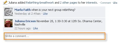
There is always this field 'Write a comment' available, which works in a very inviting way for the enduser to get motivated to write a comment. You just click in the field (which is in itself very unintuitive) and this appears:
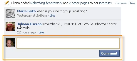
The field get's bigger, it shows your Avatar and the [Comment]-button is added. Really great UI if you'd ask me.
(/edit)
However, in XenForo we need to click on 'Comment' for the comment-input field to show up underneath the existing comments. When there are lots of comments on 1 single posting, the 'Comment'-link can be positioned very far away from the last comment in that list, making the 'Comment'-link a bit out-of-context with the user process at hand. As illustrated by the following mighty example:
(edit 05/11/2010)
Here is an example taken from the mighty Facebook:
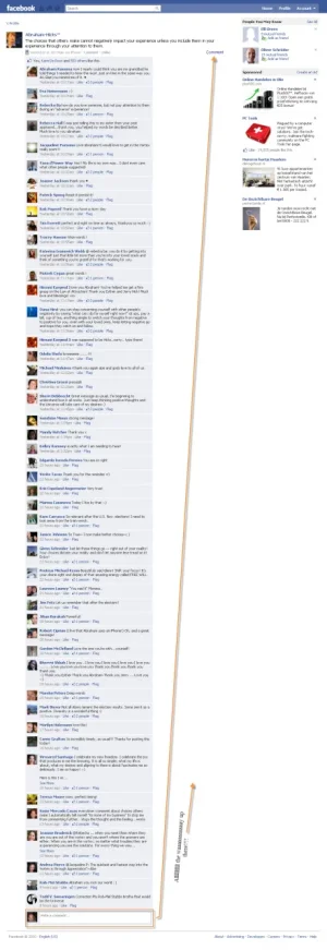
Imagine that your XenForo powered social platform becomes one the most successful websites out there (and mine will ) and that the social activity is enormously thriving. Then, having lots and lots of comments will result in the above screenshot, making it very hard to comment on anything, unless you expect your users to scroll up 'allllllllll the waaaaaaaaaaaaay up there!!!'
  .
.
Okey, Okay... I don't see that kind of activity happening anytime soon, but who knows? One has to see the bigger picture, right?
(/edit)
I understand why the Comment link is positioned there and basically there's nothing wrong with it. I just found myself now a bit getting used to it now, coming from using FaceBook a lot lately. Just a thought.

Coming from Facebook (yes, I know XenForo is not Facebook) I am used now to enter a comment directly underneath the listed comments and that works great.
(edit 05/11/2010)
This is how it works in Facebook:

There is always this field 'Write a comment' available, which works in a very inviting way for the enduser to get motivated to write a comment. You just click in the field (which is in itself very unintuitive) and this appears:

The field get's bigger, it shows your Avatar and the [Comment]-button is added. Really great UI if you'd ask me.
(/edit)
However, in XenForo we need to click on 'Comment' for the comment-input field to show up underneath the existing comments. When there are lots of comments on 1 single posting, the 'Comment'-link can be positioned very far away from the last comment in that list, making the 'Comment'-link a bit out-of-context with the user process at hand. As illustrated by the following mighty example:
(edit 05/11/2010)
Here is an example taken from the mighty Facebook:

Imagine that your XenForo powered social platform becomes one the most successful websites out there (and mine will
Okey, Okay... I don't see that kind of activity happening anytime soon, but who knows? One has to see the bigger picture, right?
(/edit)
I understand why the Comment link is positioned there and basically there's nothing wrong with it. I just found myself now a bit getting used to it now, coming from using FaceBook a lot lately. Just a thought.
Upvote
5

