You are using an out of date browser. It may not display this or other websites correctly.
You should upgrade or use an alternative browser.
You should upgrade or use an alternative browser.
Better Blogs VS XI Blogs ?
- Thread starter surfsup
- Start date
My initial thoughts are that I don't particularly like how Better Blogs is styled and XI Blogs seems to have more features but the development cycle with it is horrible slow and I'd be worried about future support.
Basically, I want @Chris Deeming or @Bob B to create a blog product
Basically, I want @Chris Deeming or @Bob B to create a blog product
Last edited:
I haven't used Better Blogs, but from what I can see between both developers I will give you my honest opinion.
For my needs, XI Blogs works better. A lot of the features in Better Blogs I do not need and my main problem with it is the general look and feel. This is no offense to the author, but it looks ugly. I love addons that reuse the XenForo look and feel so that it's easier for theme developers and more customized sites to work with their product. XI Blogs looks much cleaner and integrated well with my custom theme.
You can see it in action here for an example: http://www.otakutalk.com/
As for the issues with XI Blogs, the developer is very slow to update. Once again, I mean no offense, but as a client I can see this being an issue especially when pressing bugs are present in the software. The author of Better Blogs seems far more active in development and is always on XenForo. So here is what I can tell you:
XI Blog Pros
- Better Look and Feel
- Simpler functionality and more lightweight (Works for my needs)
- Lower Cost
- Slow development cycle
- Broken features still not fixed
- Active developer
- Feature Rich (this is also a con for me - explained below)
- Ugly style, looks foreign
- Heavy features, seems bulky (I like modular addons)
- Expensive
If someone could give me some specifics about the style I would love to hear it. The problem with saying that it is "ugly" is that it does not gives me enough information to improve. I keep updating the style in such a way that it looks better - to me.
The main goal with the blog look and feel is that it should look like a blog, and not like the forum. That's why the comments do not look like profile posts and the entries do not look like forum discussion. But that is by design, people should look at a page and immediately know they are looking at a blog.
Anyway, specific feedback is welcome.
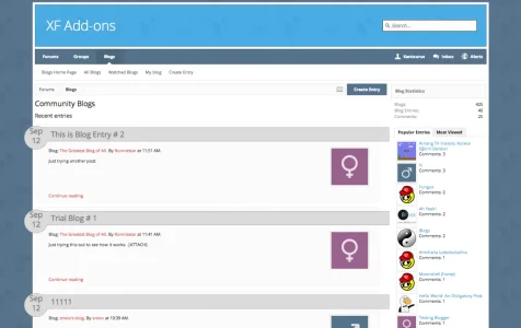
Main Page
Entry Page
Comments
The main goal with the blog look and feel is that it should look like a blog, and not like the forum. That's why the comments do not look like profile posts and the entries do not look like forum discussion. But that is by design, people should look at a page and immediately know they are looking at a blog.
Anyway, specific feedback is welcome.
Main Page

Entry Page

Comments

If you post a demo with the default style I'll be more than happy to provide you with detailed design feedback. My best response to you is that you created a lot of those styles yourself right? Looking at the screenshots I can see that. My recommendation is to reuse what XenForo has already created so it creates a more integrated experience with the default look of XenForo and allows theme creators to not worry about styling your third-party addon.If someone could give me some specifics about the style I would love to hear it. The problem with saying that it is "ugly" is that it does not gives me enough information to improve. I keep updating the style in such a way that it looks better - to me.
The main goal with the blog look and feel is that it should look like a blog, and not like the forum. That's why the comments do not look like profile posts and the entries do not look like forum discussion. But that is by design, people should look at a page and immediately know they are looking at a blog.
Anyway, specific feedback is welcome.
Main Page
View attachment 57009
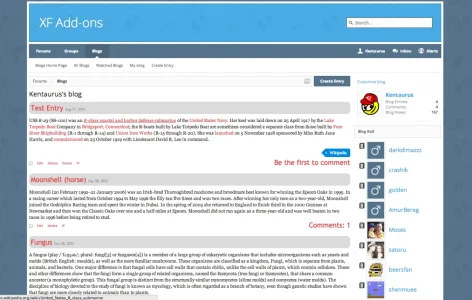
Entry Page
View attachment 57008
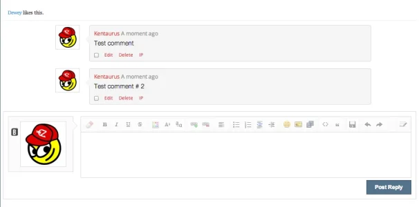
Comments
View attachment 57007
You can't imagine how annoying it is when someone says "Your theme doesn't look right when using this addon" when it's due to the developer not using what XenForo already provides in a solid framework for design.
For instance: http://xenforo.com/community/attachments/screen-shot-2012-09-28-at-9-49-05-pm-png.34811/
I mean if you look at this screenshot it doesn't look appealing to me as a designer. I wouldn't want to buy this product. It doesn't use any of the default styling from XenForo. Most of the addon developers you see will use basic XenForo style elements and create more advanced style as they are required. Once again, that's my opinion and I mean no offense.
I have temporarily put the default XenForo style on the demo site - http://xfaddons.com/blog-home/If you post a demo with the default style I'll be more than happy to provide you with detailed design feedback.
I mean if you look at this screenshot it doesn't look appealing to me as a designer. I wouldn't want to buy this product. It doesn't use any of the default styling from XenForo. Most of the addon developers you see will use basic XenForo style elements and create more advanced style as they are required. Once again, that's my opinion and I mean no offense.
That might have been true in the first version of the product, but it is not anymore. All the colors and backgrounds are references to existing CSS classes, the avatar is the same reused element, breadcrumb, sidebar is the same default elements.
I was actually using a custom theme on the demo site to detect if something breaks or is miss-styled when applying a custom theme, since on development I test with the default.
I have temporarily put the default XenForo style on the demo site - http://xfaddons.com/blog-home/
Sidebar:
- Looks much better than it does in your screenshots, has it been updated? Make sure you use newer screenshots.
- The custom styles on this page are not that great. The circle with the dates doesn't look good. I know what you're trying to do, but I would follow more of the XenPorta model if you want to have a section where a large month and day are shown next to the post in a "blog" format.
- Continue reading doesn't stand out. Try using the calltoAction class to have it become a button that stands out.
- Tags are cool, but they are aligned weird. There is an odd gap under the profile pic section.
- For the title of the post you could use the category strip style and simply make the font-size bigger with a style property class of its own. Would look better IMO.
- "Recent Entries" didn't stand out for me. I assumed they were the latest blog posts, so that text may be redundant.
- Same feedback with the title, use the category strip style.
- The date seems a little funky. The gray on the blue doesn't look right.
- View number is misaligned, these are nit picky but polish is key.
- I don't mind the comments section, but why not just use the quote style if you were going to go with that color. Also the arrow looks funny because it doesn't have the border like the rest of the div.
- Also, make the comments section the same width as the content.
- Combine the "you need to login to comment" and the actual button into the same div. Having them use the same style but separate looks very weird to me.
- Keep it consistent with the styling of other tabs. Your "Blog Entries" tab content should look THE SAME as the "Postings" tab content. Consistency is key here.
In all honesty if design is not your strength, think about hiring someone good with HTML, CSS and able to properly analyze the templates used with XenForo. I suck at PHP coding, don't know a lick of it. I just have strong marketing skills and I can design. That's my contribution to our products at LP. Andrew is the coding mastermind and if I left things to him, everything would look like a stick figure world and neon colors
Hope this helps!
In all honesty if design is not your strength, think about hiring someone good with HTML, CSS and able to properly analyze the templates used with XenForo. I suck at PHP coding, don't know a lick of it. I just have strong marketing skills and I can design. That's my contribution to our products at LP. Andrew is the coding mastermind and if I left things to him, everything would look like a stick figure world and neon colors.
Maybe he should hire you for the design optimization. ;-)
Are you available for that? I even would pay you to design our Better Blogs area (with which we haven't gone public until now).
If I had the free time I would. Have my handful with LP, a full-time job and two community forums I run.Maybe he should hire you for the design optimization. ;-)
Are you available for that? I even would pay you to design our Better Blogs area (with which we haven't gone public until now).
If I had the free time I would. Have my handful with LP, a full-time job and two community forums I run.
Too bad.. ;-)
Sidebar:
Index Page:
- Looks much better than it does in your screenshots, has it been updated? Make sure you use newer screenshots.
Blog Entry:
- The custom styles on this page are not that great. The circle with the dates doesn't look good. I know what you're trying to do, but I would follow more of the XenPorta model if you want to have a section where a large month and day are shown next to the post in a "blog" format.
- Continue reading doesn't stand out. Try using the calltoAction class to have it become a button that stands out.
- Tags are cool, but they are aligned weird. There is an odd gap under the profile pic section.
- For the title of the post you could use the category strip style and simply make the font-size bigger with a style property class of its own. Would look better IMO.
- "Recent Entries" didn't stand out for me. I assumed they were the latest blog posts, so that text may be redundant.
User Profile:
- Same feedback with the title, use the category strip style.
- The date seems a little funky. The gray on the blue doesn't look right.
- View number is misaligned, these are nit picky but polish is key.
- I don't mind the comments section, but why not just use the quote style if you were going to go with that color. Also the arrow looks funny because it doesn't have the border like the rest of the div.
- Also, make the comments section the same width as the content.
- Combine the "you need to login to comment" and the actual button into the same div. Having them use the same style but separate looks very weird to me.
*Note: I may have found a visual bug. While looking at this profile: http://xfaddons.com/members/ronniestar.15865/ you will see the gap the same size as the sub navigation div. It looks like something funky is happening with your sub nav and profile page.
- Keep it consistent with the styling of other tabs. Your "Blog Entries" tab content should look THE SAME as the "Postings" tab content. Consistency is key here.
In all honesty if design is not your strength, think about hiring someone good with HTML, CSS and able to properly analyze the templates used with XenForo. I suck at PHP coding, don't know a lick of it. I just have strong marketing skills and I can design. That's my contribution to our products at LP. Andrew is the coding mastermind and if I left things to him, everything would look like a stick figure world and neon colors.
Hope this helps!
Thanks a lot for your comments, I can tell that you took a lot of time into writing this post and I really appreciate it. I will make sure to apply your feedback to the product, it will for sure make it a better solution. The devil is in the little details and I appreciate that you mention these small things that I have looked over. For someone that is not even using the product at the moment I seriously appreciate it.
I am definitely not a designer, I'm a developer, and my strength lies in the backend and into doing software that scales to hundred thousands of users. I will consider bringing a consultant for a couple hours to continue giving suggestions on the product. I have no problem implementing them, but I sure accept help identifying the issues.
@Rigel Kentaurus
I think honestly the best thing would be to follow the standard XF approach, looking at your CSS it's literally all custom classes you've created which makes supporting it coming from a styler point of view difficult.
Don't get me wrong... it's definitely do-able but it would be nice if it followed like... your traditional subHeading classes, so when I make a change on a style, it'll carry over to your blog.
Except that's not the case from what I can see.
@Rigel Kentaurus
I think honestly the best thing would be to follow the standard XF approach, looking at your CSS it's literally all custom classes you've created which makes supporting it coming from a styler point of view difficult.
Don't get me wrong... it's definitely do-able but it would be nice if it followed like... your traditional subHeading classes, so when I make a change on a style, it'll carry over to your blog.
Except that's not the case from what I can see.
I am not a fan of the unintentional effects. I could argue that if it is was not done this way then you change the heading classes, and then you break the blog.
Then we would be saying things like "The developer just reused the same XenForo classes instead of creating dedicated ones for the blog, so a style update on Forum Home completely broke the Blog Index page"
I think different sections convey different intentions. Some are naturally reusable, like the message bit. But for example, I don't see as good software design just taking the say, home css, and applying that to another page.
Colors are reused, and style variables are reused. Specific css definitions are never reused. Global css definitions like "secondaryContent" are reused. Those were the core guidelines for the product.
I like dedicated custom classes, take showcase for example, this uses many custom classes and is one of the most popular add-ons available. I'm betting I could style better blogs with ease but I'm in a "can't be bothered doing anything" rut these days but the custom class approach is something I welcome and has been proved to be a pro (showcase being an example).
Unless i'm missing the obvious here.
Unless i'm missing the obvious here.
I like dedicated custom classes, take showcase for example, this uses many custom classes and is one of the most popular add-ons available. I'm betting I could style better blogs with ease but I'm in a "can't be bothered doing anything" rut these days but the custom class approach is something I welcome and has been proved to be a pro (showcase being an example).
Unless i'm missing the obvious here.
Bob still uses default classes though such as sectionMain and subHeading, as opposed to this blog(from what I'm seeing) isn't using either of those which is standard on almost any XF page.
If it's standard on almost any XF page and it's in the container I'm using itBob still uses default classes though such as sectionMain and subHeading, as opposed to this blog(from what I'm seeing) isn't using either of those which is standard on almost any XF page.
@Rigel Kentaurus you already gave a major class xfa_blog_home, this can allow anyone to do major stuff without breaking it (if they know what they're doing, by being specific)
For the rest just use regular classes. My two cents.
----
As for the OP, well I personally use XI Blog I find it having the exact set of features I need and want. Only downfall is the prolonged BETA. I would rather have a developer perfect the existing version to make it stable and then go for feature additions in the form of BETAs. But so far I'm really happy with it.
Adam Howard
Well-known member
If it's standard on almost any XF page and it's in the container I'm using it
@Rigel Kentaurus - Anychance you could make a default style available so I can view this? I checked your site and it only had it displaying on the xenfocus style. If you could thanks if not, no worries.
Keep this
View attachment 57036
I don't care if @LP-John thinks the round date doesn't look good. I do.
Look, I do not want my blogs to look like extensions of forums. I want blogs to look like blogs. This means you should be mimic WordPress.org or such sites as Thoughts.com where bloggers seem to flock to.
That is one area I think doesn't look great at all but that might be it just inheriting the custom style but couldn't give a thorough 2 cents feedback till I viewed the blog through a default xf style.
Adam Howard
Well-known member
To answer the original question.....What are your thoughts and which is better in your opinion?
Better Blogs could use some improvement to become Better Blogs
But the development has been far more on going in Better Blog than it has in XI Blogs which development has been very slow...
So slow that before talks about XenForo 1.2 or the beta, the last update was March 2013. Only after 1.2 did the development finally push updates & it still will not work with responsive layout, so your mobile web users are let out on XI Blogs
Similar threads
- Replies
- 91
- Views
- 14K
- Replies
- 7
- Views
- 2K
- Replies
- 79
- Views
- 13K
