Also included in this audiento style: http://xenforo.com/community/resources/ui-x.2239/ and a similar modification here: http://xenfrench.com/forum/resource...visible-pendant-le-défilement-de-la-page.424/I love this super cool toolbar.
View attachment 60008
You are using an out of date browser. It may not display this or other websites correctly.
You should upgrade or use an alternative browser.
You should upgrade or use an alternative browser.
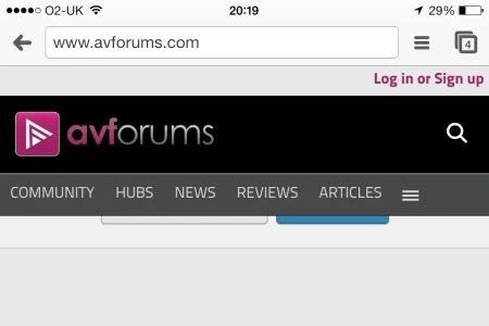
AVForums moves to Xenforo
- Thread starter Stuart Wright
- Start date
No word yet.I saw mention of poor performance at first, any idea which Addon was causing it?
One of the add-ons I created for AVForums initially caused issues with load but that was fixed almost immediately. This was further exasperated due to issues with APC and caching. For the most part, the site is flying pretty fast now.
There is still a higher-than-normal load on the server which we believe to be add-on related. It may take some time to identify exactly which. And even so, our priority will be feeding our findings back to the add-on developer rather than naming names here.
There is still a higher-than-normal load on the server which we believe to be add-on related. It may take some time to identify exactly which. And even so, our priority will be feeding our findings back to the add-on developer rather than naming names here.
It may take some time to identify exactly which. And even so, our priority will be feeding our findings back to the add-on developer rather than naming names here.
I'd be really interested how the Post Rating Addon is coping as we always see a massive load change when disabling it when we're really busy.
I think that the choice of colours and the design is a mistake. I don't think this design is suitable for a large forum where lots of people spend hours browsing the site. For such site usability should be the primary concern and there should be a balance between usability and aesthetics. Here I think aesthetics was the main concern. Fancy colours and fancy fonts is not a great idea for a large forum. I hope I'm wrong.
I think the overall of the theme is well done. But with the style having too much white and the message font it indeed hurts the eye after a while. But all things but aside if this is the only problem, avforums has nothing to worry. All easy things to fix.
Last edited:
Overall a solid migration, but there's a few things making the site a bit 'uncomfortable' for me to browse
- Custom font for body text quite difficult to read
- Fixed width, fair enough, but it's too thin
- Fixed position header makes scrolling in Firefox very laggy
- Fixed header makes the page feel claustrophobic and steals too much vertical space
- Animation on the header, while nice at first, makes initial scrolling even more laggy
- Community tab might be better as separate tabs rather than a multi-tier menu
Just relished posting this over at vB.com
Sweet! I think I'll print it out and have it framed.

I feel the same way about vB/IB, having had the 4.x licensing rammed down our throats just so we could continue getting support on 3.x...then to have that declared "end of life" not to long after, and leaving us hanging. If it weren't for my possibly having to do a bit more work with it (we still have the license), I'd have left a similar note by now. And having seen the trainwreck of vB5, I'm very glad we did not get suckered into yet another "upgrade".
We're in a far better place now. At least the developers here are in touch and monitor the forum, and actually listen to what us admins and end users experience on a daily basis. As important as our "big board" forums are to us, we can't afford a bumbling software company (see above), or any of those poorly coded freeware choices like phpBB, MyBB, etc., where development appears to be stagnating (as always).
Congrats on the migration!
Carlos
Well-known member
"CODForums moves to xenForo!"
"AVForums moves to Xenforo"
What a copycat!
I'm just kidding, Stuart! Congratulations on moving to xenForo!")
Nice site. I really, really love what you guys have done to the navigation. I mean the sub navigation disappears, then the black navigation makes it's own animation. Very well done whoever did that!
"AVForums moves to Xenforo"
What a copycat!
I'm just kidding, Stuart! Congratulations on moving to xenForo!
Nice site. I really, really love what you guys have done to the navigation. I mean the sub navigation disappears, then the black navigation makes it's own animation. Very well done whoever did that!
Congrats on the successful move and good job. Looks good and professional. And best of luck with your future!
Scott
Scott
Overall a solid migration, but there's a few things making the site a bit 'uncomfortable' for me to browse
- Custom font for body text quite difficult to read
- Fixed width, fair enough, but it's too thin
- Fixed position header makes scrolling in Firefox very laggy
- Fixed header makes the page feel claustrophobic and steals too much vertical space
- Animation on the header, while nice at first, makes initial scrolling even more laggy
- Community tab might be better as separate tabs rather than a multi-tier menu
My thoughts exactly.
- The font is too uncomfortable.
- Can you make the width a percentage instead of fixed width. Percentage width with fixed width sidebar achieves your purpose of having a fixed width sidebar for ads as well as looks good across different screen resolutions.
- Header looks impressive first but after a while becomes very irritating
Good job on the move,
Critical Media did a very nice job on the design, @Audentio did a great job integrating it into XenForo.
I do find this a little ironic :
:
http://prntscr.com/20bctr
Critical Media did a very nice job on the design, @Audentio did a great job integrating it into XenForo.
I do find this a little ironic
:http://prntscr.com/20bctr
A lot of the old folks are bashing on the pink/black theme...I think it looks quite sharp and modern. I also like the white background, but agree that it's difficult to read the text with that font. My eyes were watering after a short period. Best to nip the font problem in the butt as soon as possible.
I guess if I was to design the site ...
I would have made it look like engadget - http://www.engadget.com/
The Home Page is too image based for my eyes.
I want to read a few sentences to see if I want to read an article.
Just a picture doesn't work for me.
I also think a techy crowd likes Text (facts and figures and specs) not just glitz.
IMO.
I think the HomePage needs a rethink - more mobile friendly, different layout.
The forums are quiet fast. Lots of design things I like.
Similar threads
- Replies
- 4
- Views
- 4K
- Replies
- 1
- Views
- 1K
- Replies
- 8
- Views
- 5K
- Question
- Replies
- 4
- Views
- 2K
- Replies
- 8
- Views
- 4K