XF 2.2 Aligning and/or Re-scaling Header & Navigation Images

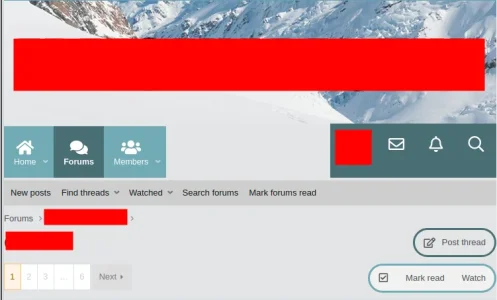
Recently, we had help filling the navigation row with an image:

Screenshot from 2021-07-02 00-03-38.png

which is working great when on full screen mode (Brave browser), with 100% zoom setting.

However, when we switch to half-screen mode, the following happens:
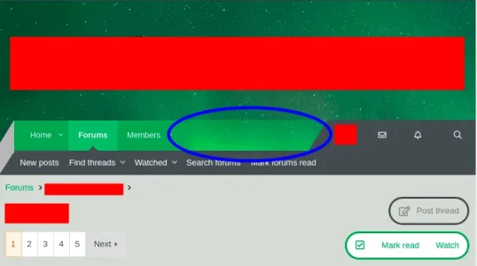
Screenshot from 2021-07-02 00-03-53.png

The header and navigation images are no longer aligned.

Prompted by a suggestion here, we tried adjusting the header and naviation settings, with less/css code "background-position: center top;" (and we also tried "background-position: left top;"):
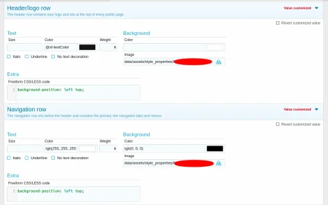
Screenshot from 2021-07-02 00-08-00.png

Neither solved our issue though.

I have also looked here, and, app_header.less file, neither of which seemed to contain the solution.

Am I just missing something simple here? Could someone please help us resolve this?

Additionally, we have a related (but perhaps slightly different issue) where if we view this theme on a mobile device, the banner image no longer captures the image. Presumably this could be resolved with whatever solution exists for the above question, or, by re-scaling/re-sizing the image for mobile users?
 
Just checked, same thing happens with both Firefox & Chrome browsers.

The CSS 'background-position' option didn't solve the issue previously.

Hadn't come across the CSS 'background-attachment' option before. Sounds like it might work, after reading about it here. Will try that shortly. Thank you.

I'll DM the site link if that doesn't work.

Edit:

Tried various settings of 'background-attachment'. Didn't do the trick.
 
Last edited:
Have been discussing/trying a few potential solutions from @djbaxter (by DMs).

Idea #1:
Him: I [was] wondering if you made the logo and the background image one image, i.e., superimpose the logo on the background image and then use the whole thing as your "logo", would that solve the problem for you?
Me: I don't think it would unfortunately, because the issue has to do with having to split the image into two (one for the header and one for the navigation row). So, even if we adjust the header image in that way, there will be a separate navigation row image.
Me: The reason we have it done with two images is that's the first way we figured out how to get the image into the navigation row (with help from people here).
Me: So, we certainly aren't wedded to that method (it's just what we are current doing), and, it's actually kind of tedious to crop the images properly to get them to line up properly.

Idea #2:
Him: With some experimentation with CSS and top-margin, you could move the navigation bar up over the bottom part of the header images. That way, you keep the navigation bar separate from the logo and background image and position it wherever you want with CSS.
Him: Also, you'll probably need to use negative values for top-margins. It may seem weird but I've done that before...
Him: Like 'top-margin: -50 px;'
Me: No luck with that.
Me: I think I did it in the correct place ... Added the 'top-margin: -50px;' CSS code top each of the following CSS/LESS boxes (one by one, added, saved, checked to see if it worked, if not, added to the next one, and so on): Navigation row, Navigation row - tab, Navigation row - hovered tab, etc. etc. (all the ones with 'Navigation' in the title). Would think 'Navigation row' is the one to do it, but, tried the others just in case.

Screenshot from 2021-07-09 23-06-21.webp
 
@djbaxter 's solution worked.

Some minor adjustments were still needed (see below for more on this), which are handled now.

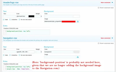
What we entered:
Screenshot from 2021-07-10 00-25-30.png

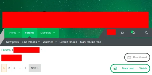
The result (full screen mode):
Screenshot from 2021-07-10 00-56-21.png

The second result (half-screen mode):
Screenshot from 2021-07-10 00-56-34.png

We needed to do some more adjusting (to have more padding underneath the logo, i.e., the large redded out box).

See next comment for instructions on this.
 
Last edited:
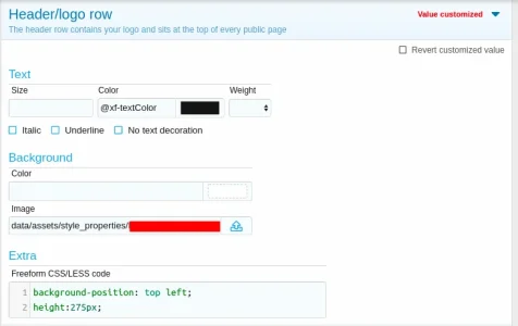
To create a larger gap between the bottom of the logo and the navigation bar, in this current configuration (i.e., using margin-top, as @djbaxter suggested), we needed to add a CSS 'height' specification to Header/log row CSS/LESS box:

Screenshot from 2021-07-10 04-16-59.webp

This idea was found here.

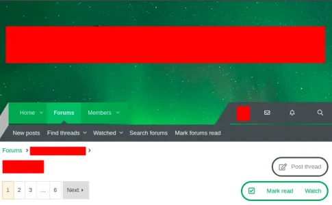
In our case, the header background image (northern lights) was 1800 width x 325 height. Playing around with it, a height of 275 px gave an about equal vertical gap on either side of our logo when on full-screen mode.

See here (full-screen mode):

Screenshot from 2021-07-10 04-11-23.png

This solution-path does introduce one minor 'feature' which is different from the default settings of the template and/or XenForo. When in half-screen mode, there is some sort of automatic re-sizing which occurs, so, it becomes no longer roughly evenly spaced above & below the logo. The gap below the logo becomes a bit larger than the gap above the logo.

The change in gap sizes isn't significant enough to really matter in our case (with the image size and logo size), though, in different configurations it might matter.

See here (half-screen mode):

Screenshot from 2021-07-10 04-11-35.png
 
Last edited:
Continuing on from the previous comment (because there is a limit of three images per comment).

It also turns out that the Navigation row background colour must be set to be fully 'transparent' for this to work.

Like this:

Screenshot from 2021-07-10 05-46-20.webp

With the fourth number in the rgba() number sequence being zero.

And now, just some final thoughts/comments on this solution-path, for future reference by other people and myself.

When not using the solution proposed by @djbaxter , rather, our old configuration of manually cropping two separate images for the header/navigation row such that there was a seamless fit (see one of the links in the orignal post above for more on that), or, just using a solid background for the navigation row, the logo padding between top and bottom does automatically adjust (when on full-screen vs. half-screen mode). This is unlike the solution described above.

However, @djbaxter 's solution fixes the header/navigation row re-alignment issue described in the original post above, and, it also has the added bonus of being much quicker to implement than the previous configuration (cropping two images to make them seamless is rather tedious, try it and you'll see what I mean). In other words, the gains far outweigh the loss (of automatically adjusting the logo height padding).

The images below are with the previous configuration (and a solid background in the navigation row), to show what I mean above about the logo height padding adjusting automatically when switching between full-screen and half-screen mode).

Full screen mode:
Screenshot from 2021-07-10 04-12-17.png

Half screen mode:
Screenshot from 2021-07-10 04-12-03.png
 
Last edited:
Back
Top Bottom