XF 2.2 How To Auto Re-Scale The Header Background Image Based On Browser Settings ?

As the thread title suggests, we've been trying to get our header background image to re-scale based on the browser settings.

As is, when we upload a header background image, the image looks alright for some browser configurations (e.g., Desktop, Chrome browser, 100% zoom, full screen).

However, if we adjust the browser zoom setting from say 100% to 80%, or change from a full screen to a half screen for the browser, it results in much of the background image being clipped/cropped and thus not visible.

The same is true for changing devices to a mobile (with typical browser settings for that device), but the header background image cropping is much worse.

We've tried manually changing the size of of the uploaded image, but this unfortunately just shifts the clipping issue to different browser settings (i.e., it might look good on mobile with the manually re-sized image, but not on Desktop).

In other words, our header background image only looks good on one particular browser configuration (e.g., Desktop, full screen), and not others (e.g., mobile + regular settings, Desktop + half-screen, etc.).

The desired header image is a cartoon scene of a forest with some mountains in the background, and with some animals at various positions within the forest. Due to the cropping described above, many of the animals are often cropped out, or, half cropped out (such that you might only see its head rather than full body for some browser settings). That tends to be really noticeable and not very aesthetic.

--------------
We've tried many different CSS codes in extra.less, as well as in the Header/logo row CSS code box for the style, with no luck.

As far as I can tell, the following CSS code ought to do the trick:

Code:
background-size: cover;

But it isn't.

(It actually seems to do nothing when I add that CSS code, along with adding the following CSS code)

---------------
We've also tried CSS code like this and this (as well as other versions of the following CSS code, such as replacing ".block-header" with other values, and setting background-position to '0 0;').

e.g.,

Code:
@media (max-width: 480px) {
    .block-header {
          background-position: center center;
          background-repeat: no-repeat;
          background-size: cover;
          background-image: url(path/to/image/the_image_480w.jpg);
    }
}

@media (min-width: 481px) and (max-width: 1024px) {
    .block-header {
          background-position: center center;
          background-repeat: no-repeat;
          background-size: cover;
          background-image: url(path/to/image/the_image_1024w.jpg);
    }
}


@media (min-width: 1025px) {
    .block-header {
          background-position: center center;
          background-repeat: no-repeat;
          background-size: cover;
          background-image: url(path/to/image/the_image_original.jpg);
    }
}


Where:
  • "the_image_original.jpg" is the largest size of the said background image,
  • "the_image_1024w.jpg" and "the_image_480w.jpg" are the same background image re-scaled to have widths of 1024px and 480px (while preserving the same aspect ratios), respectively.

All of these images were previously uploaded to the forum, on the same path.

--------------

Here are some of the many webpages we visited in attempt to figure this out:
1
2
3
4
5
6
7
8
9

Along with various webpages on "what does 'background-size: cover;' do?", "what does 'media only screen' vs. 'media' do?", etc.

Have spent quite a few hours on this now, so its not for a lack of trying, though I'm admittedly not too familiar with CSS code and these types of webpage adjustments.

---------

It might be worth mentioning that we're using a custom pre-made style, specifically, this one.

--------

Can anyone please help with this?
 
Last edited:
Solution
So here's the CSS code in extra.less that worked:

Code:
@media only screen and (max-width: 480px) {
  .header--proxy {
    padding-bottom: 0%;
    background-image: url('data/assets/mere/the_image_480w_470h.png') !important;
    background-size: cover;
    background-position: top center;
  }
}
@media only screen and (min-width: 481px) and (max-width: 1024px) {
  .header--proxy {
    padding-bottom: 0%;
    background-image: url('data/assets/mere/the_image_1024w_510h.png') !important;
    background-size: cover;
    background-position: top center;
  }
}
@media only screen and (min-width: 1025px) and (max-width: 1300px) {
  .header--proxy {
    padding-bottom: 0%;
    background-image: url('data/assets/mere/the_image_1300w_360h.png')...
Try adapting this code to fit in with your class:

Code:
width: 100%;
  height: 400px;
  background-image: url('path/to/image/the_image_original.jpg');
  background-repeat: no-repeat;
  background-size: contain;
  border: 1px solid red;

Change height to that of your image, or try height: auto;
 
Thank you Davyc.

I gave that a try, it does succeed in adding a red border around the background header image (when using the .header--proxy class within extra.less), but, no luck with any other changes in re-sizing the actual background image.

I tried contain & cover for the background-size, actual heights (in px) and auto for height, and important! after the background-image URL. No combination did what I needed.


Could CSS code elsewhere is overriding whatever changes I'm trying to make?

-------------

I've also tried many different path URLs.

In trying this path again as '/data/assets/mere/the_image_1024w.png', the entire background image disappear, and was replaced by a solid colour,

Whereas 'data/assets/mere/the_image_1024w.png' results in the background image being there, however, it does not adjust to the browser settings.

So it seems that this extra.less CSS code does have an impact on the background image (i.e., can make it show or disappear), but not the impact I'm looking for.

---------
Perhaps this is relevant. There was some CSS code that I tried in the Header/row logo CSS box for the style, which changed the background immediately behind the logo image we have in the upper left corner, but the remainder of the background image for header remained unchanged.

Barely noticed that there was an effect, because the effected area was a square box quite tight to the circular logo image.

I cannot seem to reproduce this behaviour again, so I'm not sure exactly what CSS I had in that Header/row logo CSS box
 
Last edited:
--------

Can anyone please help with this?
I have experimented with headers that retain their aspect ratio. I did it by adding a padding-bottom, e.g. this site keeps the header aspect ratio:


header css is

Code:
.mainheader
{
padding-bottom:16%;
background-image:url(https://retrofitsouthampton.org/_images/header-bg.webp);
background-size: cover;
background-repeat:no-repeat;
background-position:top center;

}

Adjust padding-bottom to suit your aspect ratio - this bit is trial and error.
 
Last edited:
Thank you Mr Lucky.

I gave that a try, in both the extra.less and Header/row logo CSS

It had no effect (including not changing the padding below)

Don't understand why none of the changes are really having an effect
 
Don't understand why none of the changes are really having an effect
Sorry just realised, in the site I linked the actual height of the header itself is not defined in px, it is is defined by the logo size (height) plus the padding-bottom - hence you need to experiment

Double check you are applying it to the same style you are viewing, that one catches me out frequently.

You can see from my site linked (I hope) that it should work.

Maybe try it first with no logowith

But
 
Last edited:
I'm not really following, in that the CSS code you provided above doesn't specify the height (whether that be the background image or logo).

You can see from my site linked (I hope) that it should work.
I can see that it works on your Retrofit Southampton forum, yup

Double check you are applying it to the same style you are viewing, that one catches me out frequently.
Indeed, I've been careful about making sure I apply it to the correct style, as I've made that mistake before in the past as well.

Maybe try it first with no logowith
Will give it a try without any logo, to see whether the logo is causing some sort of conflict
 
Last edited:
I'm not really following, in that the CSS code you provided above doesn't specify the height (whether that be the background image or logo).

I can see that it works on your forum, yup.

And I've been careful about making sure I apply it to the correct style, as I've made that mistake before in the past as well.

Will give it a try without any logo, to see whether the logo is causing some sort of conflict
The logo does have a height, that is part of the equation that makes it work along with the padding as a percentage.
 
Ah, good to know, thank you.

Your suggestions led me along a different line of thought, and I think I have found a solution.

Will post the full details once it's all worked out.

---------
Here's the gist of it.

It seems to be the case that different browser settings end up with different aspect ratios for the header background image.

On Desktop, full screen mode, the header background image within my browser falls between 1025 px and 1300 px, so, is controlled by this bit of CSS code within extra.less:

Code:
@media only screen and (min-width: 1025px) and (max-width: 1300px) {
  .header--proxy {
    padding-bottom: 0%;
    background-image: url('data/assets/mere/the_image_1300w.png') !important;
    background-size: cover;
    background-position: top center;
    border: 1px solid red;
  }
}

That image was manually scaled and uploaded to the forum, having a width:height ratio of 1300:365, which is roughly 3.56:1. It doesn't fit perfectly within the header background slot, i.e., some of the top and bottom are cropped, but only a minimal amount was cropped & the image still looks good.

When in half-screen mode on Desktop, the header background image within my browser falls between 481 px and 1024 px, so, is controlled by the bit of CSS code within extra.less under "(min-width: 481px) and (max-width: 1024px)".

The above aspect ratio was originally used for this image as well (e.g., "the_image_1024w.png"), with those dimensions being 1024:288. However, that resulted in a bulk of both the left and right side of the image being cropped.

The solution was that I manually re-scaled the original image to 1024:490 as a quick test (so a ratio of roughly 2.09:1 instead of 3.56:1), uploaded that image as "the_image_1024w_490h.png", updated the relevant bit of CSS code in extra.less (e.g., background-image now pointed to "the_image_1024w_490h.png"), amf that now fits a lot better now on half-screen mode for Desktop.

It's not perfect, will still have to play around with the dimensions a bit more, but a lot closer than before, much less undesired cropping of the background header image.

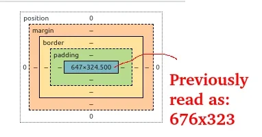
As a side note, to find that ratio of 2:09:1, I simply loaded the forum page while in full-screen mode (Brave browser, Ubuntu/Linux OS), right-clicked on the header background image, pressed "inspect", dragged the inspection box on the right-hand-side over to approximate a half-screen for the left-hand-side, which gave a crude estimate of 676:323:

676_323.webp

I then took that 676 and scaled it up to 1024, and applied that same scaling to the 323 to get 489, which I rounded up to 490

That ratio, 676:323, proved to be very similar to the one when I screenshot just the header background image and checked the resulting dimensions. Point being, confirmed that's another method to find an estimate.

----

On a different note, this didn't end up as part of the solution, but, setting width to above 100% shifted which part of the background image was getting cropped. For example, I could see more of the left of the image rather than the center of it with certain widths chosen.

Also, the bottom padding suggested caused the background image to essentially be zoomed in, rather than covering the entire space.
 
Last edited:
So here's the CSS code in extra.less that worked:

Code:
@media only screen and (max-width: 480px) {
  .header--proxy {
    padding-bottom: 0%;
    background-image: url('data/assets/mere/the_image_480w_470h.png') !important;
    background-size: cover;
    background-position: top center;
  }
}
@media only screen and (min-width: 481px) and (max-width: 1024px) {
  .header--proxy {
    padding-bottom: 0%;
    background-image: url('data/assets/mere/the_image_1024w_510h.png') !important;
    background-size: cover;
    background-position: top center;
  }
}
@media only screen and (min-width: 1025px) and (max-width: 1300px) {
  .header--proxy {
    padding-bottom: 0%;
    background-image: url('data/assets/mere/the_image_1300w_360h.png') !important;
    background-size: cover;
    background-position: top center;
  }
}
@media only screen and (min-width: 1301px) {
  .header--proxy {
    padding-bottom: 0%;
    background-image: url('data/assets/mere/the_image_original.png') !important;
    background-size: cover;
    background-position: top center;
  }
}

The three re-sized images had dimensions for width:height of: 480:470, 1024:510, and 1300:360, respectively.

They aren't yet exactly where I want them, but close enough for now.

-----
A few additional notes:

- I hadn't tested the dimensions for width > 1300 px yet, since the style has the maximum page width set as 1300 px. I left a case to handle that as a placeholder for now, with the original image being used

- By manually re-sizing the images, I have stretched/compressed them a bit horizontally (not too much, but it is a bit noticeable for the 1300:360 image), so I'll be re-making the images with those new dimensions in mind, rather than having them all be identical to the original with re-scaling applied

- The thin bar at the top of the header, specifically, the bar containing the admin & moderator menus to the left, as well as the menus for the user, mail, and alerts to the right, seems to overlap some of the background image, though I just re-sized these images to account for that

- I might manually handle a few more cases later, if I notice that different browser settings (say, zooming out on a Desktop browser to 80%) doesn't look good

----
Thank you both very much @Davyc and @Mr Lucky for helping with this, as well as @DohTheme .
 
Solution
Back
Top Bottom