Style XeroLite - new style (WIP)

John

Well-known member
Hi all! Thought I'd post some design mockups of a new style I'm working on. This one will be responsive with extensive use of CSS3 techniques. I'm curious to hear your thoughts on how I've positioned the navigation sub-menu in the breadcrumbs. Another thing to keep in mind as well, all colors are easily changed via our Xenomorph Framework's Infinity Colors tool. Thanks in advance!
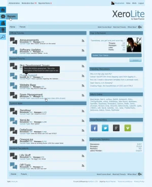
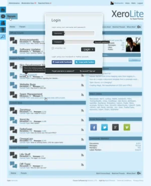
XeroLite_Forum.webpXeroLite_Forum2.webp
 
I don't like the colors so much, but that's just me! Those can be changed.
If this is responsive how does it look on smaller devices? Any screens of that?
I like it though.
 
For the Quark look a-like issue... GET OUTTA TOWN, it actually looks more innovative than Quark and nothing to do with it.

Onto the style itself... like the layout, nice change of pace than the normal stuff, I hope you keep the creativity up for the other parts such as post bit/discussion list.

As for the colors... not going to lie either John, not a fan at all. Because the style is so creative layout wise I think you'll be better off going with some more generic colors allowing folks to easily change them.
 
Not coded yet, so, sorry, nothing to see on that yet.

How do you figure that when it looks absolutely nothing like it? o_O
I think in the sense that it's flat, but flat is the trend this year. *think microsoft 8*
But it's not like quark aside from 'flat' look lol.
 
*shrug* You can disagree with me if you want. I just think it looks like quark. That's my .02 ;)
 
Thanks for the input so far folks! Any suggestions for a different color pallete if this one is generally not appealing?
 
*shrug* You can disagree with me if you want. I just think it looks like quark. That's my .02 ;)
What about it, specifically, makes you think it looks like Quark? I'm trying hard to see it and don't, myself. :)
 
Looks a little bit like the style I use on AA. If it is easy to change the colors with the framework then I would jump all over this when it's done.
 
What about it, specifically, makes you think it looks like Quark? I'm trying hard to see it and don't, myself. :)
Personally I feel the images and, yes, the overall flat look just contribute a very similar feel to quark ;)
 
What about it, specifically, makes you think it looks like Quark? I'm trying hard to see it and don't, myself. :)
Well the whole blue thing needs to be phased out. Maybe some white with hints of blue. I would not do the category node names in black on that color. It's a tad difficult to read IMO.

For a dark color scheme I would do a black with some popping colors *windows 8 inspired!*

I use colourlovers.com palettes because I really am bad at picking colors.
I just know when I don't like something and I don't like the colors!
 
I like the design but not the colours myself.

Cannot see any similarity to Quark either, other than it is a flat design, and Quark uses a similar colour as the highlight colour, but Quark is a totally different layout and is a dark theme o_O

Here is a site running Quark.... http://www.thatgamerforum.com/index.php
 
Personally I feel the images and, yes, the overall flat look just contribute a very similar feel to quark ;)

I have to agree with the others sylar, I can't see any resemblance whatsoever with the johns mockups and the quark style.

Regarding the design you know my thoughts john I posted them over at xfshowcase.com and I'm sure the final design will look excellent as do all of your designs/styles. :)
 
Thanks for the feedback, all! I've reworked the colors to go with a more muted palette and have moved on to coding now. I'll save the previews for when it's finished, hopefully sometime this week. I think everyone will like what I've come up with. :)
 
Top Bottom